
PayPal is a global tech company with over 300 million active users that strives to provide financial services for their customers, such as sending and receiving money, expanding payment options and credit, checking out online, and many other offerings.
Settings Redesign: Project Overview
The Challenge: Redesign of the Settings section for the Consumer app
There were two primary challenges being solved in this project.
First, the former design of the Settings section of the PayPal consumer app lacked a coherent and consistent design framework and an information architecture (IA) strategy to support rapid growth. Although the Setting section is not a highly trafficked area after on-boarding, the needs that do bring the customer to Settings are often crucial and have high impact on the customer’s overall account functionality and behavior. Also, since it is an area of the app generally not frequented (and therefore not learned), it is even more important that content is easy to scan and discover. All of these issues were resulting in an unnecessary call help volume from frustrated customers who cannot complete their tasks.
Secondly, a new regulation in EU law called GDPR (General Data Protection Regulation) required additional functionality, transparency, and that settings that pertain to data privacy and personal information are easy to find and use.
Getting to The Solution
One of my guiding principals in product design is to make sure that the user spends as little time on a product as possible. I want them to get in, do the thing, and then get back to real life. Tech should give us more time, not take it away. Waisting unnecessary effort on fundamental tasks in Settings was not a productive use of our customers time on app.
A customer-focused design process of Discover and research > Ideation and design > Test with customers (North America, Europe, Asia) > Iterate and repeat was employed to arrive at a new design framework, pattern flows, icons, and content that focused on delivering consistency and clarity throughout the app section to save users time and to support PayPal’s desire for transparency with their customers.
Much research and testing time was spent developing an intuitive information architecture based on depth rather than breadth that can accommodate growth for years to come and give the customers more control over how their personal data is used.
discovery and Research
Quick overview
As mentioned, there was a lack of consistency and clarity throughout the Settings experience, seen visually here:
Old Design
It’s easy to see that each page has its own unique framework, which is not a good thing. The user has to learn each page anew as they search for their task. Furthermore, as was made apparent through our user research, the secondary navigation is easily lost with the blue of the global navigation, even with the hanging arrow.
Illustrated in the high-level overview of the redesign, the layout, typography, and ui elements are consistent within a prioritized visual hierarchy in two columns (for desktop, one for mobile). The secondary navigation is now distinct from the global navigation. I go into a detailed analysis of these features further below.
New Design
Defined goals
How might we
Design clear navigation and information architecture so the user intuits which page to go to for their task
Make the content easily discoverable and usable to reduce the number of customer contacts through Help
Support GDPR requirements in a way that improves the user experience
Design required GDPR features with flexibility and consistency so that they do not need to be recoded by the engineers multiple times (since they may appear in multiple areas inside and outside of settings)
Research: Understanding users and their needs
This project was focused on the core consumer product, although many of the GDPR learnings and designs were also implemented throughout PayPal, such as with merchant and credit products. The customers for the consumer core product include Casual Sellers, Checkout shoppers, Underbanked, P2P users, and general overall PayPal customers who are not using merchant accounts.
Quantitative research
Remote usability tests were conducted on the existing design to establish problem areas and to establish a baseline
Four closed card sorting sessions were conducted remotely with 100 participants each to discover the most effective tab grouping and organization of the content
Qualitative research
Four in-lab (face to face) prototype research sessions in Germany and the UK
Four in-lab (face to face) prototype research sessions in North America
Other tests were run by partners in Asia
ANALYSIS OF SUCCESSFUL DESIGNS
IA and Navigation
Made apparent in the initial baseline testing, the old tab content of Account, Security, Payments, and Notifications was falling way short in comprehension and time to task. The Account label was too unspecific, Security and Payments were too narrow as labels, and the word Notifications didn’t always make sense as bucket for it’s particular settings. Additionally, these tabs just weren’t able to accommodate many settings (i.e., Change debit card PIN, is it a security or a payment setting?), making scaling difficult for the product.
To solve this challenge, four closed card sorting sessions were conducted using the current IA (baseline) against three options that were hypothesized to be more effective options. The participants where given 20 tasks and asked to locate the appropriate tab for each task. Tabs were tested and retested until a consistent success rate bubbled up for Personal Information, Financial Settings, Privacy and Security, and Communications.

An example of our task list for the closed card sort with the success rates
old design
new design
Another important issue that was solved was the blue background of the old navigation. During in user testing, many users missed the navigation all together since the blue made it difficult to differentiate. Making the secondary background white with larger type and a clearer page indicator tested up to 85% better for certain tasks!
For each page, a review of recent analytics and in-lab user research had shown which tasks were most frequented. Balancing with GDPR needs and requirements, the content was prioritized to align with this data and feedback.
Although there is an ongoing effort for parity between the desktop and native mobile apps, the UI experience can differ between these two platforms. Most of the focus for the IA of the native app was in reorganizing the settings navigation and grouping with a similar solution in a way that reflected the tab structure of the web design:


Framework consistency
Using panels with a visual hierarchy for typography greatly increases the ability for the user to scan the page and successfully locate their task. Keeping headlines, descriptive text, and high level actions on the left while keeping all edit options on right makes it clear to the user how the page is consistently intended to be navigated.
New panels with a clear hierarchy and visual progression from left to right
Mobile version
The old design had inconsistent alignment, panel separation, and different ui elements for similar functionality
Another important framework solution is the use of over-panels for any settings management. This solution was arrived at when exploring the needs of GDPR settings to appear throughout the PayPal experience, even in a logged out state. Over-panels are not a new design pattern at PayPal, but the design was standardized and made consistent where ever the need for a focused setting management flow was required. This makes coding and reusing over-panels in other areas much easier and provides a consistent user experience that tested very well.
The UI in web settings
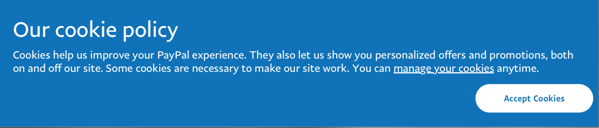
The GDPR banner for cookies settings that can appear anywhere during a PayPal experience. This is an entry point to the same over-panel that the user would see in Settings.
The cookies management over-panel
This pattern was scaled throughout the UI for any task that required a settings management flow:
Add/edit email flow
The mobile app uses a similar flow:
UI Elements
To help achieve the goal of increasing discoverability and usability, several ui elements were created or redesigned to be more context effective.
A large “plus circle” was created for areas where the management of many items (addresses, phone numbers emails, etc) may require easy access to the option to create a new addition. This helps the user quickly perform a frequent action.

Having a text link for managing a setting can be unclear, with options such as “edit,” “manage,” “update,” etc. An argument can be made for each with no clear consensus on consistency. To get around this, the pencil icon was preferred and tested very well as a metaphor for all of the possible text options.

Using colored icons to reinforce the setting status (on, off, paused, etc) increased the visual feedback so that users can easily scan the page with less reading.
Switches were introduced for settings that are singular and do not appear anywhere else in the site. This helps reduce the steps for users when a flow is not required. Adding the related text (yes/no) and changing the on state to green greatly increased effectiveness.

The checkbox was set as the standard for communications management since multiple options can be selected and are more clear than clicking icons (as in the old design).
The tooltip pop out was introduced to communicate any unique behavior for certain settings.

New design

Old design
Content/Copywriting
Although I won’t go into content too much because my focus was ux/ui design and research, it is important to note that content design was crucial to the success of this project. Keeping the headlines and descriptions terse, jargon-free, and friendly was key for discoverability and the information architecture.
New design
Old design
Another important content feature was just keeping things minimal and getting rid of information that was unnecessary. This was just as important as anything that was added. Grouping content under headlines was another big content decision that really improved the ability of the user to narrow in on the setting they needed.
Moving forward/what was learned
Overall, the settings redesign for the PayPal consumer app was a big success in user testing and I was proud to be a part of the project with incredible team members. We as a team at PayPal learned that even areas of a product that have minimal traffic can become huge pain points for customers when they need to use it, potentially snowballing into other issues such as call volume and negative product perception if not given the careful analysis a holistic system deserves. Creating a design framework that can accommodate years of unpredictable growth through a user-focused design method can pay off dividends down the road.
The settings redesign outlined here is scheduled to go live Q1/Q2 2019.
The Core Team:
Alexa Apallas - Content Strategist
Carla Alford - Product Manager
Jackie Vasquez - User Experience Researcher
Eric Tomlinson - Design lead