

Project Overview
PayPal is a global FinTech company with over 300 million active users.
The primary challenge being solved in this project:
Legacy card products and features had developed in isolation and had resulted in duplicate work with different customer experiences and engineering.
This included a lack of unification across the different types of card offerings, web vs mobile, and consumer and merchant accounts, from awareness, enrollment, activation, and servicing/management. Needless to say, this was a very large project with touch points across the entire PayPal experience.
Considering the size of the project, for this case study I will focus on details for how we solved for unifying servicing/management experiences for the different card offerings.
Why we knew it was a problem
Designs and experiences were inconsistent for the servicing platforms of different cards. In some cases designs were outdated and broken.
It took longer to introduce new features and improvements for Product, Design, Content, Engineering, PMOs, Legal, Risk, Issuance & Tokenization, and Customer Service teams.
It greatly slowed our ability to scale into new markets.
My Design Process:
Discover > Define > Ideate > Test > Iterate > Launch
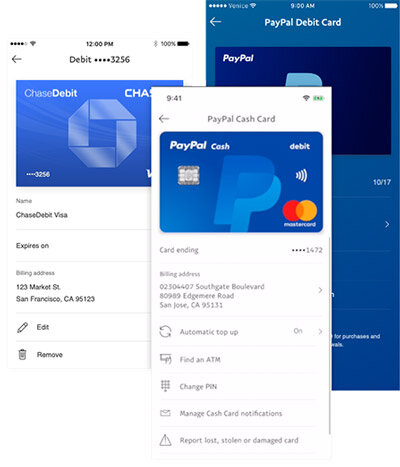
A quick glance across the old designs reveals visual inconsistencies and a lack of a coherent experience in the card servicing experience.
My Role
During the time this project was completed, I was a lead product designer for the Consumer Financial Service (web and app) team at PayPal. During this time I designed two new products and led a redesign/enhancement project, part of which is the project I am now presenting.
For this particular project, I provided the visual design, the user experience design, and conducted user participant interviews for research.
Additionally, I worked alongside an amazing core team:
Nick Gamino - Content Strategist
Miguel Simões - Product Manager
Crystal Tobias- User Experience Researcher
Kicking Off with Discovery and Problem Analysis
discovery:
Like most projects, we started with a kickoff meeting between the primary stakeholders/team to discuss the scope, process, timing, and begin to outline our sprints.
We then had extended conversations with other stakeholder teams in both the consumer and merchant products as well as customer service, where we audited concerns, ideas, and requirements.
We spent time with our data analyst, reviewing the metrics for past year on several card products.
Finally, we did a feature analysis of other products in the market
From these conversations we began consolidating user journeys and mapping out our hypotheses for a cohesive and scalable user experience.
Define
Our goals
Designs consistent experiences for all cards that are flexible and scalable enough to accommodate the needs of various products, stakeholders, and markets, current and future.
Update the UI to align with current PayPal and quality design standards.
Introduce new servicing features determined through market and voice of the customer research: lock card, copy card number, and automatic top up for debit cards
We’ll know we nailed it when:
There’s consistency and an excellent user experience for our customers across all our cards.
Enabling the launch of new features and improvements simultaneously across all cards, in all markets, is possible.
We’ve increased our speed to market to offer cards to customers across the globe.
This needed to be accomplished in both web and mobile, and for consumers and merchants.
THe full scope of the project: An End-To-End Cycle
Due to the complexity of the project, I wanted to make sure we were taking an end to end user experience approach. This project covered several different products for both consumer and merchant on both web and mobile and we needed to start capturing the commonalities and differences. Below is an illustration of the user story for the PP Cash Card, covering awareness, enrollment, activation, and servicing. Therefore, this is a full lifecycle for card customers going from awareness/discovery to closing the account.
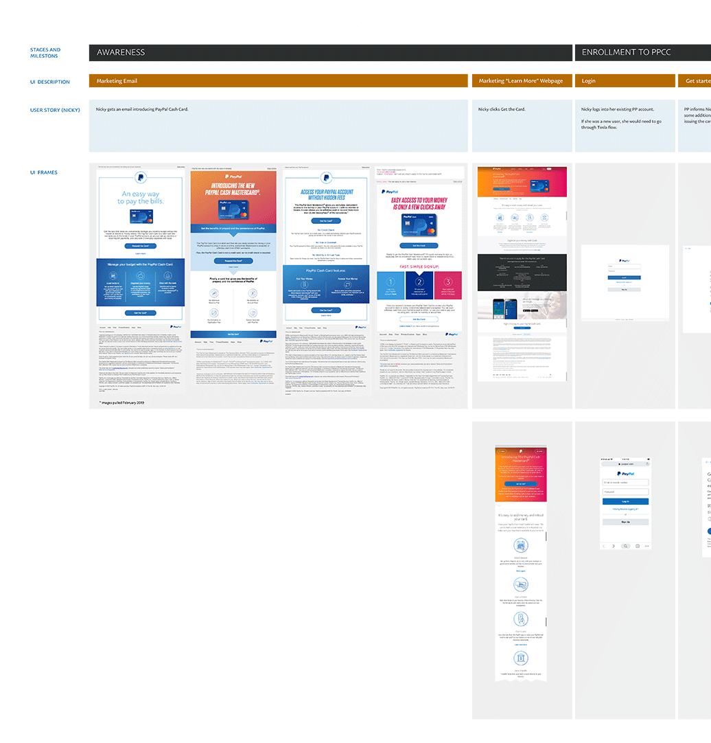
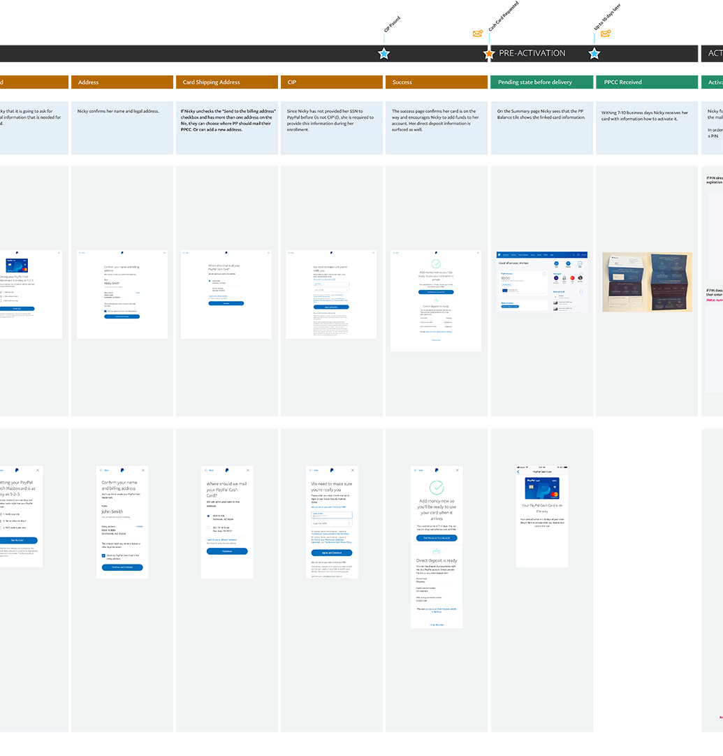
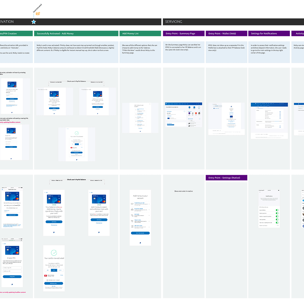
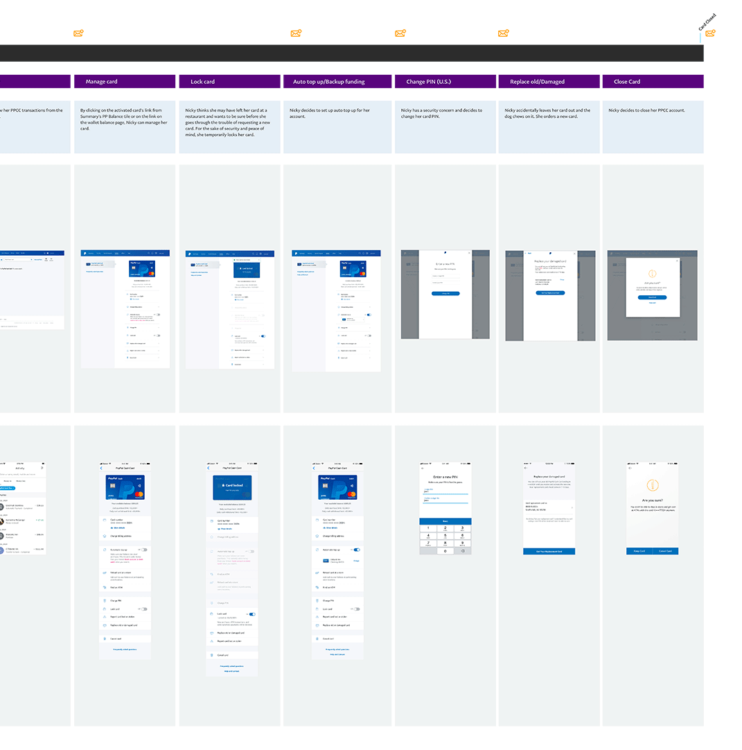
A zoom-in on the part of the user journey I will be covering below
Here you can see both the web and mobile frames for each feature:

Due to the size of the full project, for the rest of this case study, I will narrow my focus on how we got to the solutions for:
PP Cash Card in mobile for
the card management organization and UI
the copy card number feature
the lock feature
User Research and Testing for Card Management

A quick outline of our research strategy:
Getting clear on what works across the board with card management
Content audit and organization with in-lab card sorting
Unmoderated task testing/baseline
In lab qualitative research
Qualitative and validation
Four in-lab (face to face) prototype research sessions in North America
One final unmoderated round of task testing for new features
My role: I created the prototypes and conducted some of the in-lab participant interviews with the UX Research team.
Card Management IA and Feature Organization
Closed card sorting and brainstorming
To begin solving the challenge of organizing and updating the card features, I conducted a brainstorm with stakeholders from several teams to be sure that we had an audit of all the necessary features, with enough flexibility to scale, and to discuss possible groupings, labeling, and design solutions.
We also conducted a closed card sorting session with customers in the lab using the outcome of this brainstorm.
iterating towards the solution with prototypes:
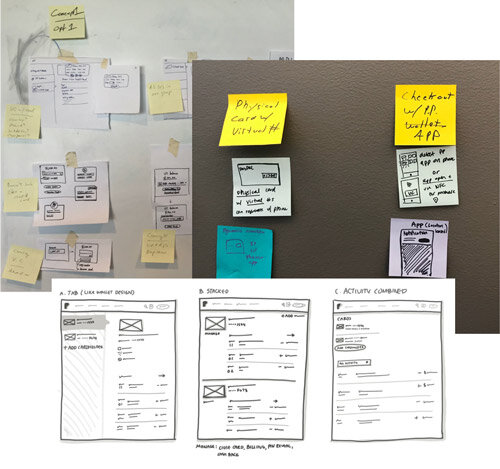
Starting approach:
After the brainstorming session and card sorting research, I had some starting ideas about how to order and group the content, labeling, and UI design changes. However, I still needed to validate our hypotheses with some visual prototypes and user feedback so we could begin iterating towards the solution.
In my first attempt, I wanted to see how users would react to having as little information as possible on the first frame to reduce choice consideration. I also thought this might help with product scaling. So, anything related to a setting for the card was placed in a card details “bucket”. Lock card was prioritized as a feature to see the reaction from users. I also wanted to see if users would understand they could copy the card number using a subtle icon.

I quickly realized that this was too many taps and the flow was causing some disjointed experiences. Reaction to Lock Card was enthusiastic, but some users where having trouble with discoverability. Users were totally missing the ability to copy the card number and many users couldn’t find the spending limits. Another apparent issue was that new users were confused about automatic top up (topping balance or card?) and were hesitant to engage. Finally, the presentation and exposure of card details had accessibility and security concerns.
This was on the wrong track and more work was needed.
The next iteration:
Coming out of the previous session’s learnings, I had hypothesized that user would be ok with clicking into a nested flow for their card details but all other settings would be surfaced on the landing page. I also wanted to make the material more easily scanned, so I made some adjustments to the typography and layout, and began chunking the features into groups.
I prioritized Lock Card as a new and high use feature, based on the positive value feedback from the previous session.
To address the comprehension issues for automatic top up in the last round, I added content to describe the feature for first time users.
I also redesigned the copy card number experience entirely.

Overall, this version tested much better than the previous one. Users were scanning the page more effectively, but the groupings were creating some confusion and needed some rethinking.
The reaction to Lock Card was still enthusiastic, but through customer conversations, I realized that the positive feedback was for the feature, but the location was too prioritized and didn’t really make sense with its grouping.
The copy card number button worked like a charm, but having the card details in a flow was causing issues for some users and needed to be simplified further. Also, the placement of the “eye” icon was causing some issues with tapping.
The addition of content for automatic top up greatly improved users comprehension and willingness to engage. We just needed to polish the content a bit.
Spending limits was still getting lost and the green was superfluous and not scalable globally.
Arriving at the solution.
At this stage, I had surfaced as much information as possible up front, focusing on an appropriate grouping of features. Additionally, I further refined the typography and icons, all of this contributing to making the page more scannable and scrollable.
For the card details, I used an accordion variation so that users could have the security of the information being hidden, but easily accessible without leaving the page.
In previous versions, Many users wanted to see their balance and limits up front. However, other users would complain when too much emphasis placed on this information was unnecessary. To compromise, I aligned this content with the card on the landing page to make is distinct from the features and reduced the typographical emphasis.

Finally, we had a design that was testing very well. Users were scanning the page effectively and time on task was minimal.
An important hypothesis validation was that, for users who wanted to use automatic top up, having it higher on the page increased visibility, but for users that wanted to lock card or change PIN, having it further down the page had no negative impact. This was a crucial insight that let us know that our grouping strategy was working.
The great thing about this pattern is that it easily scaled into other products and elegantly grouped the feature requirements. Having it validated by our users was a big win.
Detail: Evolution of entry points
In addition to the order and architecture of the features, improvements were made to the UI that greatly enhanced the experience.
As mentioned before, one of the changes that improved comprehension was grouping the features. Improvements were made in typography and content for hierarchy and comprehension. Changing the color of the icons to blue also improved compression and modernized the designs.
Detail: Copy card number
The concept for this new feature arose out of the early brainstorm session through a combination of market analysis, data related to customer spending behavior, and requirements related to new products in the works.
Specifically, we were seeing customers get around merchants that do not have a PayPal check out option by manually typing in their cash card details to checkout and make the purchase. I felt it was important to facilitate this behavior and empower our customer.
I focused on creating an experience that was easy to use, maintained accessibility, and, for security reasons, didn’t expose the card details until the user was ready to.
As mentioned above, an “accordion” pattern worked very well for keeping the details obscured until the user was ready, as well as avoiding any accessibility issues.
Overall, PP cash card users were truly excited by the possibility of being able to use PayPal anywhere, regardless of whether the merchant has a checkout button. This concept is currently being transitioned into a new product offering.
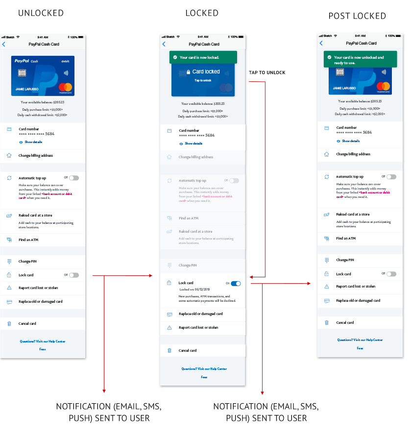
New Feature Flow: Lock Card
This was a new feature arose out of a combination of market analysis and voice of the customer concerns through our customer service representatives. We were seeing this feature appear in competitive products. We also heard that it was common for users to temporarily lose a card, call in to cancel it, and then call back after they found it. This common mistake was causing a lot of wasted time and bother for customers and wasted money for PayPal to send out new cards.
The feature design was pretty straight forward. There was no need for a flow, a switch was very clearly the best option for an on/off feature. However, in order to create the best feature possible, I determined appropriate messaging points and worked with the content designer to get it right through our user research. I felt that helping users clearly understand what they can/can’t do in a locked state was crucial for a net new feature. I also designed the experience so that the messaging only happened when it was most useful and informative, so that it kept the overall experience streamlined and not distracting.
Finally, I also created a new icon for lock card states, adhering to PayPal UI library guidelines, but visually reinforcing the state of the feature.

The locked states:
Outcome and Summary
Overall, the settings redesign for the PayPal consumer app was a big success in user testing and I was proud to be a part of the project with incredible team members.
The UCS launched in February 2020
Scaling into several new markets for card products is feasible and planned for 2020 due to the UCS
Usability and customer satisfaction has measurably improved
New features are already being planned as well as a new card product prioritized by leadership for Q4 2020. This is only possible due to UCS