
Settings Redesign: Project Overview
PayPal is a global FinTech company with over 300 million active users.
There were two primary challenges being solved in this project:
First, the former design of the Settings section of the PayPal consumer app lacked a coherent and consistent design framework and an information architecture (IA) strategy and was hindering growth. Although the Setting section is not a highly trafficked area after on-boarding, the needs that do bring the customer to Settings are often crucial and have high impact on the customer’s overall account functionality and behavior. All of these issues were resulting in an unnecessary and expensive call volume to customer service from frustrated customers who could complete their tasks.
Secondly, a new regulation in EU law called GDPR (General Data Protection Regulation) required additional functionality, transparency, and that settings that pertain to data privacy and personal information are easy to find and use.
* Complete final design is presented at the bottom of this case study
My Role
From November 2016 until November 2018, I was the lead product designer for the consumer experiences (web and app) team at PayPal. During this time I led several redesign and enhancement projects, including this one.
For this particular project, I provided the visual design, the user experience design, and conducted much of the user participant interviews for research.
Additionally, I worked alongside an amazing core team:
Alexa Apallas - Content Strategist
Carla Alford - Product Manager
Jackie Vasquez - Lead User Experience Researcher
Kicking Off with Discovery and Problem Analysis
Discover > Define > Ideate > Test > Iterate > Launch
After a kickoff meeting with the primary stakeholders, one of our first steps in the process was to have several conversations with the customer service teams that had dealt directly with customers having issues with settings. We also took the time to review the metrics for settings traffic over the past year. Our take away from this was that, although the setting section is not a highly trafficked area after on-boarding, the needs that do bring the customer to settings are often crucial and have a high impact on the customer’s overall account functionality and behavior. I also noticed that the settings landing page had ~75% of the overall traffic with less than 25% of the features, meaning that there appeared to be a reason that users were not going to the other settings pages. More on this later in the case study.
As mentioned above in the overview, there was an obvious lack of consistency and clarity throughout the settings experience. More specifically, typography and layout structure were inconsistent, navigation and calls to action were misleading, and icons and UI elements were vague.
Additionally, I wanted to make sure we were taking an end to end user experience approach, and since almost every PayPal product has features in settings, I made sure we also spent time discussing the needs and concerns of other product teams who would require settings integrations for their products in two ideation and requirements collection sessions.
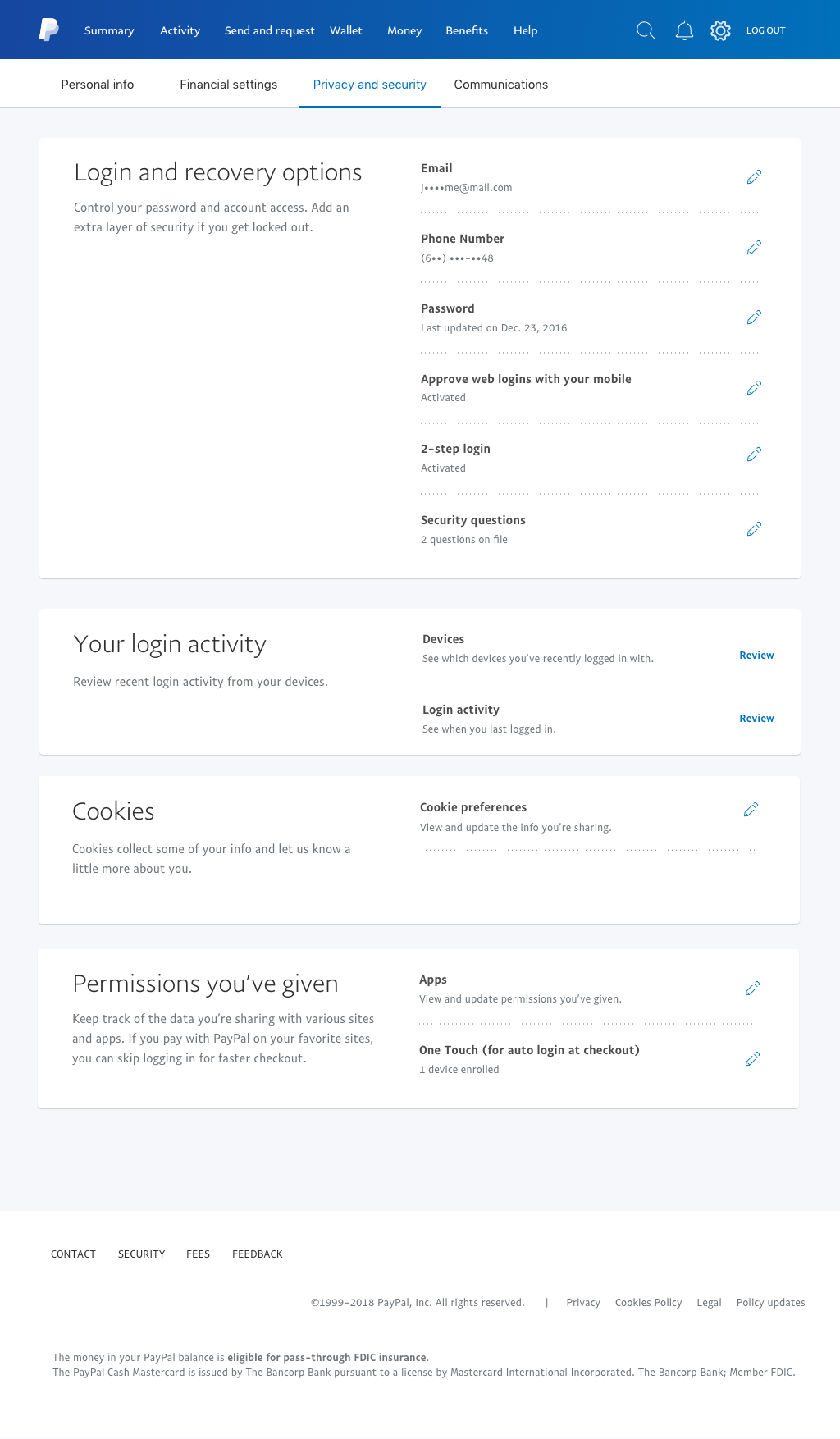
A quick glance across the old settings designs reveals visual inconsistencies and a lack of a coherent experience:
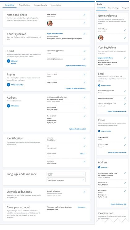
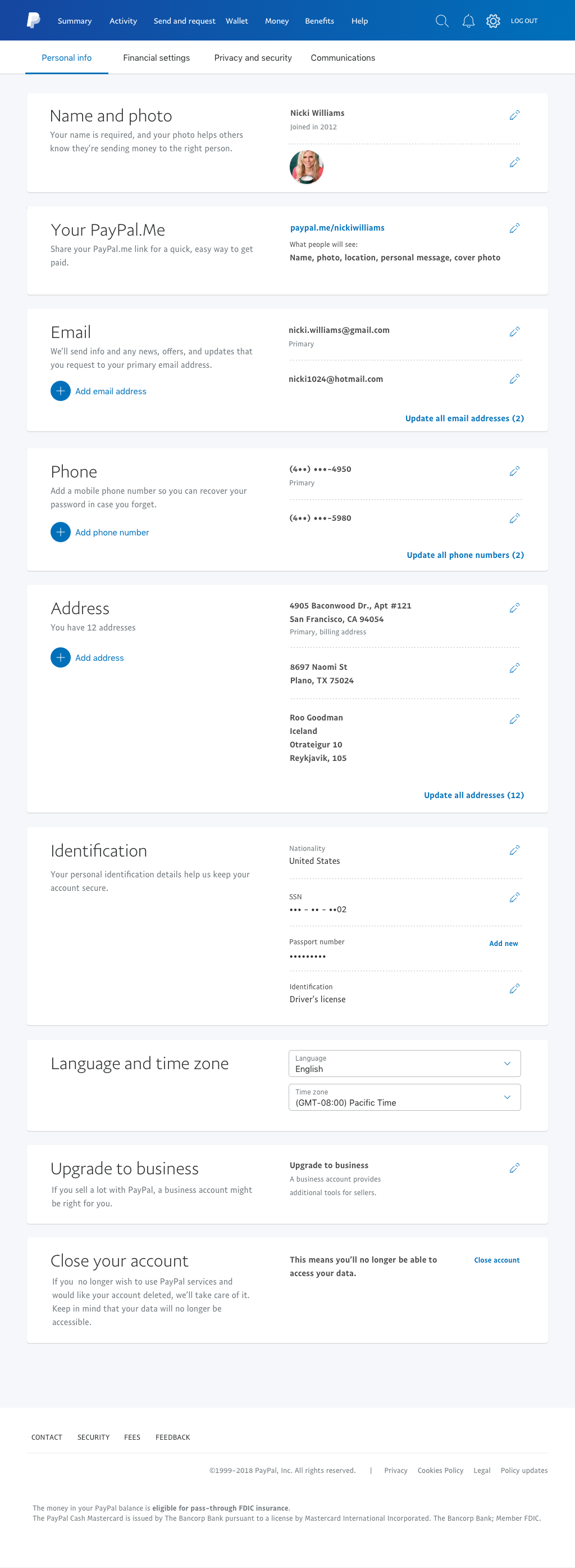
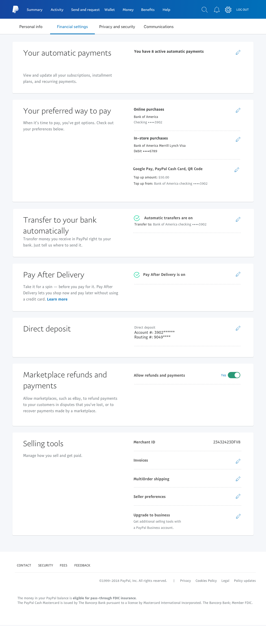
The new settings designs reveals a consistent and scannable visual experience, unlike the old designs initially presented above:

Starting Goals and Hypothesis
Based on the above discovery and analysis, we asked ourselves how might we:
Create a consistent visual design framework and patterns that can scale for future features.
Design an intuitive navigation and information architecture so that a user easily intuits where to go for their task.
Support GDPR requirements in a way that improves the user experience
Design required GDPR features with flexibility and consistency so that they do not need to be recoded by the engineers multiple times (since they may appear in multiple areas inside and outside of settings)
Our hypothesis was that getting these goals right would result in a decrease in time on task and an increase in task completion. This should mean a decrease in customer service related calls. I also felt that GDPR integration could (and should) be done in a way that supported these improvements.
These needed to be accomplished in both web and mobile.
Taking the Time to Learn From Our Customers
A quick outline of our research strategy:
Quantitative research
An unmoderated, task-based UserZoom usability test was conducted on the existing design to help establish problem areas and a baseline for new designs
Four unmoderated, closed card sorting sessions were conducted with 100 participants each to discover the most effective tab grouping and organization of the content
Two unmoderated, task based UserZoom sessions were conducted with high fidelity prototypes using the same task list used in the baseline testing
Qualitative research
Four in-lab (face to face) prototype research sessions in Germany and the UK
Four in-lab (face to face) prototype research sessions in North America
Other tests were run by partners in Singapore
I personally created the prototypes and conducted the in-lab participant interviews (US, UK, and DE) and qualitative testing under the guidance of the User Experience Research team.
Starting From the Top: IA and Navigation
The old tab design and content:

Made apparent in an initial unmoderated baseline user test, the old tab content of Account, Security, Payments, and Notifications was falling way short in comprehension and time to task. The “Account” label was not specific enough, “Security and Payments” were too narrow as labels, and the word “Notifications” didn’t always make sense for its particular features. Additionally, these tabs just weren’t able to accommodate many settings (i.e., change debit card PIN, is it a security or a payment setting?), making scaling difficult for the product.
A screenshot of one of our task lists for the closed card sort with the success rates to the right

A screen shot from the read out of the closed card sorting sessions
To solve this challenge, I conducted four closed card sorting sessions using the current IA (baseline) against three options that were hypothesized to be more effective. The participants were given 20 tasks and asked to locate the appropriate tab for each task.
Three workable options came out of these closed card sessions and were integrated into high fidelity prototypes to narrow down the options to a clearer winner.
The final three navigation prototypes. The third was the winner in user testing with the adjustments of keeping the gear icon after more extensive testing, preserving “Personal info”, and reversing Security and privacy
A screenshot of the heat map from the unmoderated task testing read out. All tasks were started from the PayPal homepage and anything with a success rate above 70% was considered successful

Tabs were tested and retested until a consistent success rate bubbled up for Personal Information, Financial Settings, Privacy and Security, and Communications.
A critical issue that was confirmed was the blue background of the old navigation. During the initial baseline user testing with the old design, many users missed the navigation all together since the blue made it difficult to differentiate. As mentioned above, around 75% of the traffic stopped on the first settings page and we hypothesized that this was the reason why.
I successfully solved this by making the secondary background white, increased the type size, and designed a clearer current page indicator. Overall, this greatly reduced user confusion in the lab and tested up to 85% better for certain tasks in unmoderated tests!
The old sub nav design: The sub nav is in blue, making it difficult to distinguish from the global navigation. Many users didn’t even notice it during testing.

The new sub nav: Creating a clear differentiation between the global nav and the sub nav greatly increased discoverability.

For each page, a review of recent analytics had shown which tasks were most frequented. The content designer and myself also took into consideration our discussions with the call center and what had come out of our card sorting research. We balanced this with stakeholder needs and GDPR requirements to determine the order that features would have on each page.

Balancing with GDPR needs and product requirements, the content page order was given a hierarchy to align with this data and feedback and then put through an unmoderated user test to confirm we got it right.
a Consistent Visual Framework Pulls it all together

Foundations
As someone with a visual design background, I have to admit that this stage is usually my favorite part.
After several ideation sessions and design explorations, I decided to move forward with using panels for the primary framework. It was agreed by the team that these made for easy task grouping and visual organization that worked very well in both web and mobile.
New panel designs with a clear hierarchy and visual progression from left to right.
As illustrated here, this design easily translates into mobile.

A visual and typography hierarchy based on PayPal UI standards was created and tested to increase the ability for the user to scan the page and successfully locate their tasks. Keeping headlines, descriptive text, and high level actions on the left while keeping all edit options on right made it clear to the user how the page is consistently intended to be navigated.
Another important framework solution, achieved through brainstorming sessions with the engineering team and validated in research, was the use of over-panels for any settings management flows. This solution was arrived at when exploring the needs of GDPR settings to appear throughout the PayPal experience, even in a logged out state. Over-panels are not a new design pattern at PayPal, but the design was standardized for settings. This makes coding and reusing over-panels in other areas much easier and provides a consistent user experience that tested very well.
The entry point for browser cookie preferences in the web settings experience
The GDPR banner for cookies settings that can appear anywhere during a PayPal experience, whether or not they are logged in
Regardless of the entry point, the user would have the same over panel experience for their settings. This both provides a consistent experience for the user and cuts out a lot of redundant development time.
Nuts and bolts: Getting the UI ELEMENTS Right
To help achieve the goal of increasing discoverability and usability, several ui elements were designed and tested to be more context effective.
Having a text link for managing a setting can be unclear, with options such as “edit,” “manage,” “update,” etc. An argument can be made for each with no clear consensus on consistency. To get around this, the pencil icon was preferred and tested very well as a metaphor for all of the possible text options.
Here in the old design, “Update” gets redundant really quick. Furthermore, the label Update doesn’t always make sense as the best option.
New design: The pencil icon is a cleaner experience and doesn’t dominate the attention of the user.
A large “plus circle” was created for areas where the management of many items may require easy access to the option to create a new addition and help the user quickly perform frequent actions.

Switches were introduced for settings that are singular and do not appear anywhere else in the site. This helps reduce the steps for users when a flow is not required.

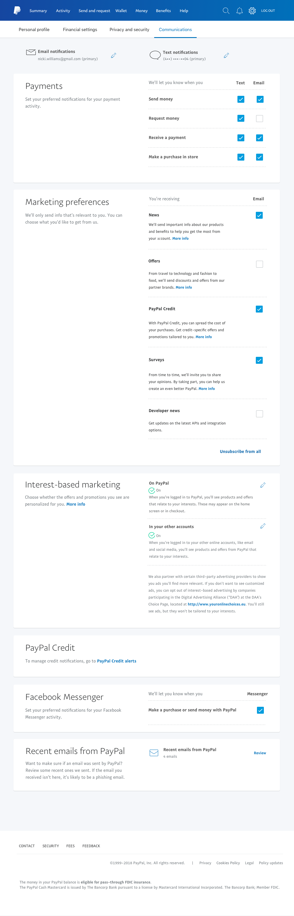
The checkbox was set as the standard for communications management since multiple options can be selected and are more clear than clicking icons
Old design: Using icons in communication management as settings indicators sounds like a good idea but are vague and unclear.

New design: Check boxes make much more sense and the tooltip pop out was introduced to communicate any unique behavior for certain settings.

A quick glance across the new settings designs reveals a consistent visual experience, unlike the old designs initially presented above:
Final Results and What Was Learned
Overall, the settings redesign for the PayPal consumer app was a big success in user testing and I was proud to be a part of the project with incredible team members.
We as a team at PayPal learned that even areas of a product that have minimal traffic can become huge pain points for customers when they need to use it, that can potentially exponentialize into other issues such as call volume and negative product perception if not given the careful analysis it deserves.
Together, we were able to create a redesign that performed extremely well against the old design and usability issues, using a iterative design method based on user testing, stakeholder needs, and legal/leadership requirements.
There’s more where that came from!
Click here to read the PayPal Unified Card System case study.