About me
I’m Eric Tomlinson, a senior product design leader with 15+ years of experience delivering enterprise-scale digital products, design systems, and user experiences. I’ve led distributed UX teams across North America, Latin America, and Europe, shipping B2B, B2C, and B2B2C platforms used by millions in fintech, civic tech, and products that bring utility and value to users.
My background includes compliance-heavy, regulated environments, with hands-on experience designing to ADA, WCAG, GDPR, accessibility, and other standards. I combine strong craft, systems thinking, and AI-powered design methods to simplify complexity, align teams, and drive measurable outcomes.
I consult on product design, design operations, and design leadership—supporting organizations as they scale teams, products, and platforms.
Selected work
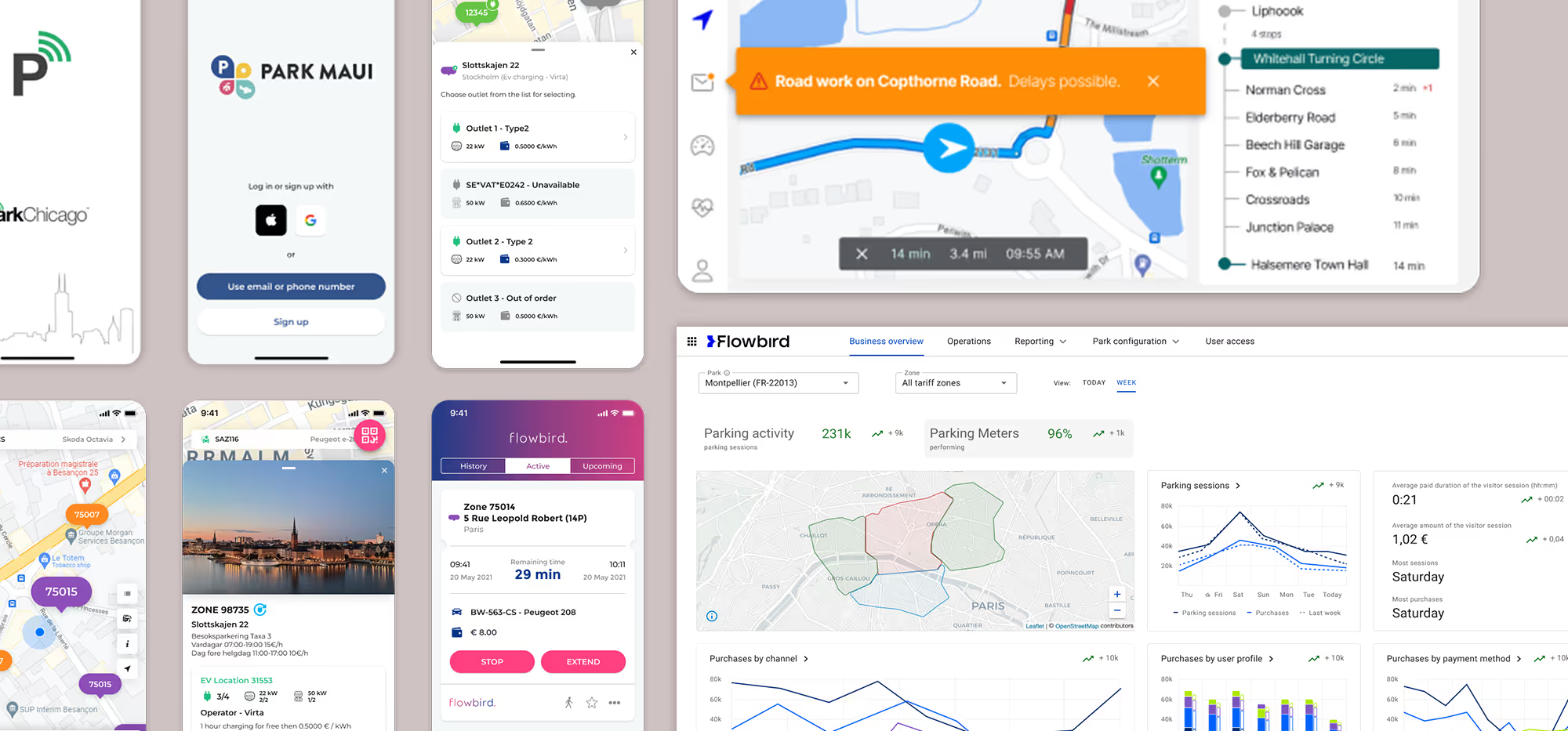
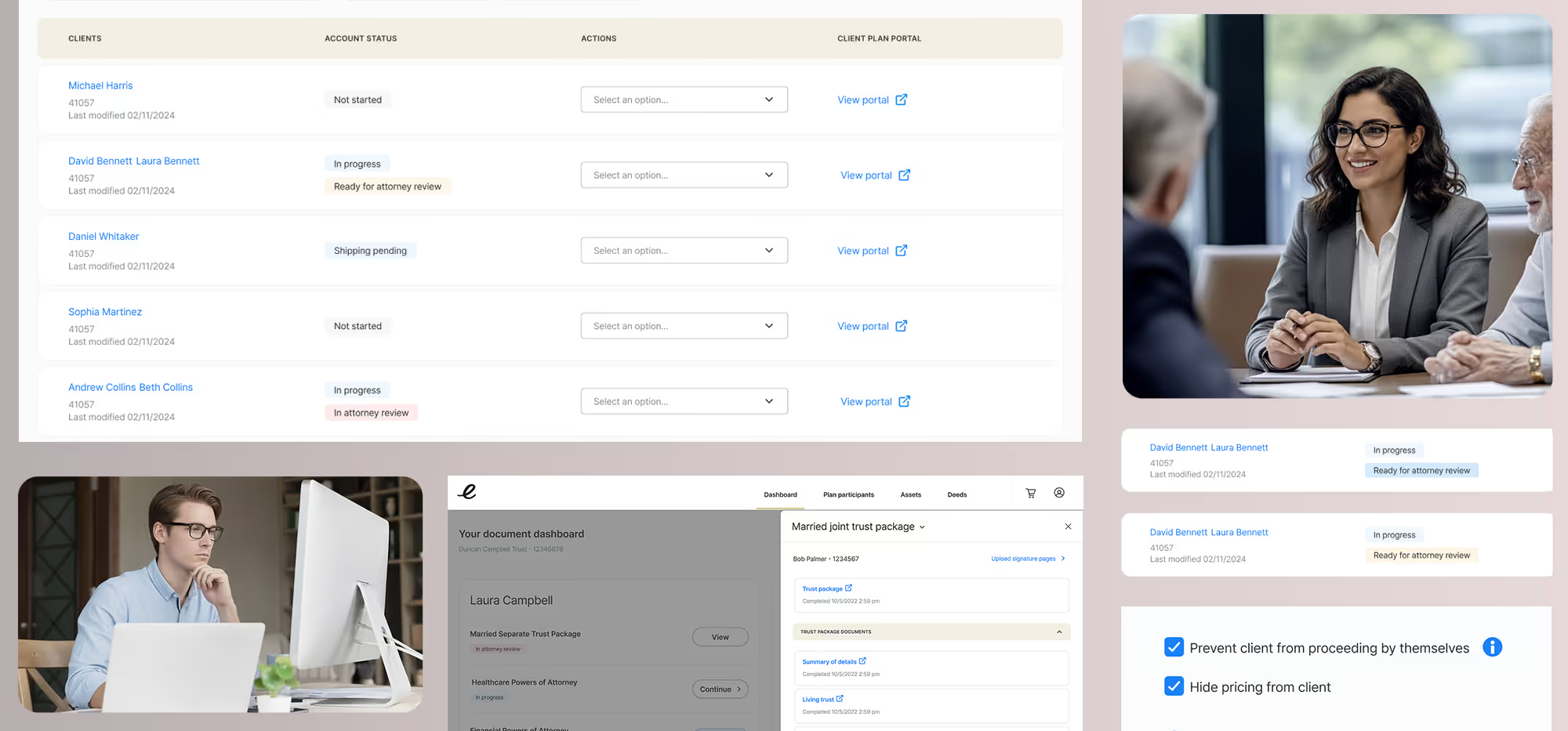
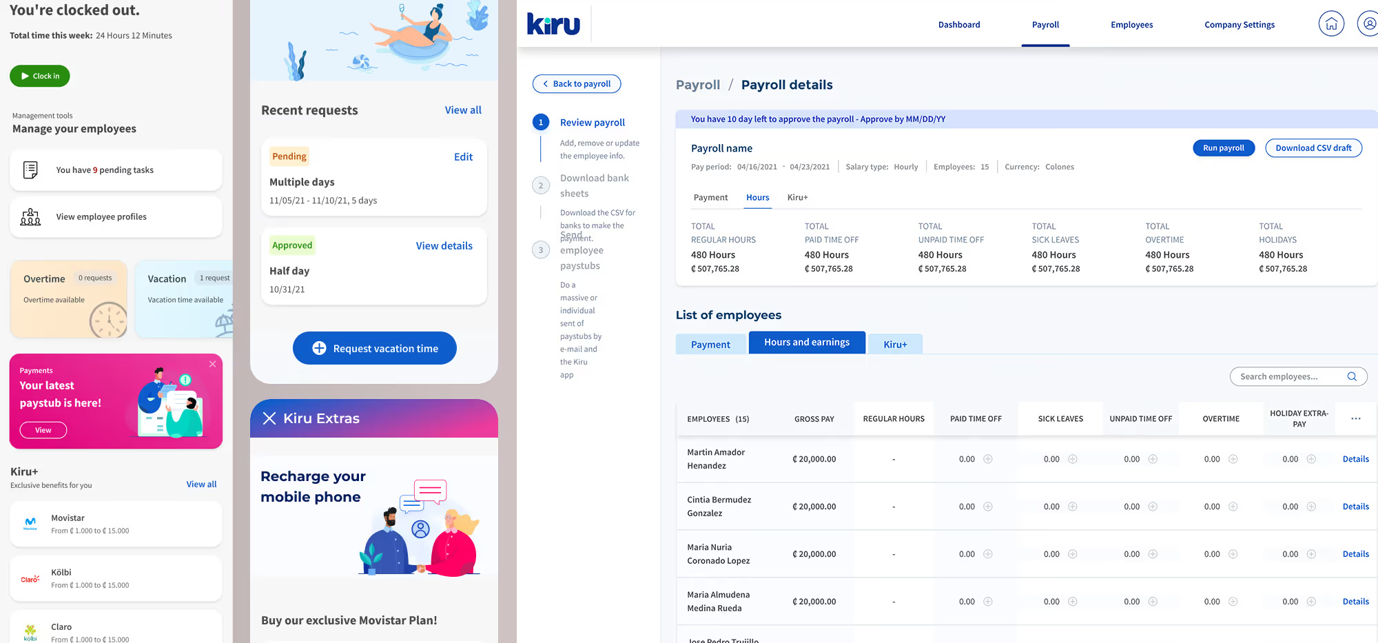
Below are a few of my recent case studies. I’ve included details about how I approach validation, collaborate with stakeholders, and make key design decisions—all the way through to final outcomes. Some of these projects span months or even years, reflecting the scale and depth of the work.
FAQ
Eric Tomlinson is a senior product design leader specializing in UX strategy, product design, AI-design, and design systems for complex digital products in B2B, B2B2C, fintech, urban mobility, and products that provide utility for their users. He helps organizations align user needs, business goals, and scalable systems to drive measurable outcomes.
Eric is a product design leader with deep hands-on UX expertise. His work spans strategy, systems thinking, team leadership, and execution—bridging design craft with business and product outcomes.
Eric has worked with startups, scale-ups, agencies, and enterprise organizations across fintech, mobility, SaaS, mobile apps, and platform-based products—often in regulated or technically complex environments.
Unlike an agency, Eric embeds deeply with teams, leaders, and product organizations. He operates as a strategic partner—shaping direction, elevating design maturity, and building long-term capability, not just delivering screens.
AI is changing how users discover, interact with, and trust digital products. As a design leader, I focus on how AI impacts experience strategy, system design, and decision-making—ensuring products remain clear, ethical, and user-centered as AI becomes more embedded.
Eric helps organizations improve UX maturity, modernize legacy platforms, scale design systems, incorporate AI-tools and processes, ensure visual design quality, and align cross-functional teams around clear product strategy and customer outcomes.


