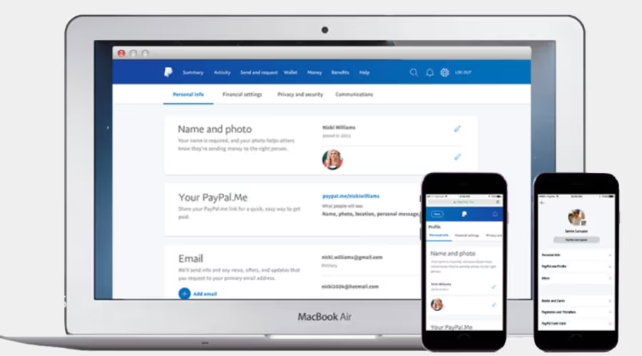
PayPal Settings
Redesigning settings for clarity, consistency, and control while boosting task success rates by up to 85%

Settings Redesign: Project Overview
This project addressed two key challenges.
The first problem.
The PayPal app’s Settings section lacked a cohesive design system and scalable information architecture. Though not frequently used after onboarding, it’s vital for account management—where users handle tasks that impact functionality and trust. Poor organization and confusing navigation made these moments frustrating, driving up support calls.
The second problem.
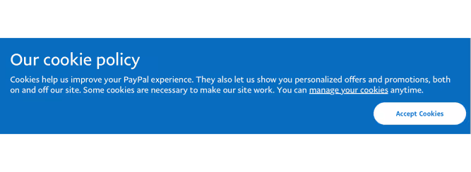
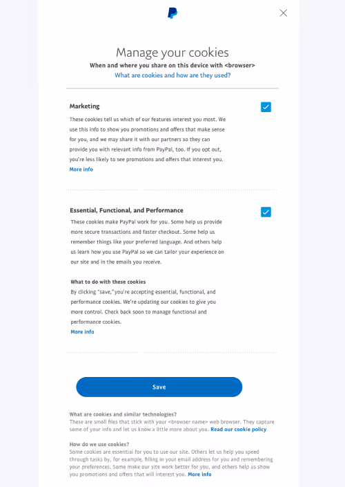
New GDPR (General Data Protection Regulation) requirements in the EU introduced an urgent need for greater transparency and user control over personal data. The Settings experience needed to make privacy and data management features not only compliant but easy to discover and use.
The Approach Philosophy
At the heart of my design philosophy is a simple principle: users should spend as little time as possible inside a product. The goal is to help them accomplish what they came to do—quickly, confidently, and without friction. A user spending extra effort on routine tasks within Settings isn't a productive or meaningful use of their time.
To address this, we followed a customer-centered design process:
Discover and Research → Ideate and Design → Test with Customers → Iterate and Refine.
This cycle led to a new design framework, refined interaction patterns, updated iconography, and clearer content—all centered on improving usability, consistency, and transparency.
Significant attention was given to building an information architecture rooted in depth over breadth—allowing for long-term scalability while helping users easily locate and manage their data.
The Outcome
A settings experience that's more intuitive, scalable for growth, and empowering users around the world by boosting task success rates up to 85%.
Quick Overview
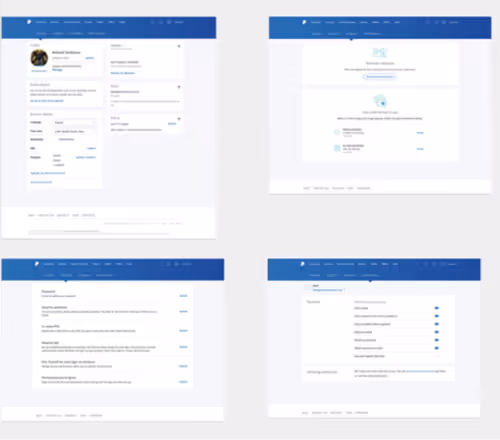
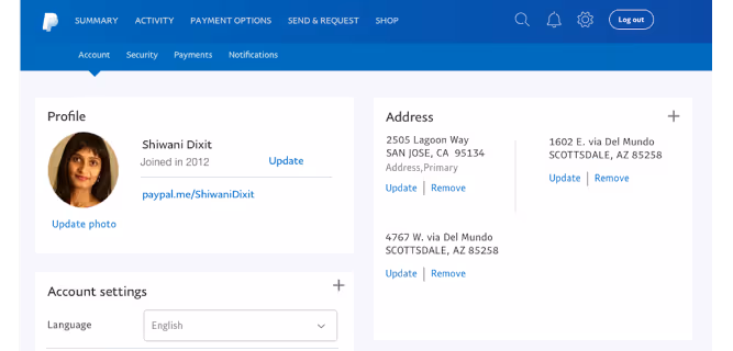
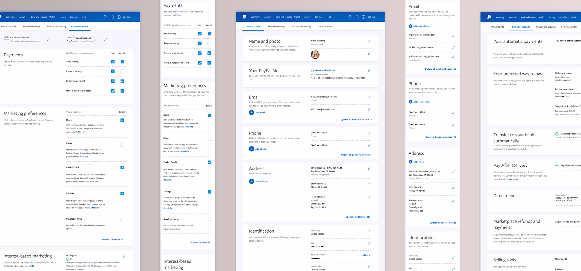
Before the redesign, the Settings experience lacked consistency and clarity across pages—something clearly visible in the original layouts. Each page followed its own framework, forcing users to relearn patterns as they moved through the section. Our research confirmed that the secondary navigation often blended into the global navigation, causing confusion and task abandonment—even with visual cues like the hanging arrow.
The Defined Goals
Through collaborative discovery—including stakeholder workshops, performance analysis, customer support interviews, and GDPR review—we defined clear goals that balanced user needs, business priorities, and compliance to create a more effective, future-ready experience.
- Design a clear navigation system and information architecture so users intuitively know where to go for their task
- Make content easier to discover and use, reducing customer support calls
- Support GDPR requirements in a way that enhances user experience rather than disrupting it
- Create GDPR-related components flexible enough to be reused across the app without requiring rework from engineering
The Research Strategy
The effort centered on PayPal’s core consumer product, with GDPR insights later extended to merchant and credit experiences. The primary audiences included Casual Sellers, Checkout Shoppers, Underbanked users, P2P senders and receivers, and general account holders.
- Conducted remote usability testing on the existing design to identify key problem areas and establish a baseline
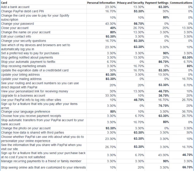
- Ran four closed card sorting sessions (100 participants each) to uncover the most effective content organization and tab groupings
- Led four in-lab prototype research sessions in Germany and the UK
- Conducted four in-lab sessions in North America
- Additional testing was performed by research partners in Asia
Analysis of Successful Designs
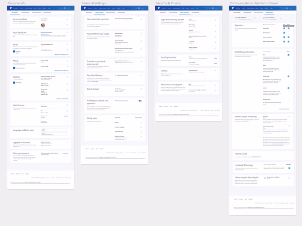
Information Architecture & Navigation
Baseline testing showed the original Settings IA was confusing and not scalable—tabs were unclear, and users struggled to find key tasks.
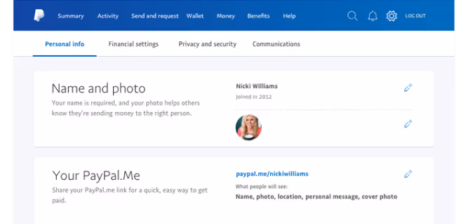
We ran four closed card-sorting sessions with 100 participants each, which revealed Personal Information, Financial Settings, Privacy & Security, and Communications as the most intuitive groupings.
Switching the secondary navigation from blue to white with larger type and clear indicators improved visibility and boosted task success rates by up to 85%.
Framework Consistency
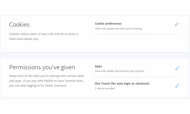
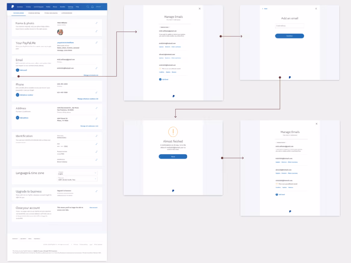
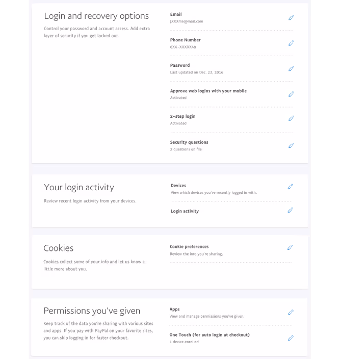
A major framework improvement was the standardization of over-panels—a reusable design pattern for managing settings in focused flows. This solution proved particularly valuable for GDPR compliance, as these controls needed to appear across multiple touchpoints, including logged-out states. Standardizing this pattern reduced engineering effort, increased design consistency, and tested extremely well with users.
Establishing a consistent visual framework was essential for usability. Using panels with clear typographic hierarchy allowed users to quickly scan and locate the task they needed. Headings, descriptions, and high-level actions were anchored on the left, while editable actions remained consistently on the right, reinforcing predictable interaction patterns.
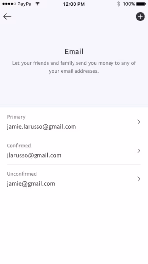
This pattern was scaled throughout the UI for any settings management task, from adding or editing an email to other key account actions.
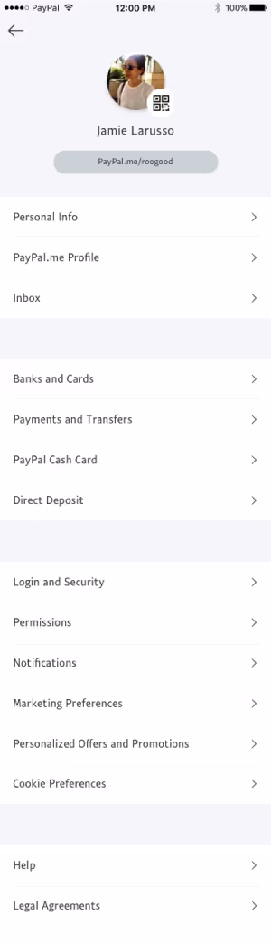
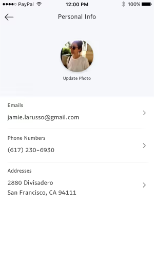
For the native mobile app, IA adjustments mirrored the improved desktop structure, aligning tab groupings and flows while respecting mobile platform conventions.
UI Elements
To help improve discoverability and efficiency, several UI elements were refined or introduced iteratively. This significantly contributed to improving testing success rates by up 85%.
“Plus Circle” Button: Added to areas managing multiple items (addresses, phone numbers, emails) to make adding new entries quick and intuitive.

Pencil Icon for Edit Actions: Replaced inconsistent text links like edit, manage, or update. The icon tested well as a universal metaphor for modification.
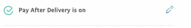
Color-Coded Status Icons:
Reinforced setting states (on, off, paused) for faster visual scanning with less cognitive load.
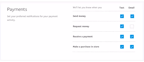
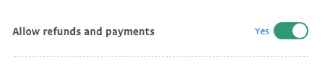
Switches:
Introduced for singular, self-contained settings to reduce unnecessary steps. Adding “yes/no” labels and a green active state improved clarity and success rates.
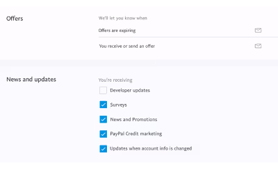
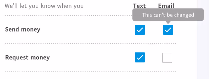
Checkboxes:
Standardized for communications settings, allowing multiple selections and clearer control than icon-based interactions.
Tooltips:
Introduced to clarify unique or conditional behaviors within specific settings.
Content Design
Although UX/UI was the main focus, content design was key. Clear, concise, jargon-free copy improved discoverability, with scannable headlines and descriptions. Unnecessary information was removed, and related content grouped under meaningful headings to help users quickly find their settings.

Moving Forward & What We Learned
The redesigned Settings experience for the PayPal consumer app was a significant success in user testing and continues to scale across the product ecosystem.Our biggest takeaway: even low-traffic areas can have high-impact consequences when they fail to support users at critical moments.
Neglecting these foundational experiences can lead to frustration, increased support calls, and negative product perception.By building a flexible, scalable design framework through a user-centered process, we created a system that not only meets current needs but can adapt to years of future growth—delivering clarity, trust, and efficiency for millions of users worldwide.
I appreciate you taking the time to explore this project and the process behind it. If you’d like to connect, I’d love to hear from you—whether it’s to discuss a potential collaboration, compare notes on design challenges, or just say hello.
You can reach out directly using the links in the footer below, or head back to the Projects page to see more of my work.
Selected work
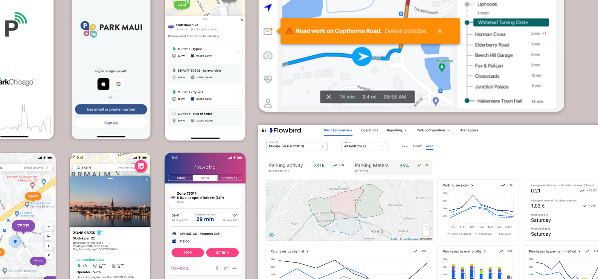
Flowbird: UX Maturity
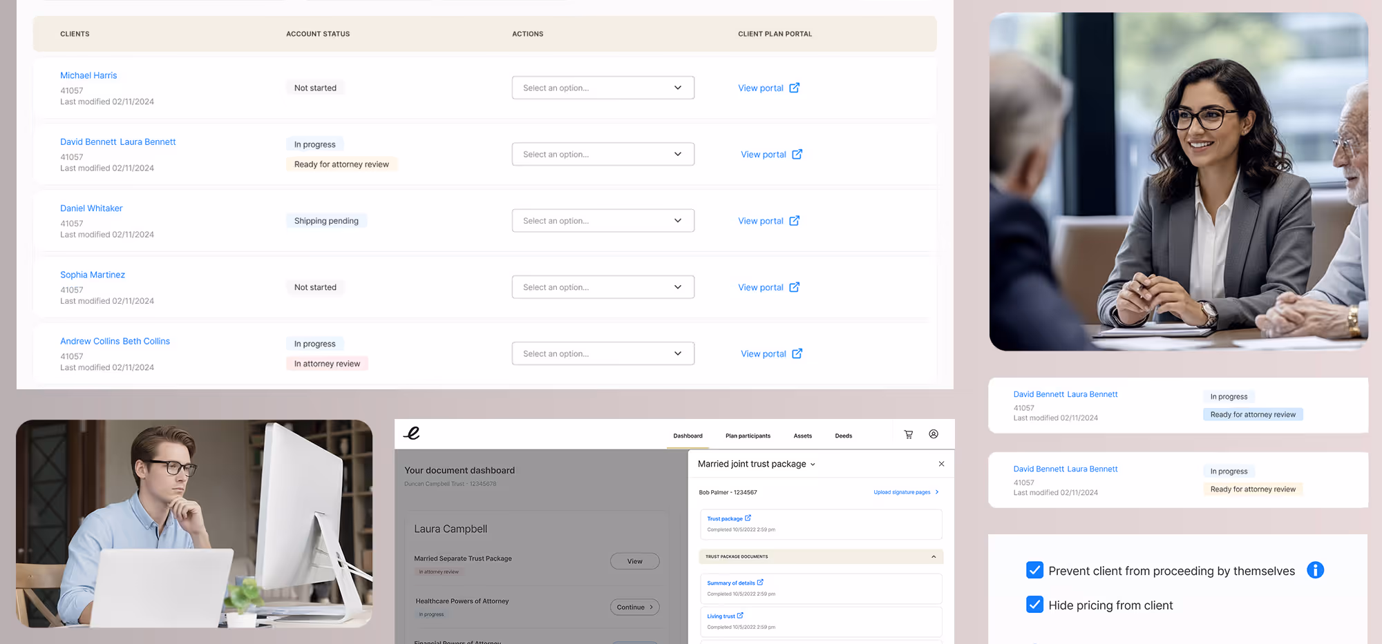
Estate Guru: Modernizing Estate Planning
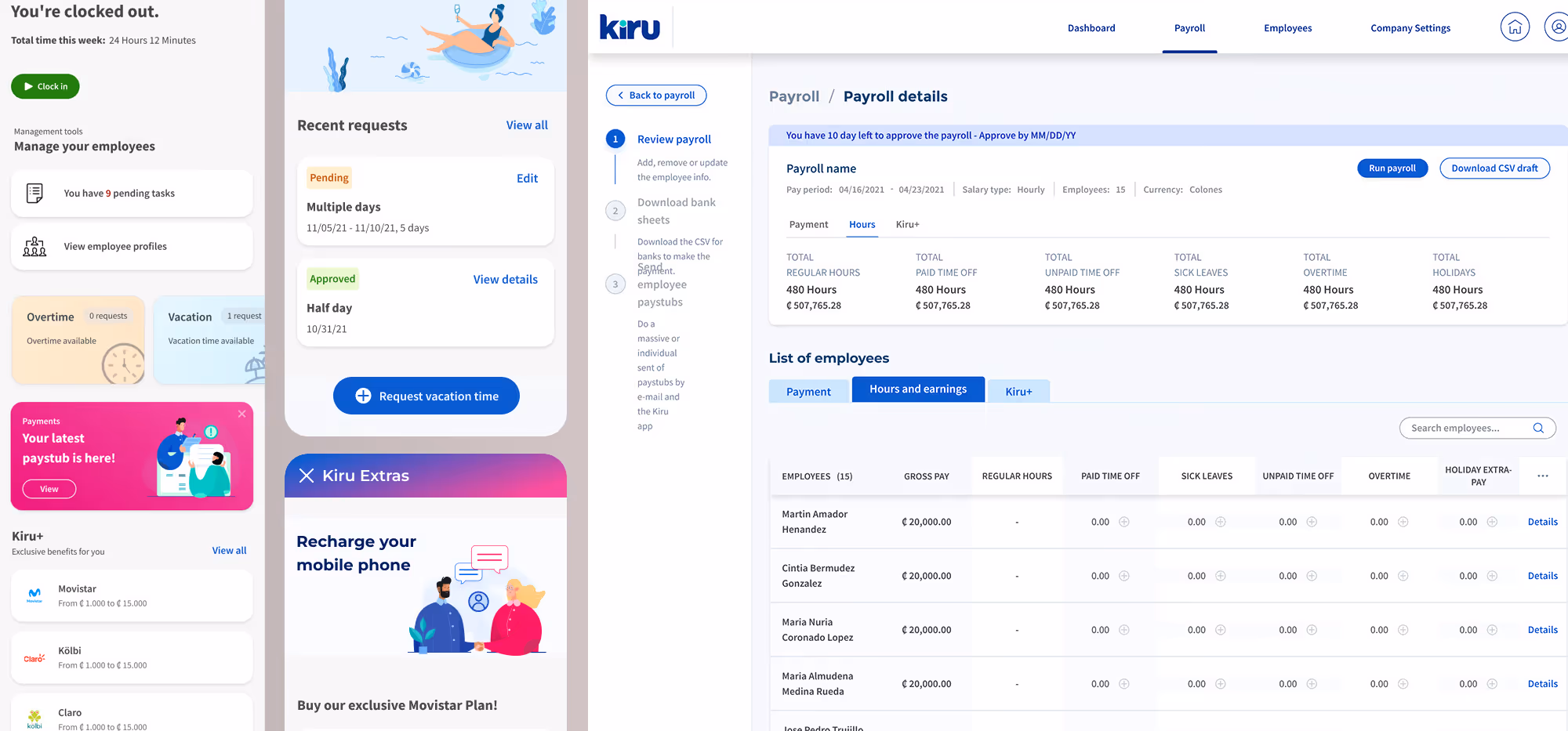
Kiru: A Payroll Startup

PayPal: Unified Card System
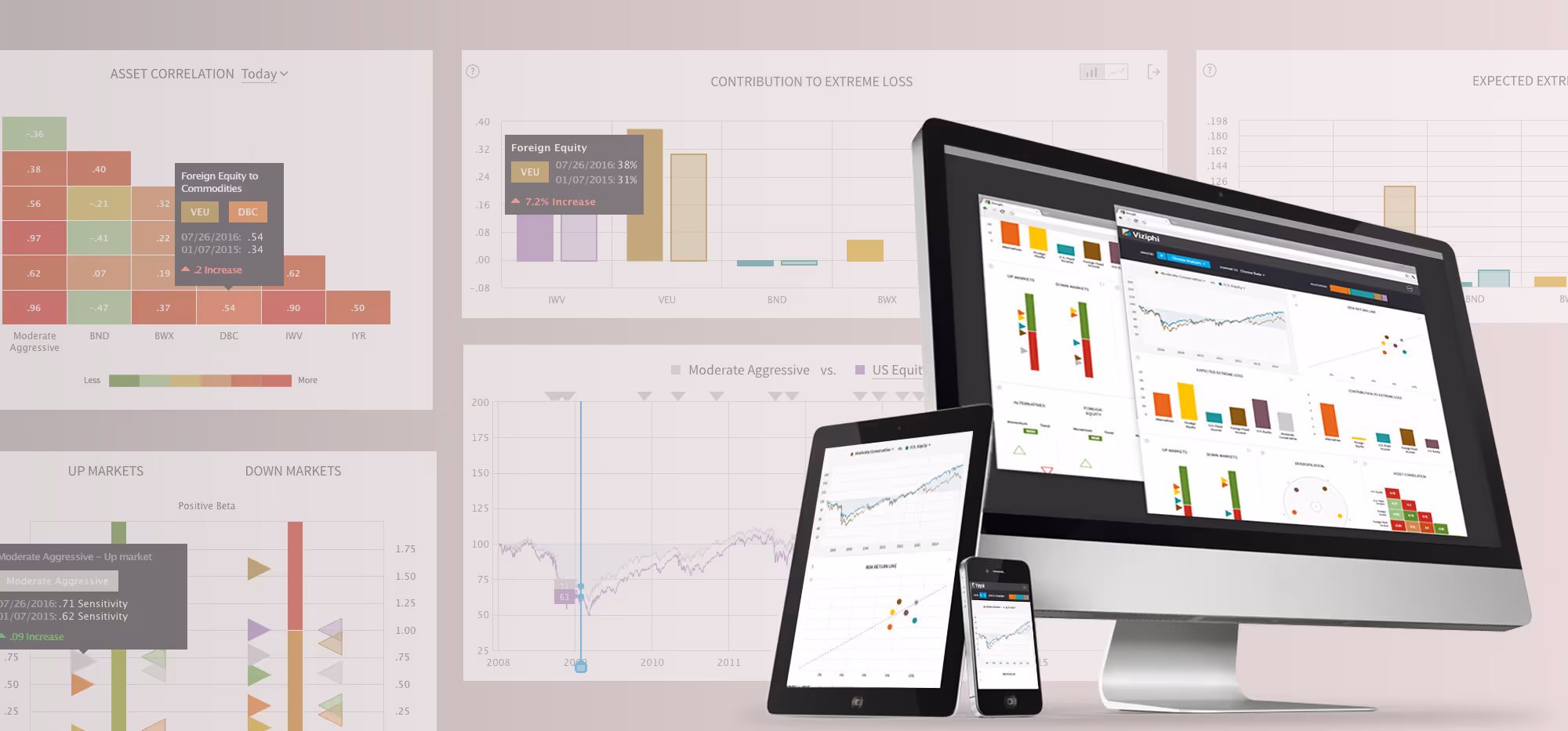
Viziphi: Visualizing Wealth
PayPal: Settings Redesign
RoleCall: A Platform for K-12 Staffing