Viziphi: Project Overview
The Challenge
The financial landscape for Asset Managers and Financial Advisors is becoming increasingly complex and competitive. Advisors are under pressure to deliver value, reduce costs, and communicate insights effectively—yet the tools available to them often fall short. Traditional reports are difficult to interpret, lack visual clarity, and fail to inspire confidence—contributing to a widespread trust gap between investors and advisors.
Our Solution
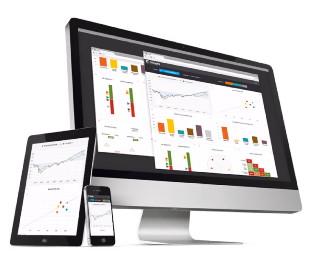
Viziphi is a data visualization platform that helps Portfolio Managers and Asset Managers make smarter allocation decisions and clearly demonstrate value to their clients. Combining proprietary quantitative models with a simplified UX/UI, Viziphi enables users to explore portfolio risk, compare performance, and uncover actionable insights—all in a highly visual, interactive environment.The result: greater transparency, faster decision-making, and stronger client relationships.
The Outcomes
→ Selected for Startupbootcamp’s 2016 FinTech Accelerator
→ Evolved into Visualize Wealth, a B2B2C platform promoting investment transparency
→ Recognized for advancing the democratization of financial insight through design and technology by americanbanker.com
From Idea to Concept
Viziphi began like many startups do—sketched on a coffee shop napkin. Ben and I shared a passion for democratizing finance through better design. His deep domain expertise and my product design background proved to be a powerful combination.
We followed a user-centered, end-to-end process, beginning with market research, concept exploration, and data visualization strategy. Our focus was on surfacing complex financial data in a way that was clear, insightful, and actionable.
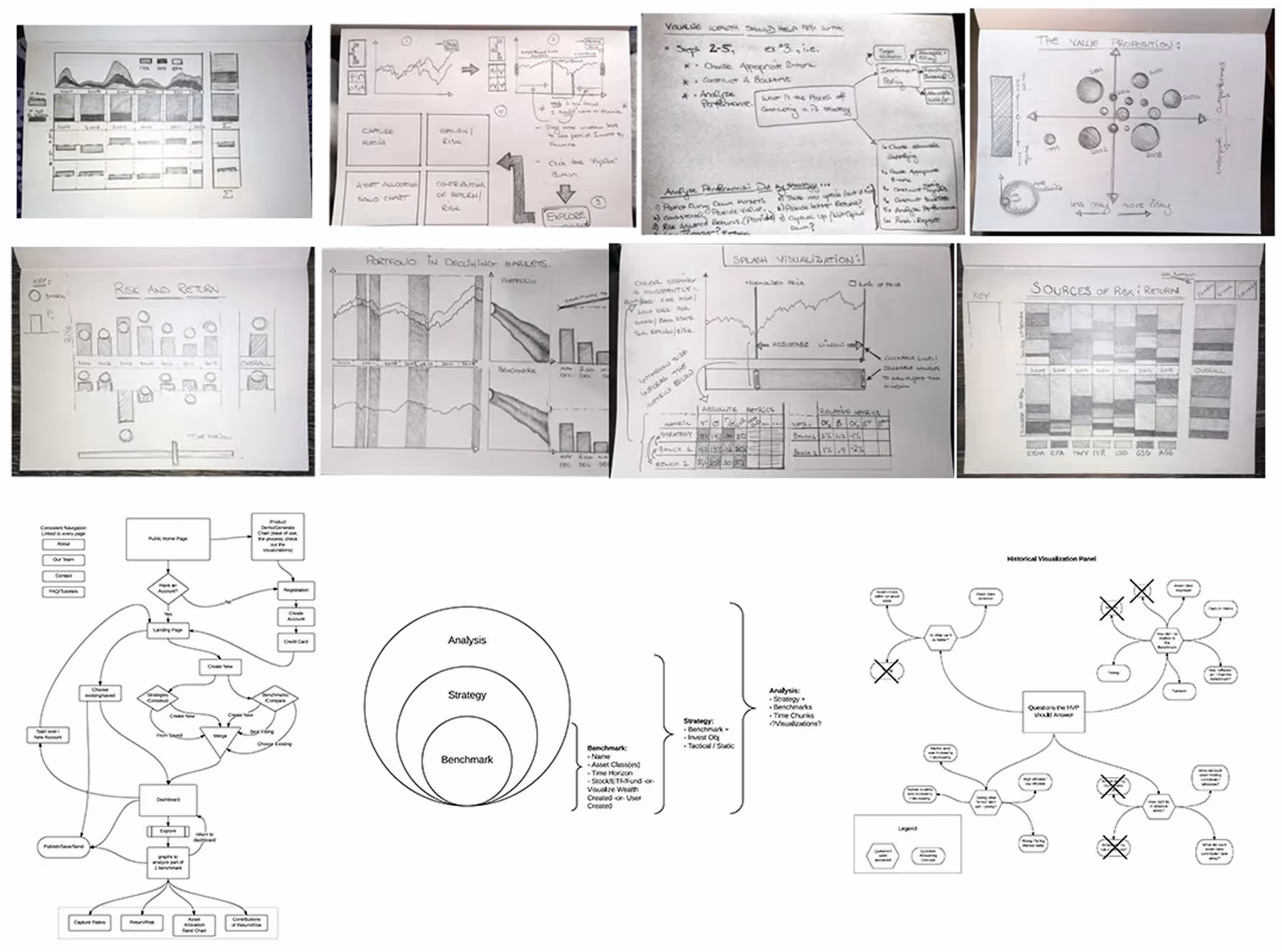
Once the visualization logic was defined, we moved into interaction design and navigation, ensuring the interface supported exploration without distracting from the data.
Our hypothesis:
“Through clean, elegant design supported by rigorous analytics, financial insights can become truly understandable—and therefore, more valuable.”
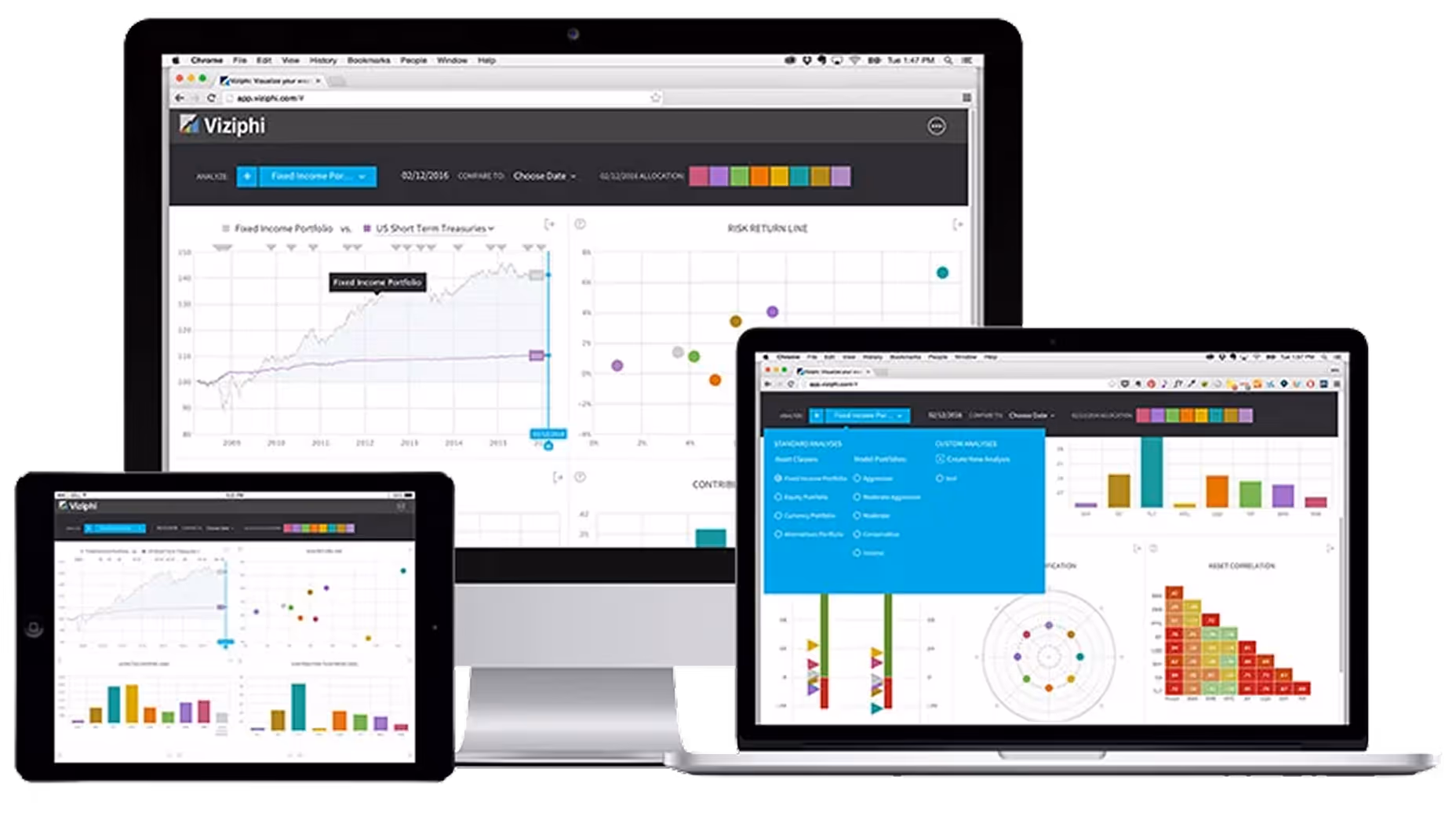
Designing Data That Speaks
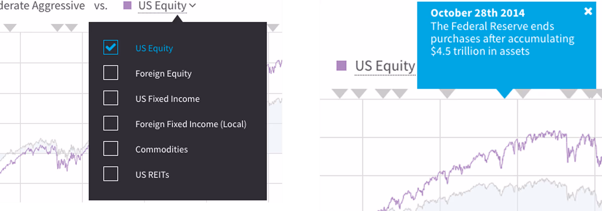
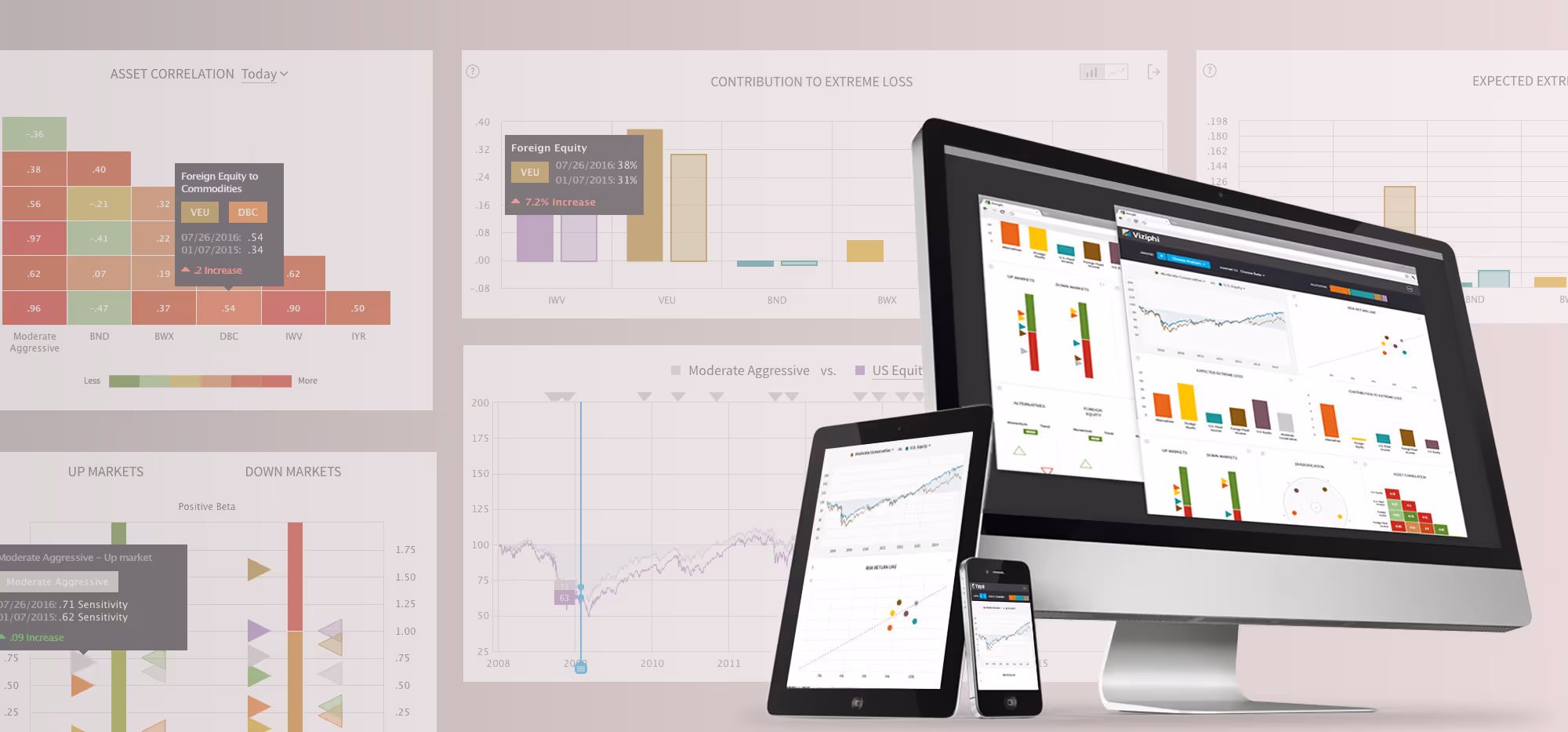
Price Chart
An interactive performance view that lets users set a comparison date for the entire dashboard, explore historical market events, and benchmark assets or portfolios.
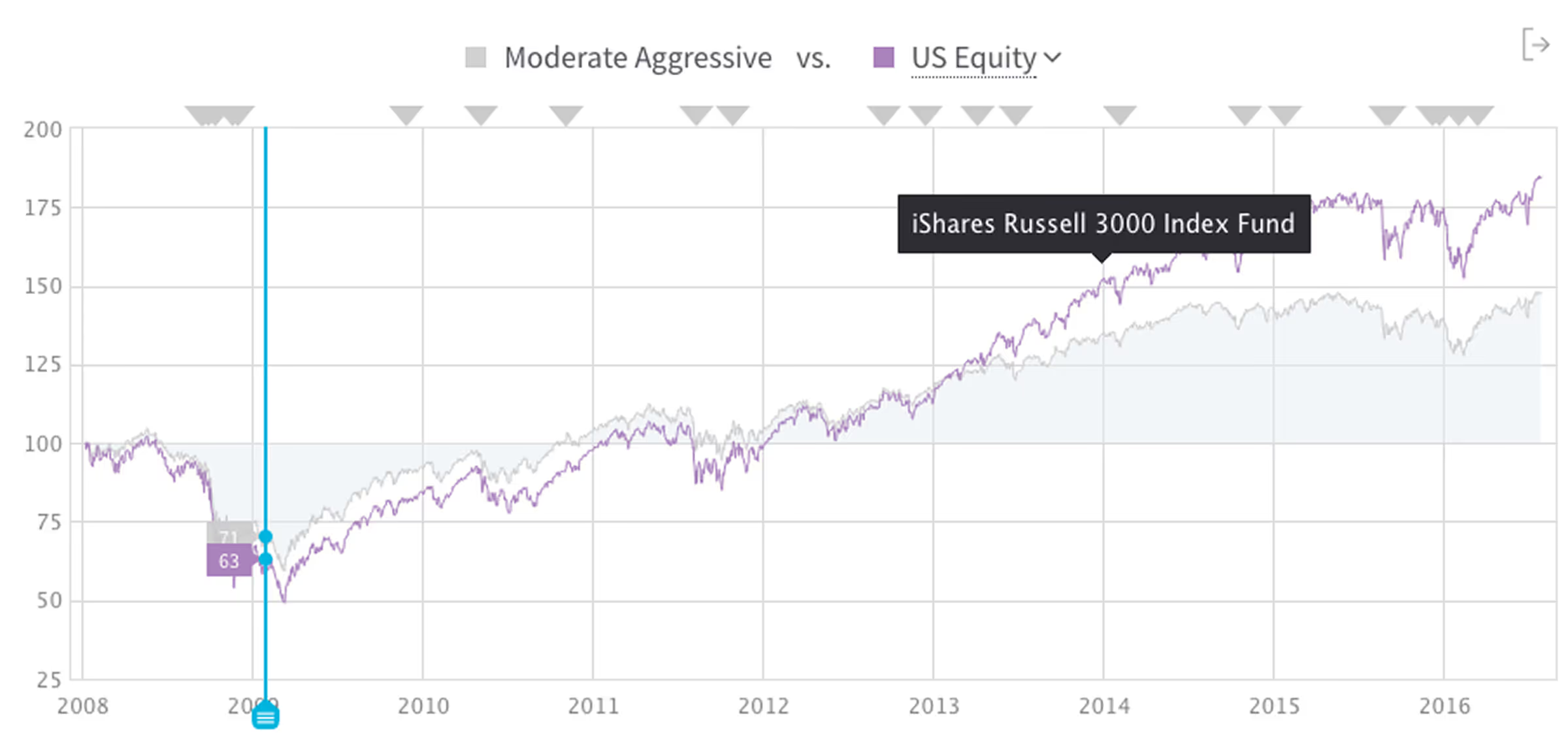
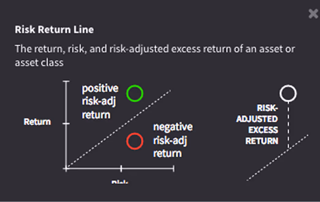
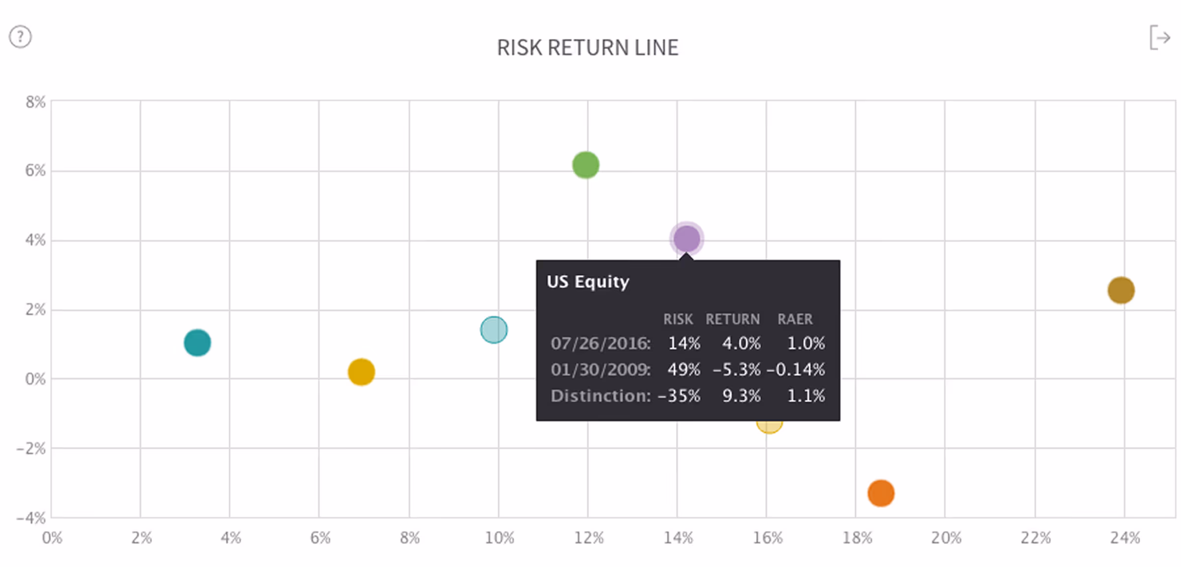
Risk & Return
An interactive performance view that lets users set a comparison date for the entire dashboard, explore historical market events, and benchmark assets or portfolios.
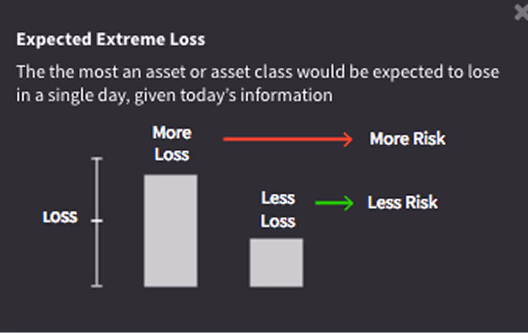
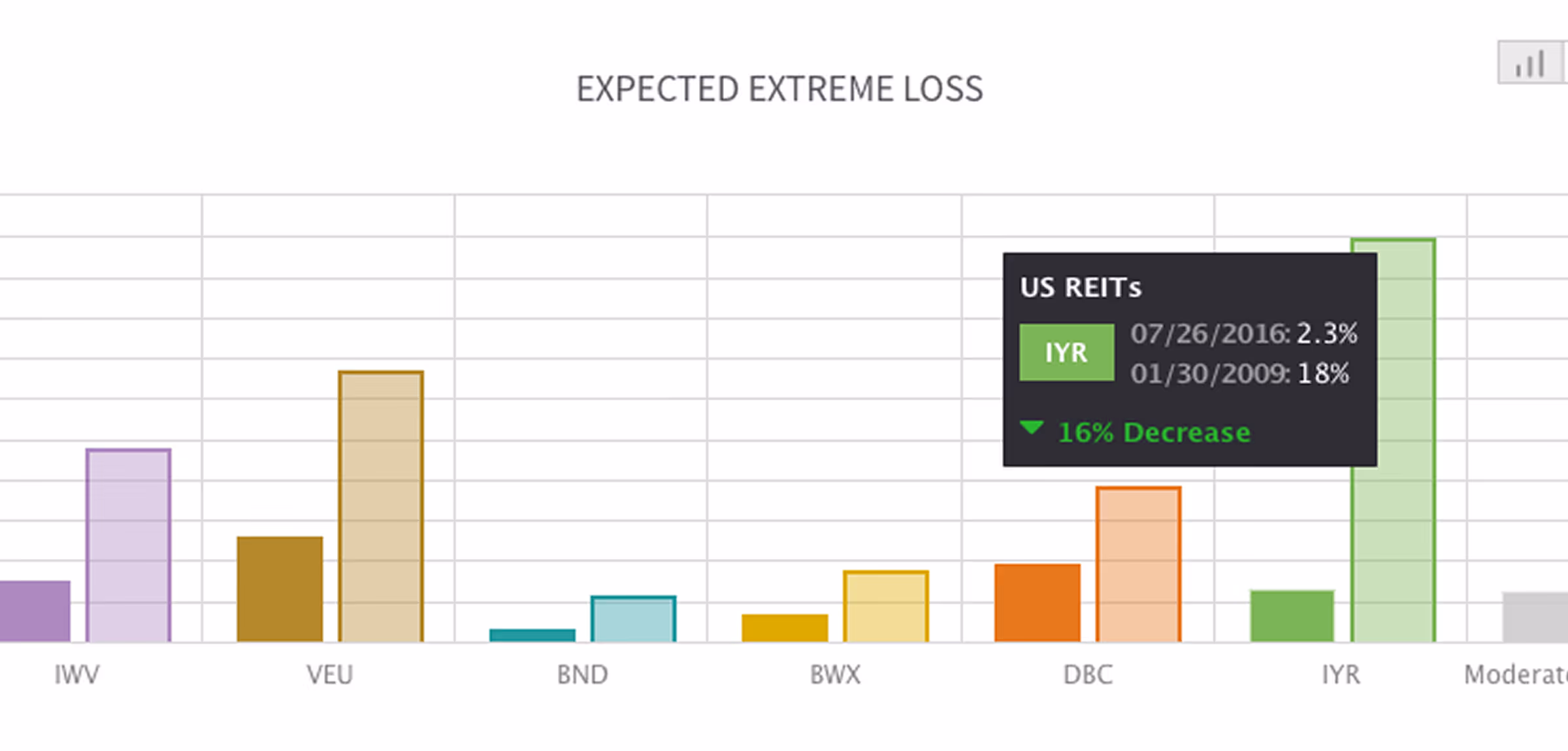
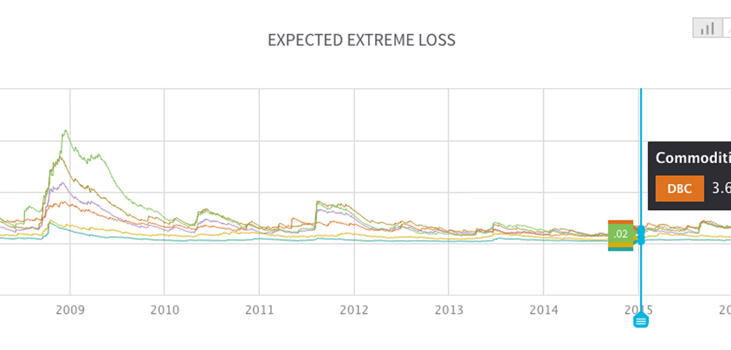
Expected Extreme Loss
Shows the potential downside for each asset under worst-case scenarios, with timeline and comparison views for deeper insight into portfolio vulnerabilities.
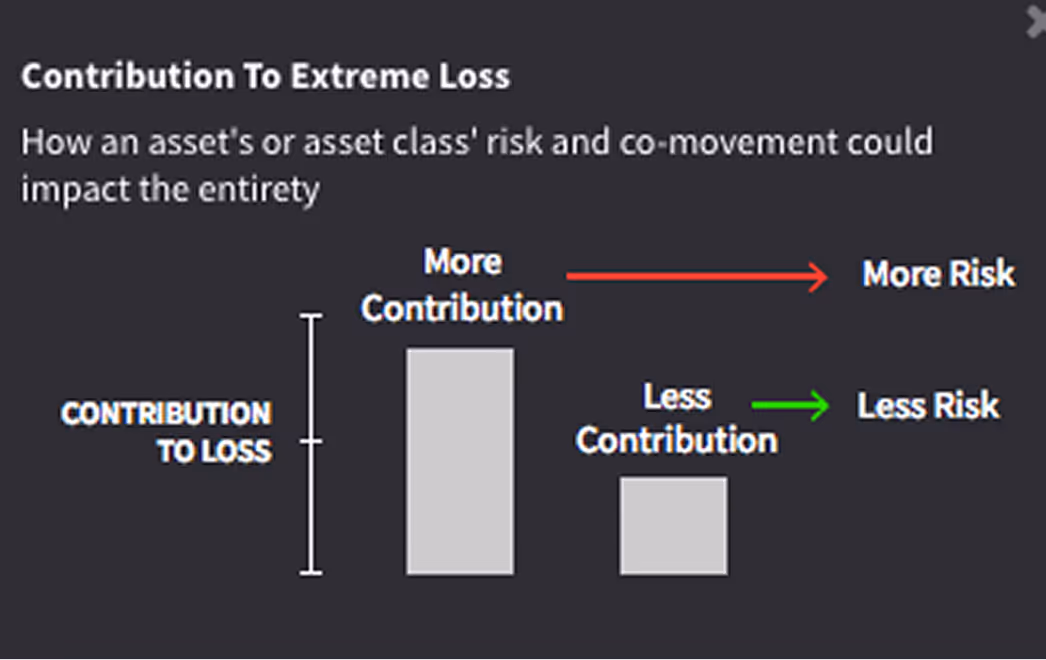
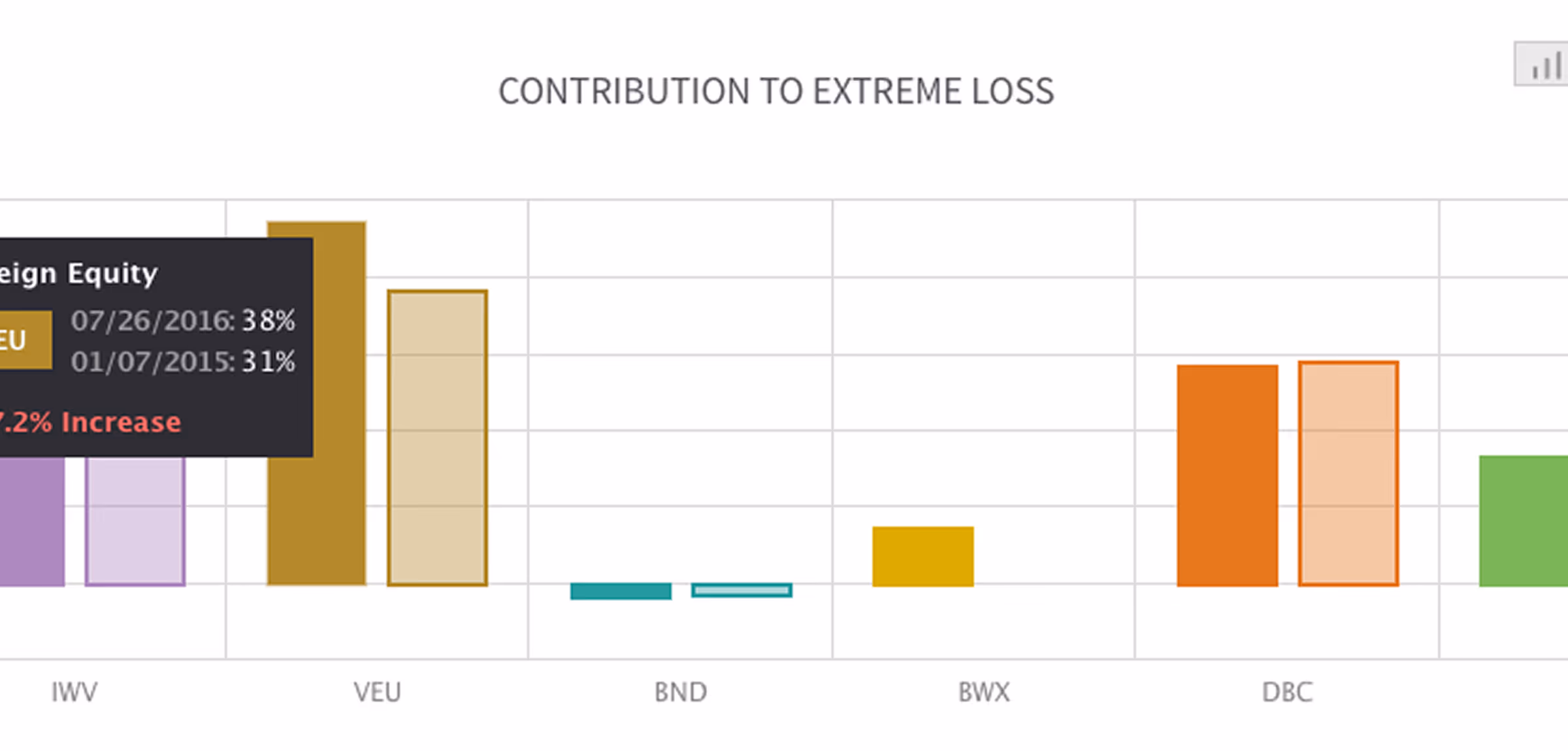
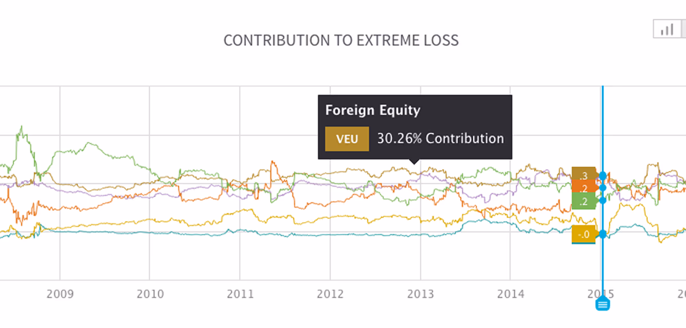
Contribution to Extreme Loss
Illustrates how individual assets contribute to total portfolio risk through covariation, enabling better diversification decisions.
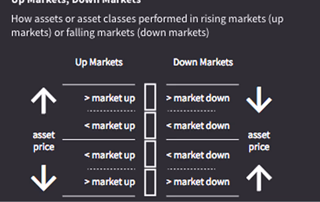
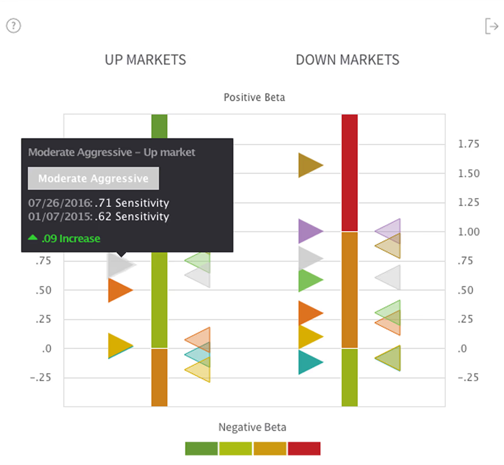
Performance Relative to Up Markets and Down Markets
Side-by-side view of asset performance in rising and falling markets—an intuitive visual for stress testing and historical context.
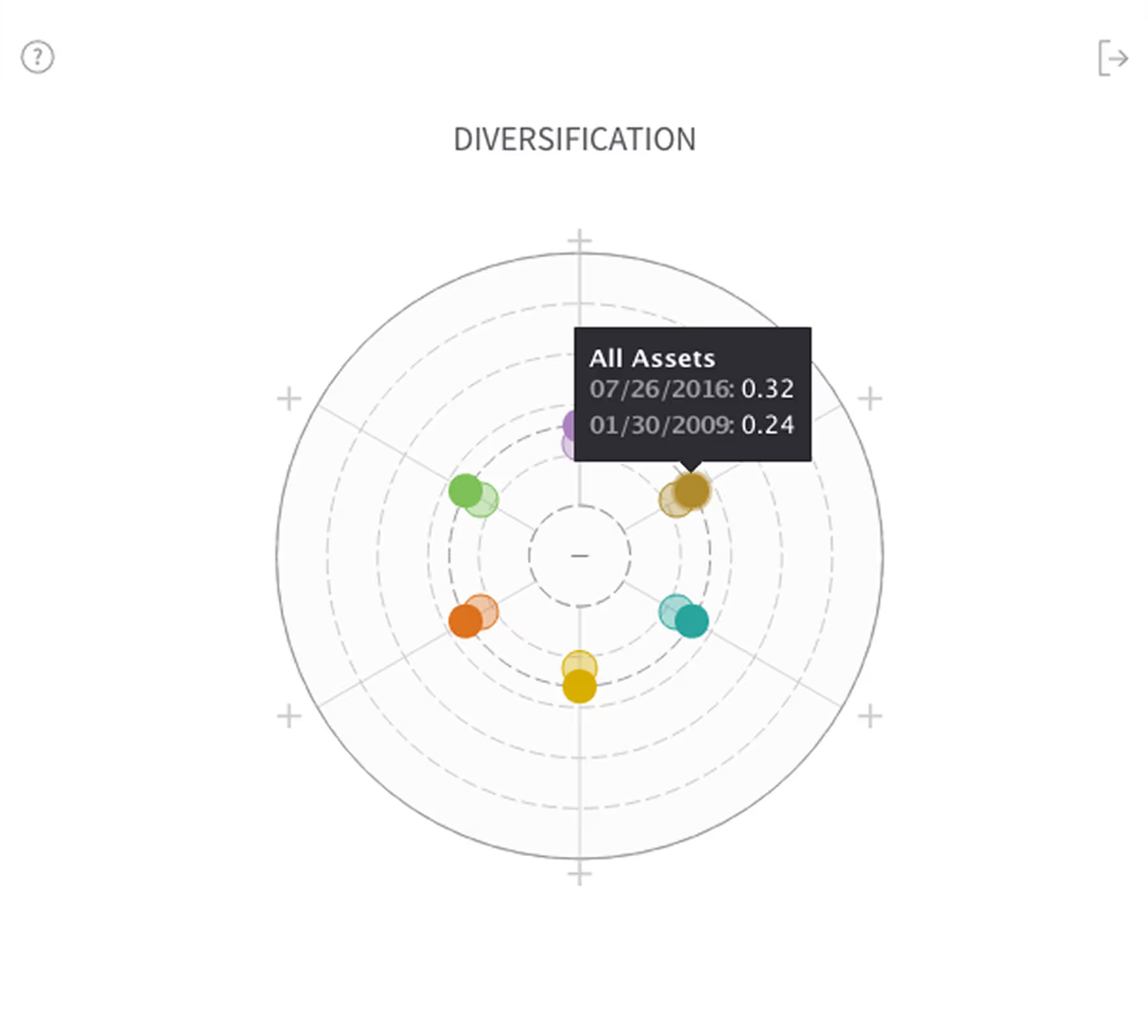
Asset Diversication
This chart indicates the available diversification when using the assets or asset classes set in the analysis, set on a value between 0 (no diversification) and 1 (complete diversification).

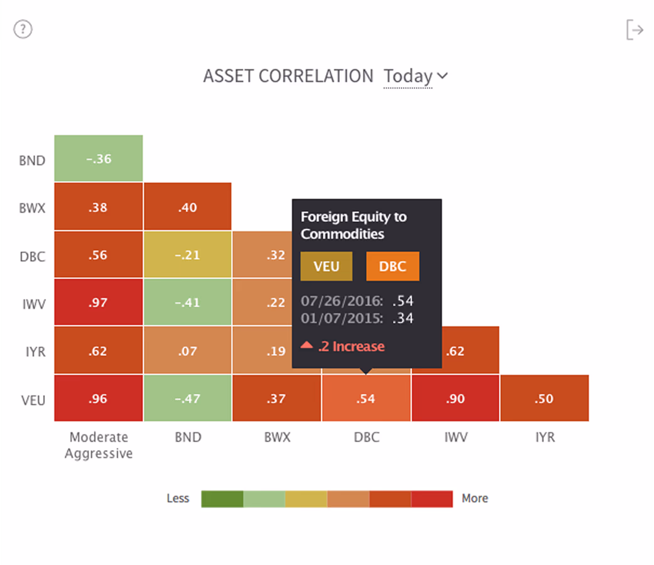
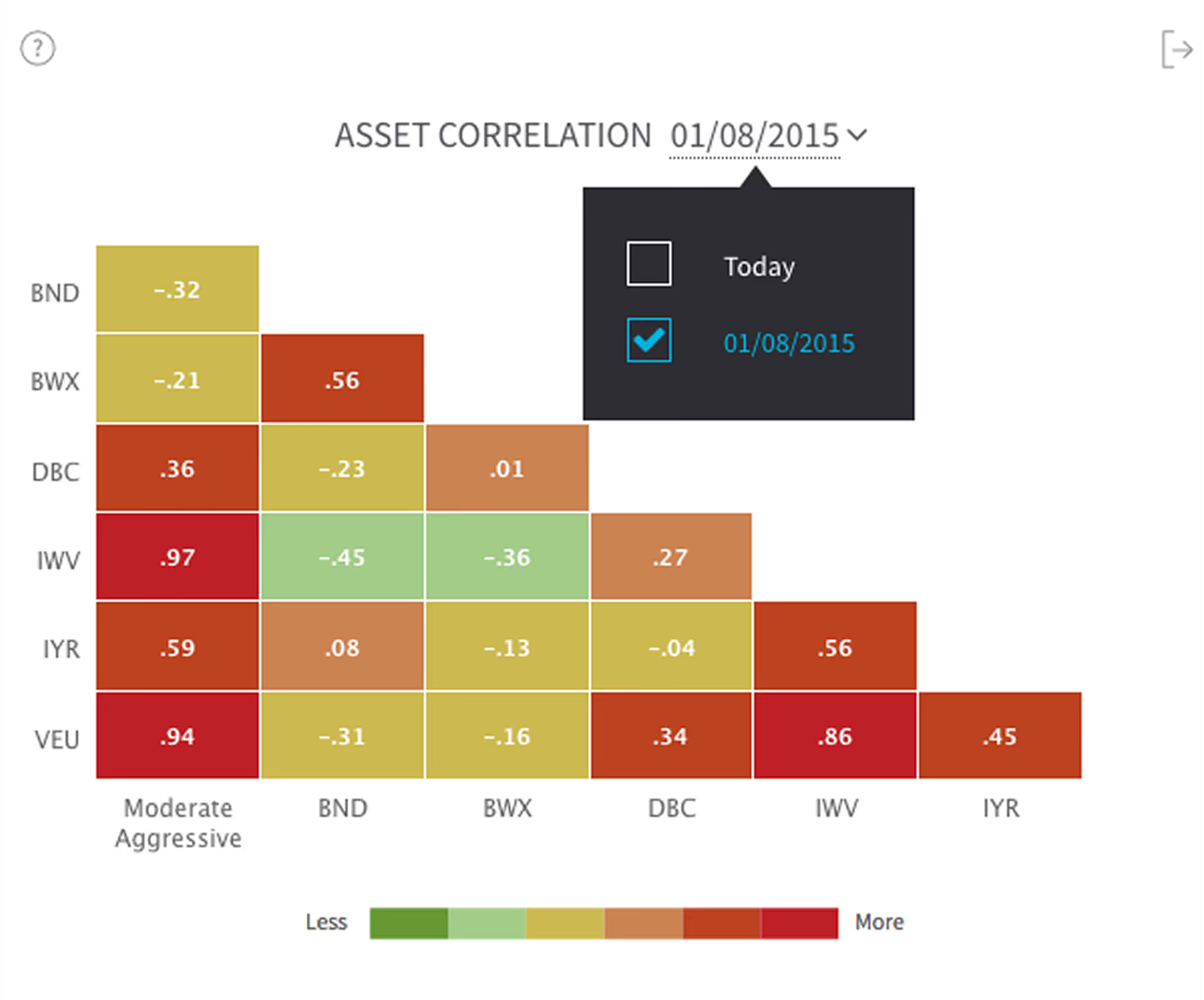
Asset Correlation
This chart measures the relationship between the changes of two assets or asset classes' dependence/correlation in time. The user must toggle to the dashboard's comparison date to compare assets for that date, since this chart is comparing assets in a given time.

Dashboard Design: Synergy and Control
Top Toolbar
The toolbar at the top is a sticky element for high-level tasks such as creating and setting the analysis, setting comparison dates, and a quick-view reference for portfolio asset allocation.

Create Analysis Button
Here, the user can quickly choose between benchmarks provided by Viziphi, choose a previously created custom analysis, or start a new custom analysis.
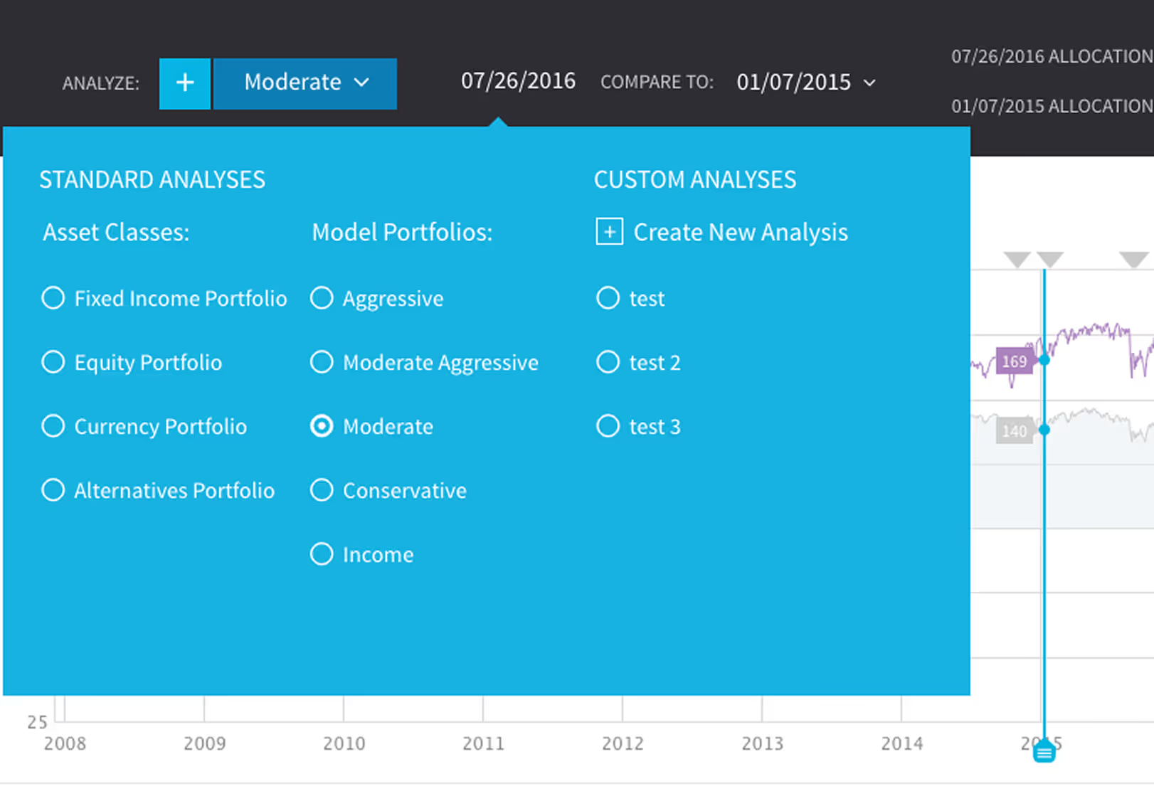
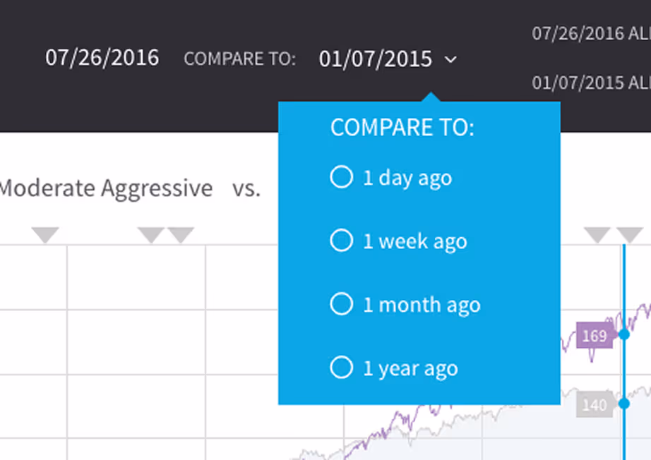
Compare Dates
Here, the user can quickly choose between benchmarks provided by Viziphi, choose a previously created custom analysis, or start a new custom analysis.
Custom Analysis
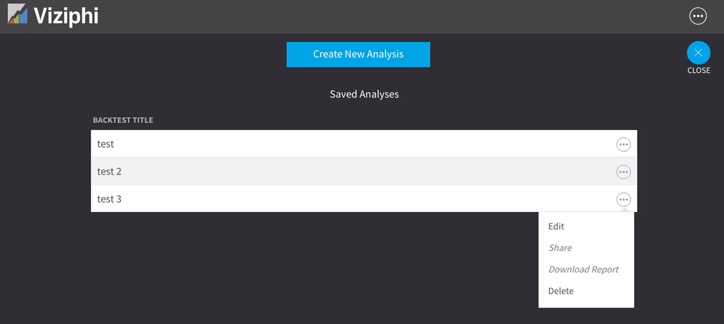
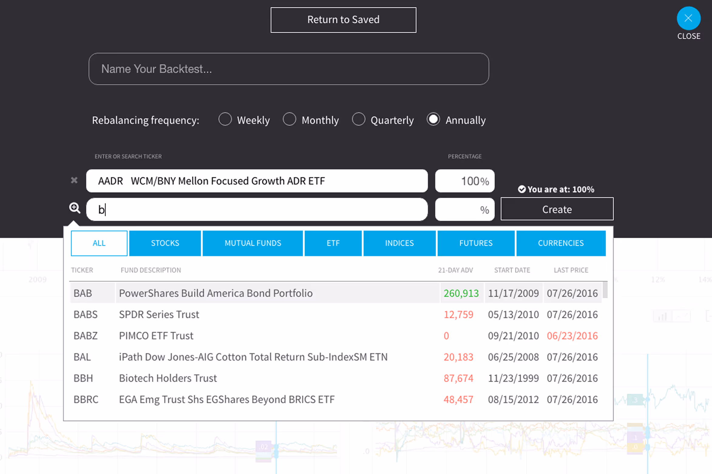
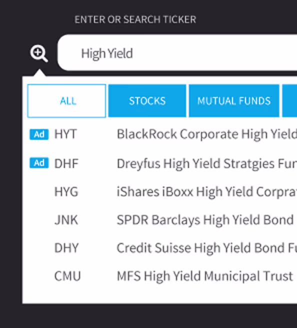
Many times, users will want to construct their own custom analysis using specific assets and asset classes. Users would also want to save these analyses, so they can be reviewed, adjusted, and/or shared later. Viziphi makes this process super easy.
Monetization Strategy
→ Freemium model: Free for users with up to three analyses.
→ Premium tier: Unlimited saved analyses, enhanced sharing options, and time-based comparisons.
→ Fund placement: ETFs and funds can purchase limited in-app visibility based on user types and keywords.
→ API access: Available for institutional integrations.
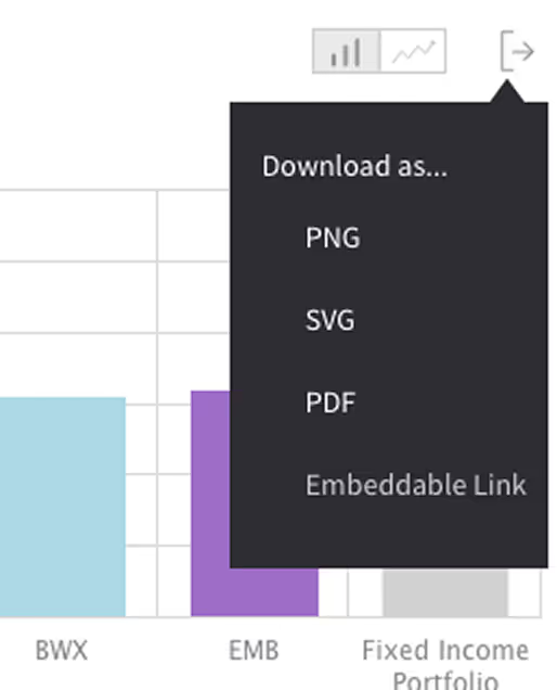
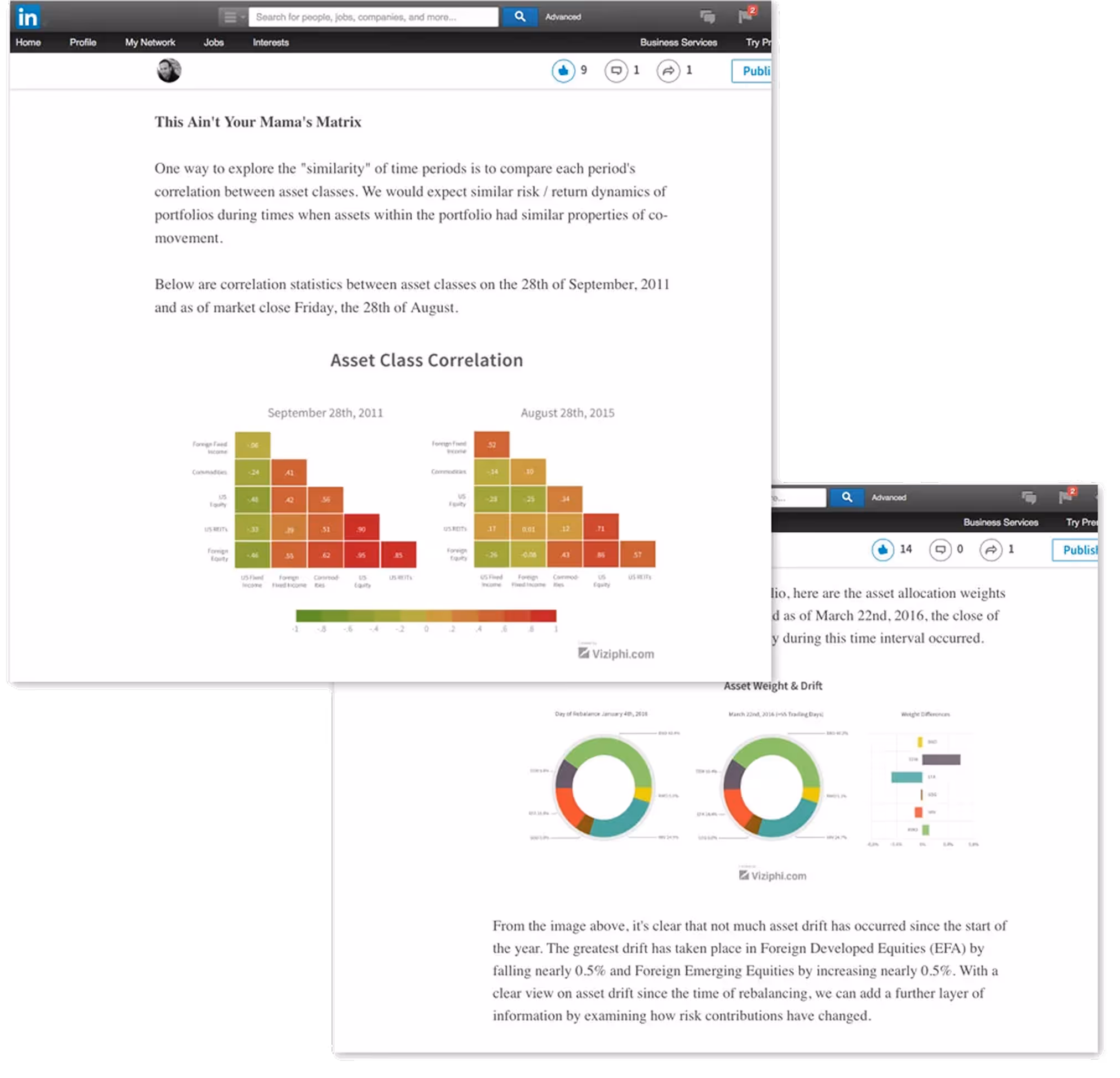
Sharing Insights That Matter
A key differentiator for Viziphi was its ability to share visual insights seamlessly. Charts could be embedded in presentations, reports, or financial articles—making data storytelling part of everyday advisory workflows.
Visual Branding

You can reach out directly using the links in the footer below, or head back to the Projects page to see more of my work.
Selected work
Flowbird: UX Maturity
Estate Guru: Modernizing Estate Planning
Kiru: A Payroll Startup

PayPal: Unified Card System
Viziphi: Visualizing Wealth
PayPal: Settings Redesign