Redesigning a outdated fintech product to capture a $124 trillion in wealth transfer opportunity
1.2M+
documents supported
50%
reduction in errors
Evolving Legacy Estate Planning Software Into a Modern, Scalable Platform
Overview
When Estate Guru brought me on as Chief Product Designer in 2022, they faced a critical challenge: a 10+-year-old platform sitting at the center of a $124 trillion opportunity but held back by outdated UX that was actively damaging sales. As the player-coach over nearly three years, I transformed this legacy fintech product end-to-end—delivering a 35% improvement in task completion, 50% reduction in user errors, and a modern platform now managing 1.2M+ documents across the estate planning lifecycle.
www.estateguru.com
Chapters

Role:
Chief Product Designer
Timeline:
2022-2025 (2.7 years)
Team:
Individual Contributor
Collaborators:
CEO, COO, CTO, Product Managers, Engineering Team (Remote and in-person collaboration)
Scope:
SaaS
Company Context:
The company only began serious scaling efforts around 2021 - attempting to evolve from legacy software into a modern digital product startup.
Context
The Challenge:
A massive market opportunity was constrained by outdated technology. With 180 million Americans lacking estate plans and $124 trillion in wealth set to transfer over the next two decades, Estate Guru’s legacy platform couldn’t compete.
The product suffered from an outdated UI that hurt sales and retention, unclear content and clunky workflows that frustrated users, inconsistent UX patterns, and no scalable path for advisors to grow—ultimately making the platform feel stuck in 2010.
The Market:
The market opportunity is both massive and time-sensitive. With 180 million Americans lacking estate plans and $124 trillion in wealth expected to transfer over the next 20 years, demand for accessible, affordable estate planning is accelerating.
At the same time, financial advisors often weakened or lost client relationships by handing clients off to attorneys, exposing a gap in the traditional model. The shift toward tech-enabled, hybrid solutions creates a clear opportunity for platforms that let advisors retain ownership of the client relationship while delivering modern estate planning at scale.
The Solution:
As the sole product designer, I led a full end-to-end transformation—conducting a comprehensive UX audit, aligning with C-level stakeholders on vision and roadmap, and driving deep user research through interviews, surveys, competitive analysis, and behavioral data.
Using a human-centered design process, I developed personas, mapped journeys, and iteratively tested solutions through sprints, while building a scalable design system from the ground up and ensuring seamless design-to-development handoff with ongoing QA.
My Mandate:
Design a modern, clean, and highly usable product that could scale effectively and compete in the marketplace.
As the sole designer on the project, I owned the entire design process from research through implementation - responsible for strategy, execution, stakeholder management, and quality assurance across all user touchpoints.
Setting the Stage
Impact At-a-Glance
Business Value
- Positioned product to compete in $124T market opportunity
- Enabled platform to support 1.2M+ documents across the estate planning lifecycle
- Created foundation for sustainable growth and competitive advantage
User Experience
- 35% improvement in task completion rates
- 50% reduction in user errors
- Complete UX redesign
- Measured against baseline usability testing with 8 participants
Design Operations
- Reduction in design-to-development handoff time
- Built comprehensive component library supporting multiple user types
- Established scalable design standards across complex workflows
Skills Demonstrated
Product Strategy • End-to-End UX/UI Design • User Research • Design Systems • Cross-functional Leadership • Remote Collaboration • Fintech UX • Regulatory Compliance • Design Operations • Sole Designer Ownership
Discovery & Research Approach
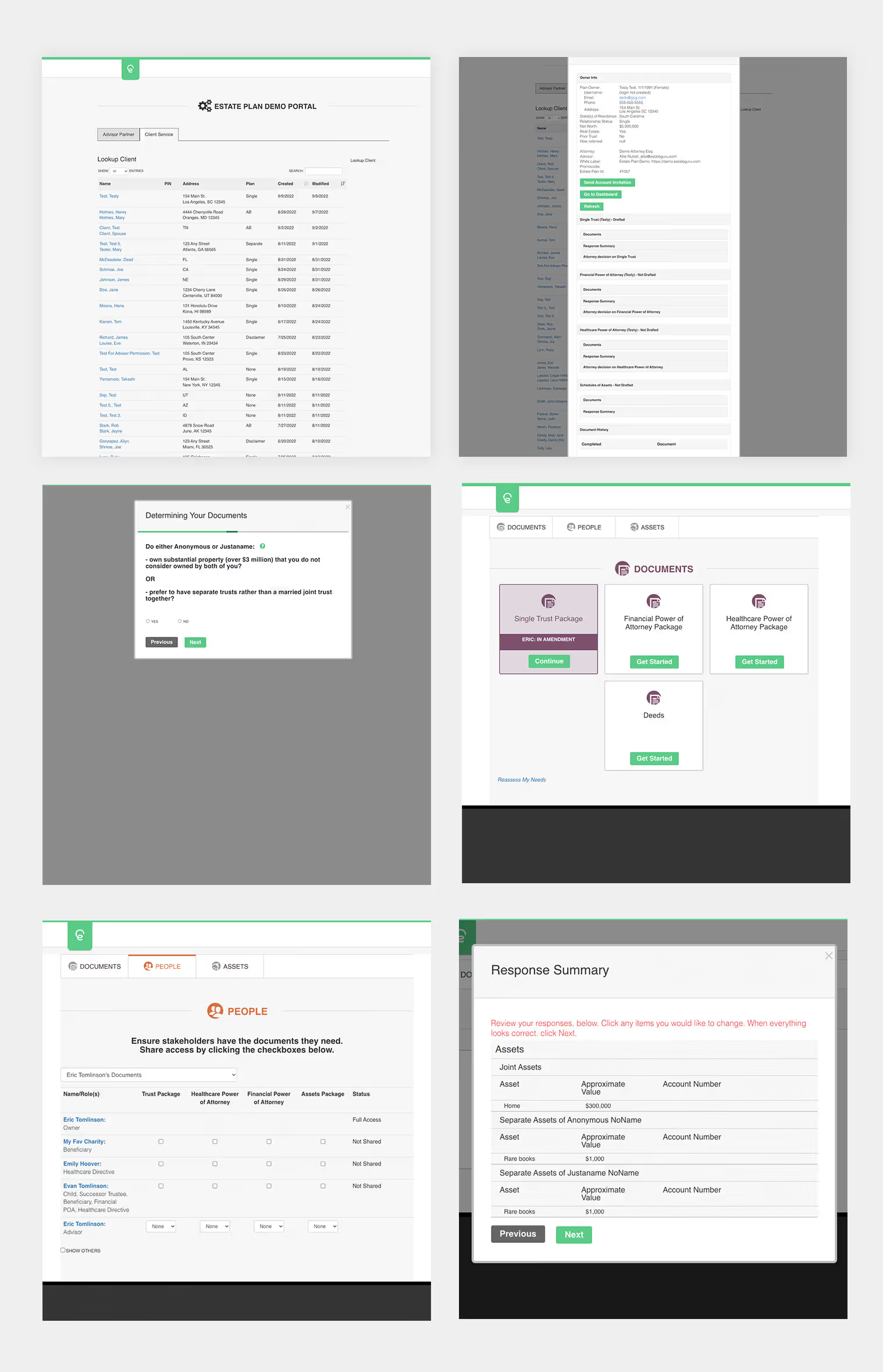
Product Audit (Initial Assessment)
I began by conducting a comprehensive audit of the existing platform to document issues and opportunities:
Critical Issues Identified
- Severely outdated UI with no cohesive brand identity
- Overly complex interface patterns (overpanels stacked on overpanels)
- Unnecessarily dense dashboards with redundant columns
- Poor content clarity - confusing, intimidating language
- Unclear document recommendations and outcomes
- Minimal value in customer-facing portal
- Interface designed for older, less tech-savvy users but needed to serve next generation
Required Feature List
Based on the audit, I created a prioritized feature list aligned with:
- Legal compliance requirements (primary)
- Critical architecture issues (buried primary tasks)
- User workflow optimization
- Business growth enablers
User Research & Data Collection
Methods:
- Stakeholder interviews with advisors, attorneys, and institutional clients
- Remote usability testing with interactive prototypes
- User surveys measuring satisfaction and pain points
- Competitive analysis of estate planning platforms
- Usage analytics and business metrics analysis
Sample Size: 10 participants (advisors and end clients)
Timeline: 2023-2024
Team: Myself, Product Managers, COO
Key Research Insights
Finding 1: Progress Visibility is Critical
Finding: Advisors and clients both expressed frustration about not knowing document status. Evidence: "I don't know when the plan ships to my client" appeared in 6 of 10 interviews
Implication: Implement clear status indicators and progress notifications throughout the dashboard and client portal
Finding 2: Primary Tasks Were Buried
Finding: Most important actions required too many clicks to access. Evidence: Analytics showed 60%+ of users couldn't find key functions within 3 clicks
Implication: Surface priority actions directly in dashboard with quick-access patterns
Finding 3: Intake Process Needs Streamlining
Finding: Advisors wanted standard information gathered upfront. Evidence: "I ask the same 10 questions every time - this should be automated"
Implication: Design intake form to capture standard details before document-specific questionnaires begin
Finding 4: Process Transparency Missing
Finding: Users couldn't determine scope of work ahead of time. Evidence: "How many questionnaires do I need to complete?" was common question
Implication: Add progress indicators showing total steps and current position
Finding 5: HPOA/FPOA Confusion
Finding: Users confused about why separate questionnaires existed for Healthcare and Financial Power of Attorney. Evidence: Support tickets and user feedback
Implication: Clarify distinction through better labeling, dashboard indicators, and contextual help
Finding 6: Post-Creation Usability Issues
Finding: After plan creation, advisors struggled with document management. Evidence: Difficulty uploading/storing signature pages, managing revisions
Implication: Design dedicated post-creation workspace for ongoing plan management
User Personas

Primary User: Financial Advisors
Advisors wanted to grow and differentiate through estate planning, but traditional solutions were slow and expensive, while DIY tools lacked quality. They needed a professional, trust-building product with fast workflows, clear plan tracking, and visibility into new opportunities to scale relationships across generations.

Secondary User: Financial Institutions
Financial institutions saw estate planning as high-value but faced cost, compliance risk, and brand dilution with third-party or in-house solutions. They needed a white-label, enterprise-grade platform with built-in compliance, scalable infrastructure, and a brand-aligned experience.

End Users: Clients & Beneficiaries
Clients and beneficiaries wanted an affordable, clear path to a high-quality estate plan, but traditional processes were intimidating and opaque. They needed a simple, transparent experience with plain language, clear timelines, easy document access, and confidence in legal quality.
Competitive Landscape
Key Competitors Analyzed
Wealth.com - Advisor-focused estate planning platform
Trust & Will - Direct-to-consumer DIY estate planning
LegalZoom - Broad legal services including estate planning
Competitive Gaps Identified
Where competitors fall short:
- No embedded attorney network (DIY models lack legal oversight)
- Physical document fulfillment not standard (fully digital only)
- Limited white-label capabilities for institutions
- Generic, one-size-fits-all approaches
Estate Guru's Advantages
Unique positioning:
- Attorney network - Legal representation in all 50 states, tier 1 and tier 2 options
- Physical + Digital - Printed documents mailed to clients, not just PDFs
- White-label ready - Full institutional branding capabilities
- Hybrid model - Combines tech efficiency with attorney expertise
Opportunities to Improve
Where Estate Guru needed to catch up:
- Modern UI/UX - Competitors had cleaner, more intuitive interfaces
- Streamlined workflows - Reduce friction in task completion
- Clear information hierarchy - Surface priority actions and information
- Professional appearance - Match or exceed competitor design quality
Definition & Strategic Framing
How might we help financial advisors, institutions, and attorneys serve their clients more efficiently, provide higher-quality estate planning services, and maintain generational client relationships—while making the estate planning process accessible and understandable for end clients?
Challenge 1:
Advisors Struggle to Grow Their Practice
Challenge:
Financial advisors want to grow either by providing new services to existing clients or by using new services to acquire clients. High-quality, useful services are difficult to find and integrate.
Strategy:
Provide a turnkey estate planning solution that advisors can offer confidently, differentiating their practice and deepening client relationships.
Challenge 2:
Traditional Estate Planning is a Pain
Challenge:
The traditional process requires referring clients to attorneys, which is expensive, slow-moving, and limited to specific states where advisors may have clients across multiple jurisdictions.
Strategy:
Offer 50-state attorney network coverage with streamlined digital processes while maintaining legal quality.
Challenge 3:
Other Solutions Lack Quality
Challenge:
Digital estate planning solutions are either fully DIY (lacking legal oversight) or don't provide necessary personalization for most users.
Strategy:
Combine technology efficiency with attorney expertise—the only attorney-led estate planning software.
Challenge 4:
Estate Planning is Inaccessible
Challenge:
For end users, estate planning is expensive, complicated, and time-consuming, creating a massive underserved market.
Strategy:
Make comprehensive estate planning accessible through user-friendly technology, affordable pricing, and expert legal backing.
Design Principals / North Stars
These four principles guided every design decision throughout the project:
1. Simplify Tasks
Reduce cognitive load. Every workflow should feel effortless, guiding users to successful completion with minimal friction.
2. Clear Language & Content
Use plain language that's accessible to average users while maintaining professional credibility. Avoid legalese unless legally required, then provide clear explanations.
3. Compliance Without Complexity
Legal requirements are non-negotiable, but the user experience doesn't have to suffer. Build compliance into the structure invisibly.
4. Surface Critical Information
Make recommendations, errors, required information, and anything crucial to document success immediately visible and actionable.
The Execution: Ideation & Design Process
6 Key Design Decisions
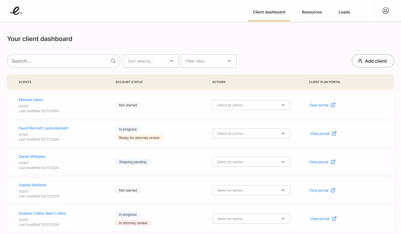
Decision 1: Consolidate Dashboards
The Problem:
Multiple dashboard pages existed for unclear reasons. Information was redundant, served no purpose, or was rarely used, creating confusion and inefficiency.
The Decision:
Combine into a single, focused dashboard that surfaces high-value information and actions.
Rationale
- Puts all critical information in one scannable view
- Reduces cognitive load by eliminating unnecessary navigation
- Allows users to quickly understand status across all clients
- Enables faster task completion through reduced clicking
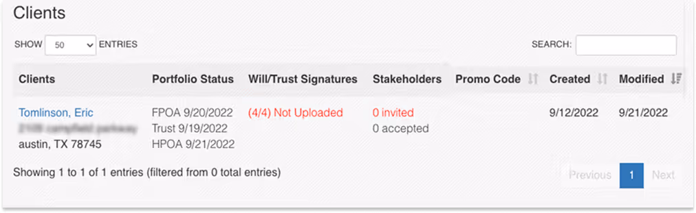
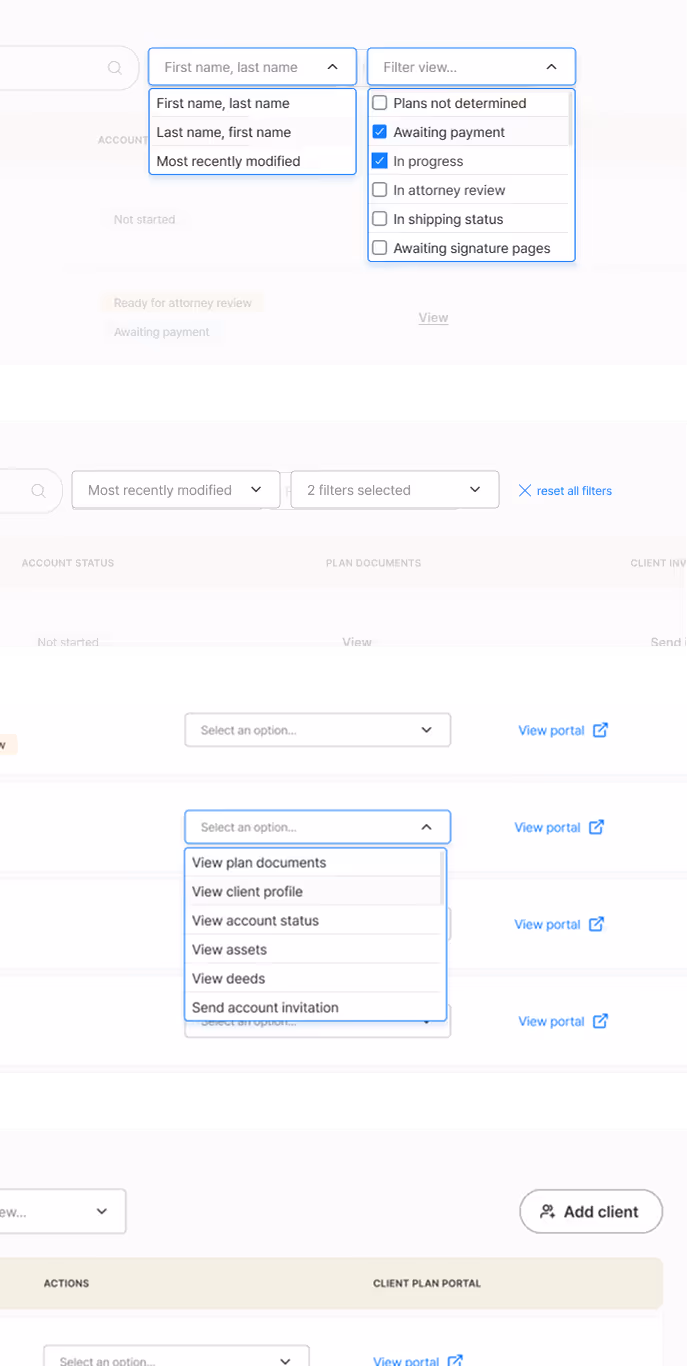
Various table labels and navigation on different pages
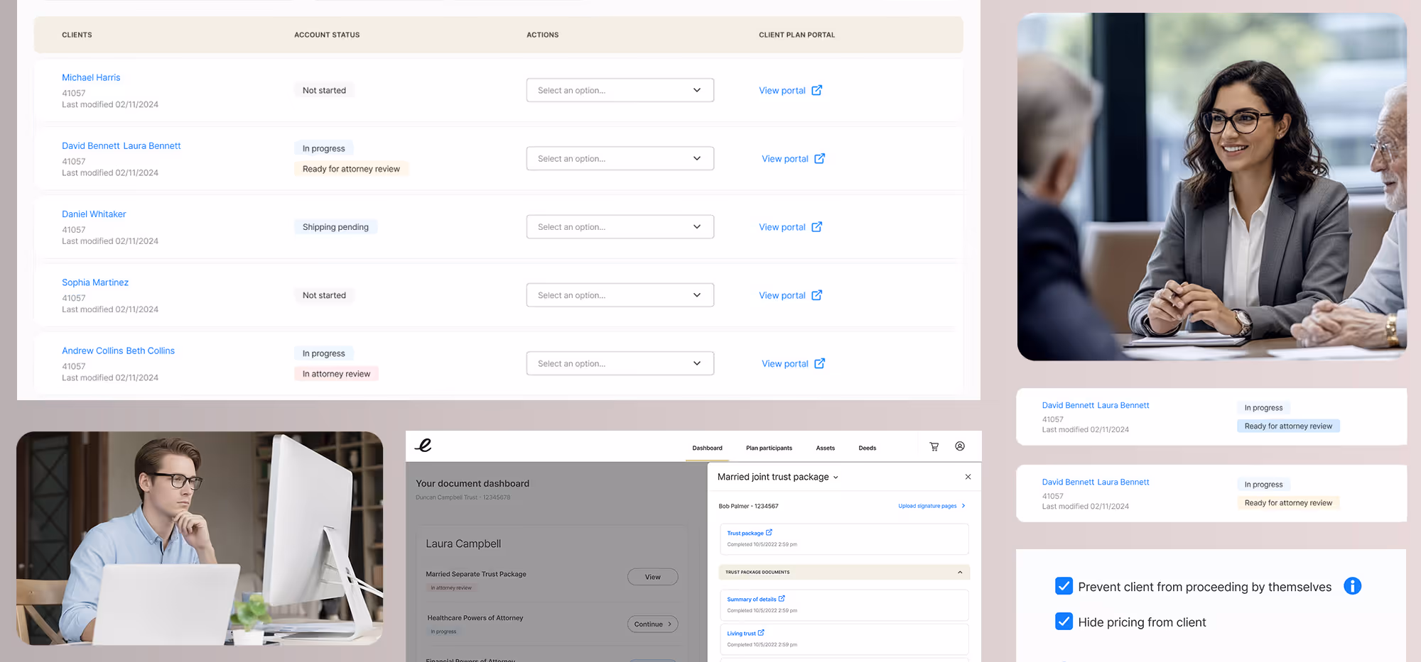
Redesign: Consolidated and simplified in one dashboard
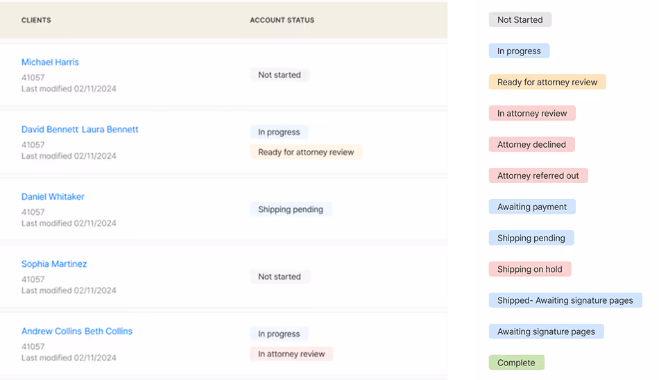
Decision 2: Clear Account Status Progression
The Problem:
Users had no visibility into where clients were in the estate planning process. "When will documents ship?" was a constant question.
The Decision:
Implement clear, color-coded status indicators showing exactly where each client's plan stands in the workflow.
Rationale
- Eliminates guesswork and reduces support burden
- Allows advisors to proactively manage client expectations
- Creates transparency that builds trust
- Enables prioritization of accounts needing attention
Account status is unclear
Account status is clearly labeled and color coded
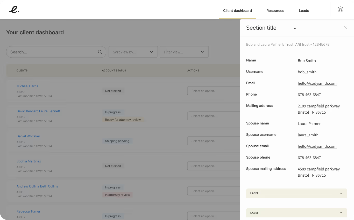
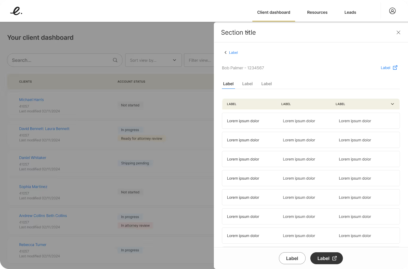
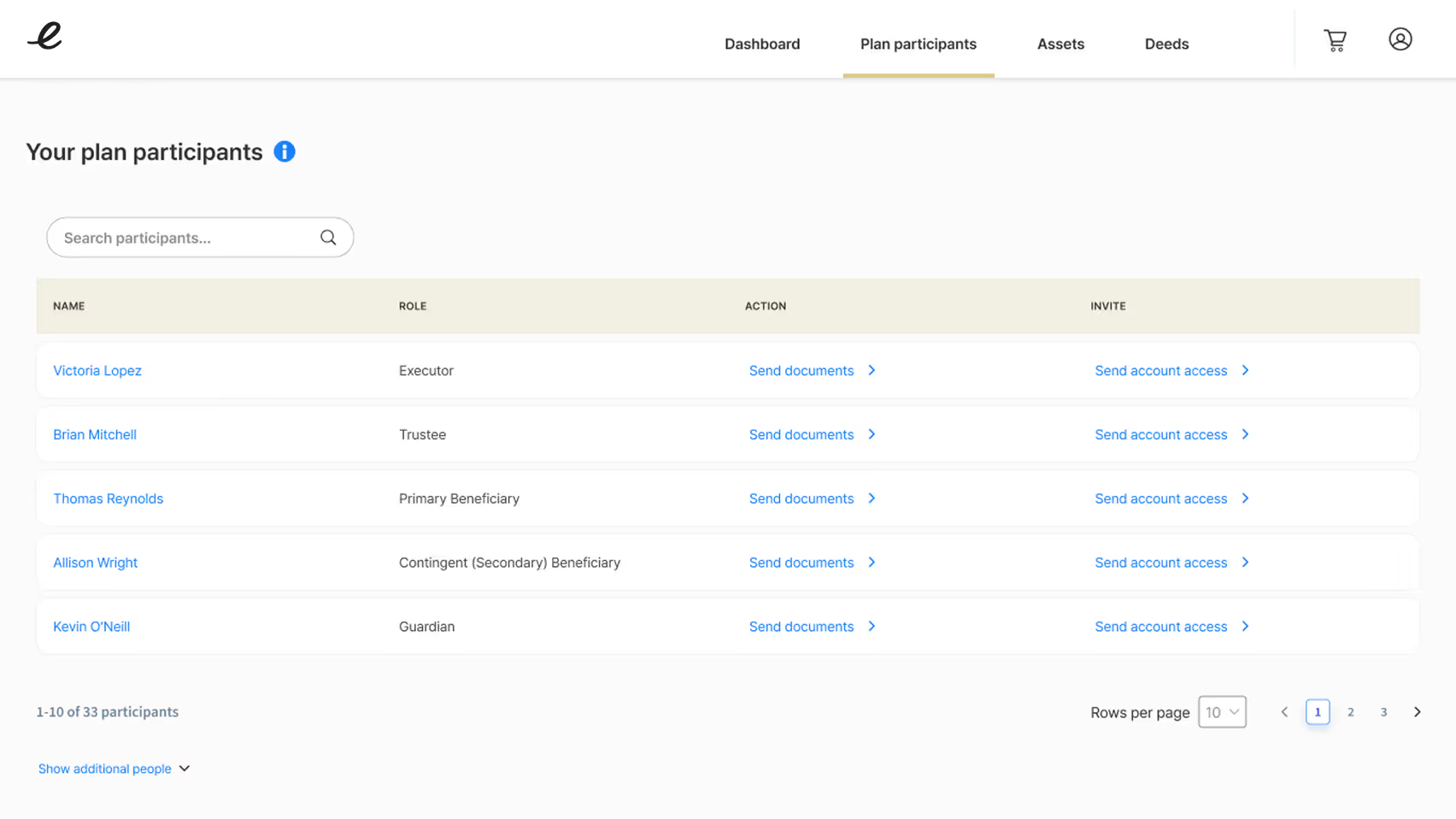
Decision 3: Clickable Client Names & Quick Actions
The Problem:
Accessing client details required multiple clicks. Important information was buried.
The Decision:
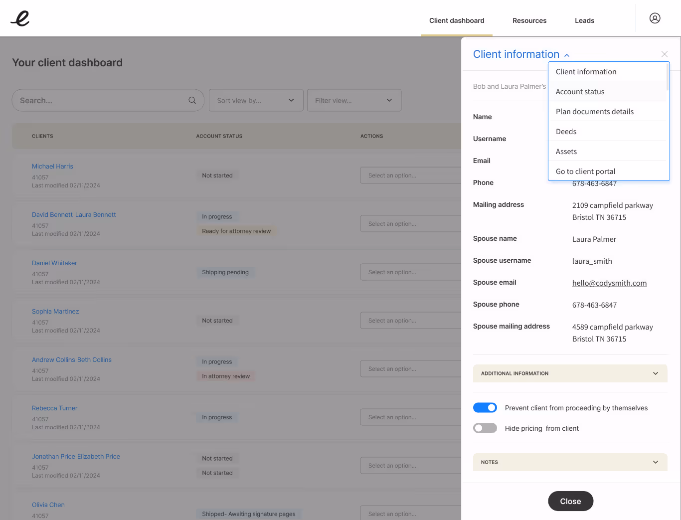
Make client names clickable to open slide-in drawer with profile details, contact info, and quick actions menu.
Rationale
- Reduces clicks from 4+ to 1 for most common tasks
- Keeps users in context of the main dashboard
- Surfaces priority actions based on user research
- Allows rapid movement between client accounts
Final design
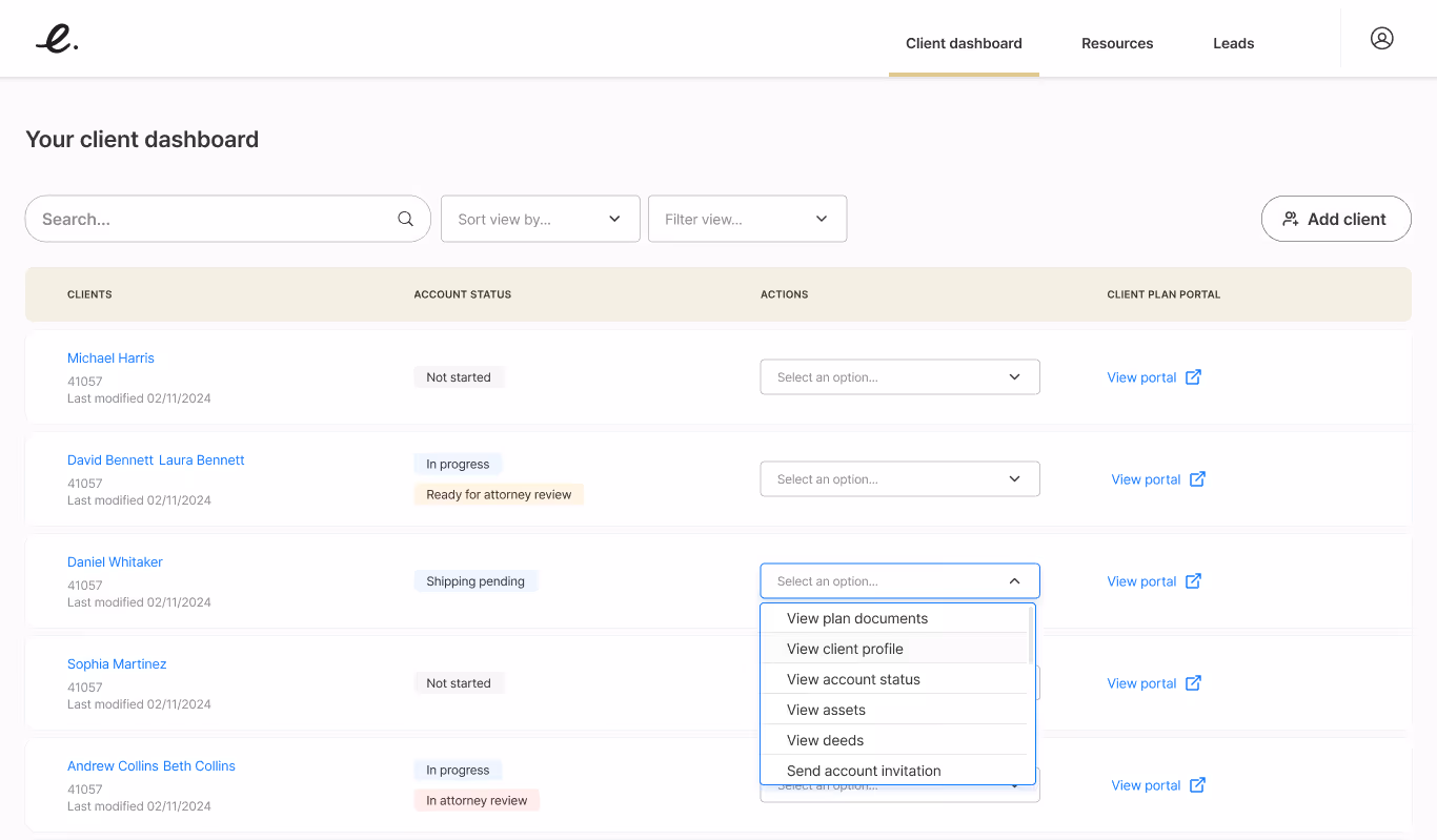
Quick Actions Menu Includes
- View plan documents
- View client profile
- View account status
- View assets
- View deeds
- Send account invitation (to the client)
Decision 4: Progress Indicators in Questionnaires
The Problem:
Users didn't know how much time or effort would be required to complete questionnaires. "How many more questions?" created anxiety.
The Decision:
Add step-by-step progress indicators showing current position, completed steps, and remaining steps in the process.
Rationale
- Reduces anxiety by showing clear endpoint
- Helps users plan time commitment
- Creates sense of accomplishment as steps complete
- Allows saving and returning with clear position
Original design
Redesign
Decision 5: Effective Use of Slide-in Drawers
The Problem:
The old system overused nested modal overlays, creating confusion. But some information should be accessible without navigating away.
The Decision:
Use slide-in drawers strategically for viewing high-level details and related information while maintaining dashboard context.
Rationale
- Keeps users oriented to their primary workspace
- Provides progressive disclosure without disruption
- Allows quick information access without losing place
- Prevents the nested-modal problem of the old system
Drop navigation between the drawers

Strategic Use Cases
- Client profile details
- Account status
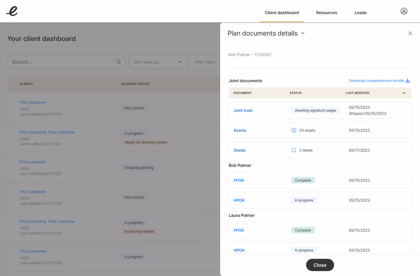
- Document details
- Asset lists
- Deed information
- Access to client portal
Decision 6: Rewrite All Questionnaire Content
The Problem:
Content was confusing, overly legalistic, and intimidating—especially problematic when advisors walked clients through it live.
The Decision:
Completely rewrite questionnaire flows for comprehension, compliance, and brevity.
Rationale
- Serve two audiences simultaneously (advisor + client)
- Use plain language that's legally accurate
- Reduce intimidation factor
- Speed up completion times
- Maintain legal compliance while improving clarity
Contextual help
Content Principles
- Active voice, direct questions
- Contextual help when legal terms required
- Brief explanations for complex concepts
- Consistent language patterns
- Clear next steps
Original design
Redesign
Original design
Redesign
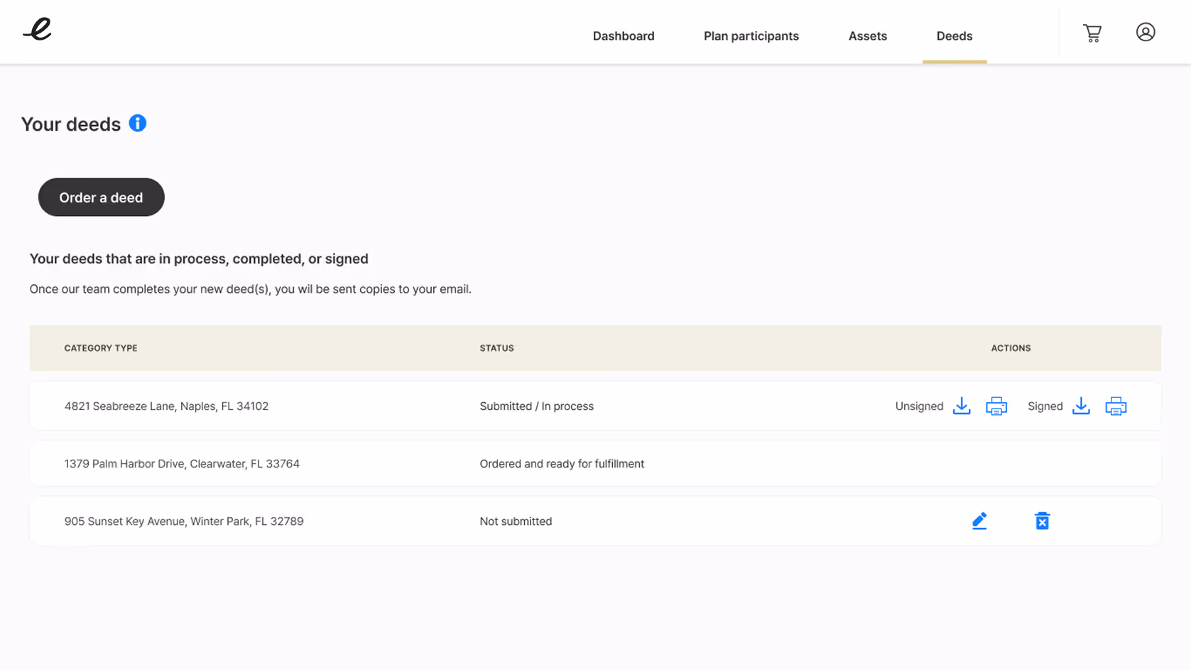
Core Features & Screens
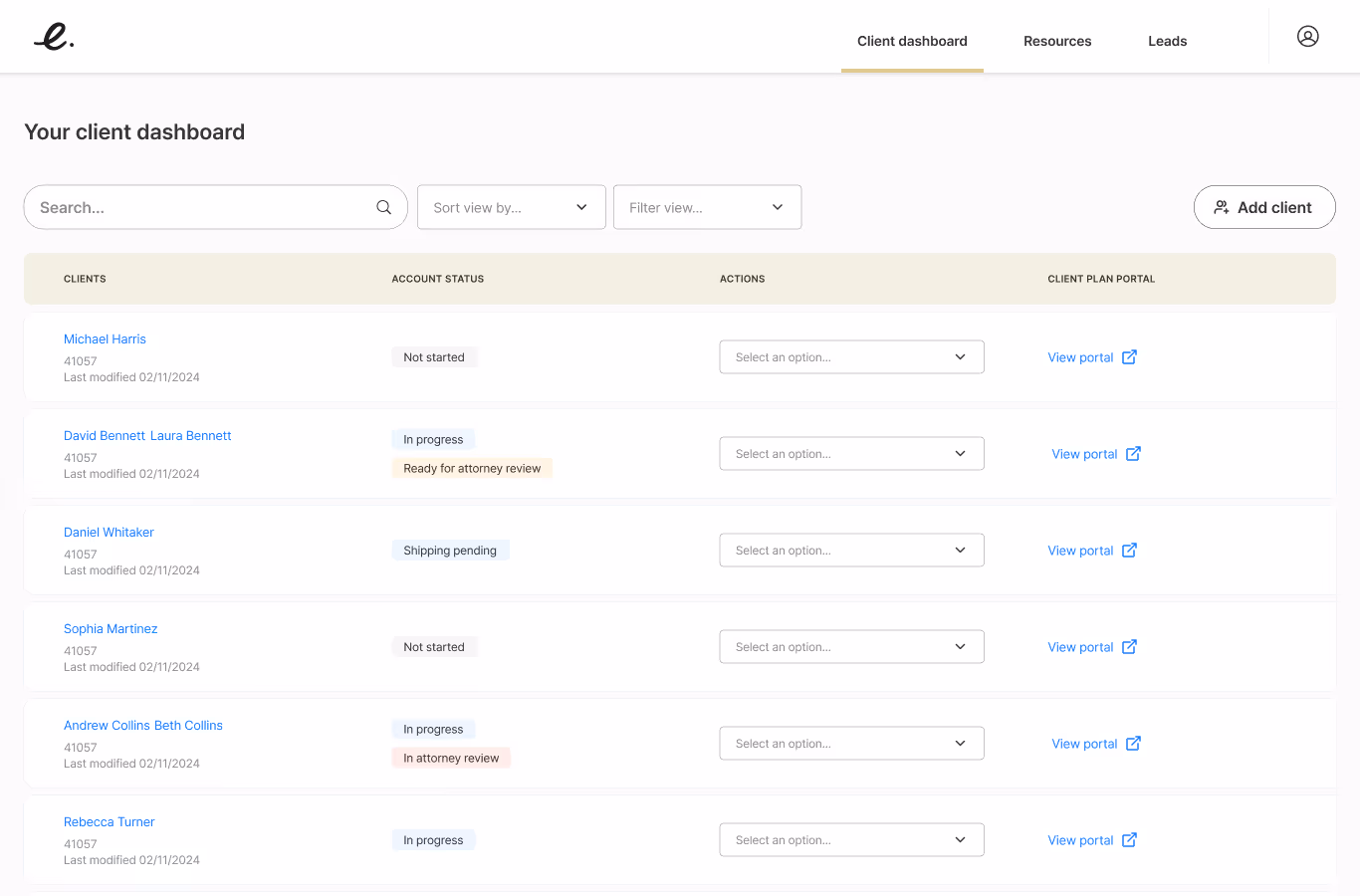
Feature 1: Financial Advisor Dashboard
Purpose
Central workspace providing high-level information about all clients, latest document status, and quick access to profile details, documents, assets, deeds, and client portals.
User Benefit
Streamlined interface surfaces high-value information and tasks, dramatically reducing time-on-task and cognitive load.
Design Approach
- Simplicity - Remove all non-essential elements
- Clarity - Clear labels and visual hierarchy
- Efficiency - Minimize clicks to accomplish any task
- Scannability - Information-dense but easy to parse
Content Principles
- Search and filter capabilities
- Sortable columns (status, date modified, client name)
- Status indicators with semantic color coding
- Quick actions dropdown from every row
- Pagination for large client lists
- "Add client" prominently placed
Client dashboard
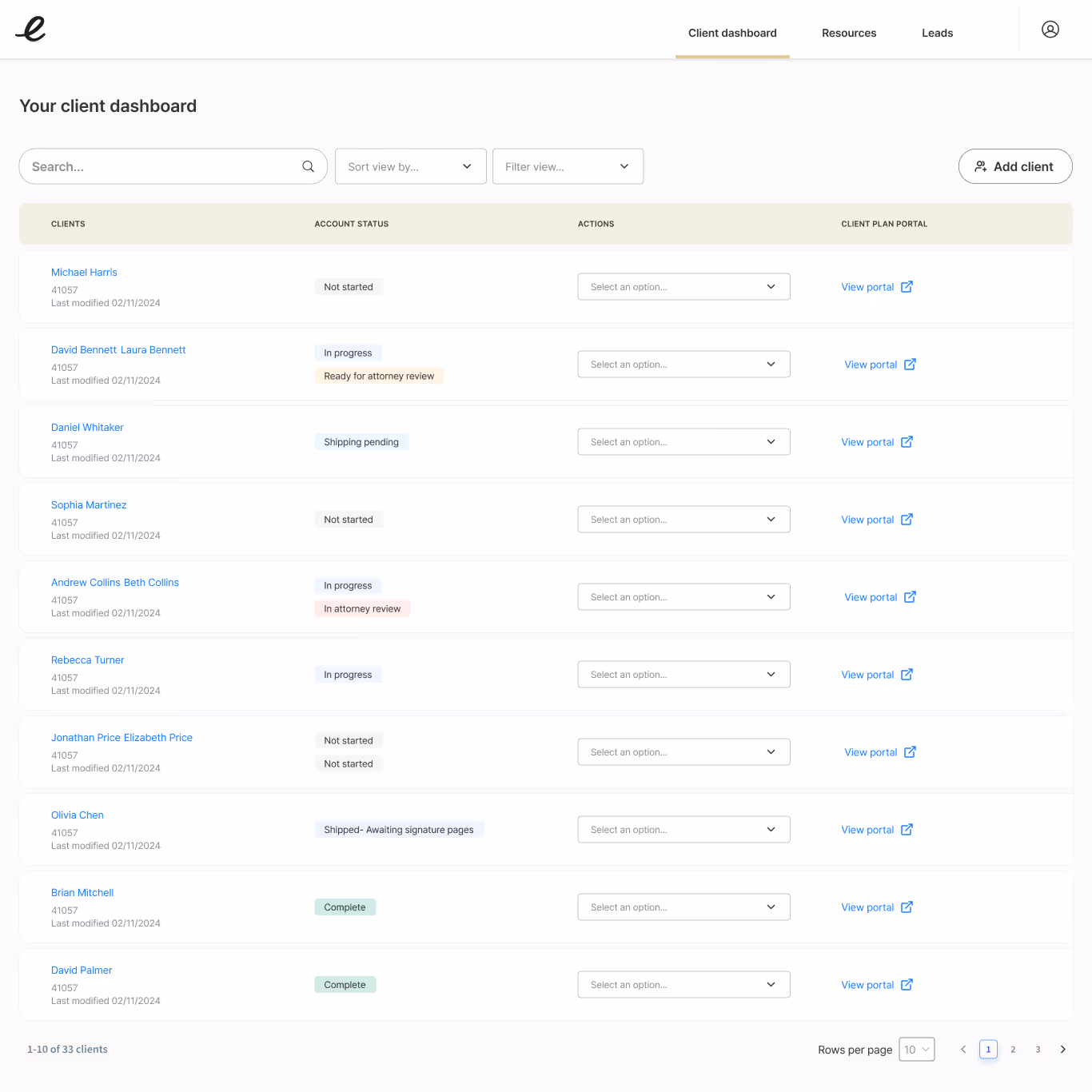
Dashboard components
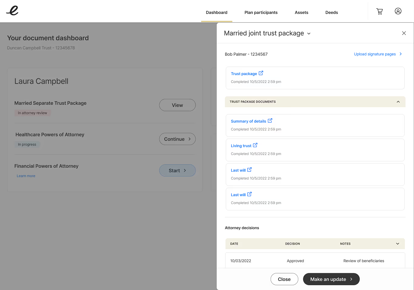
Feature 2: Slide-in Drawers for Progressive Disclosure
Purpose
Provide detailed account and document information without navigating away from the dashboard.
User Benefit
Users stay in context of their workflow while accessing comprehensive details - best of both worlds.
Design Approach
- Keep users oriented to dashboard position
- Provide full information depth without disruption
- Enable quick scanning and closing
- Support multiple drawer types for different content
Drawer Types
- Client information and settings
- Plan document details
- Asset lists and management
- Deed information
- Beneficiary/participant details
Client profile information
Client plan documents details
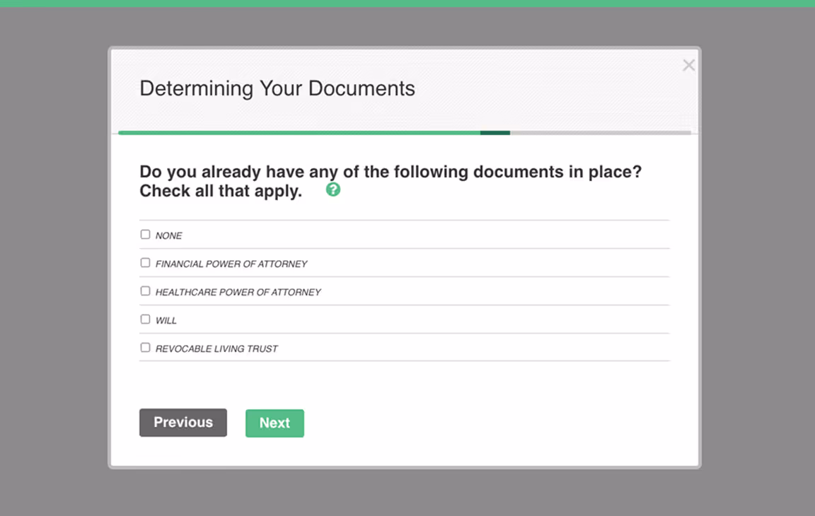
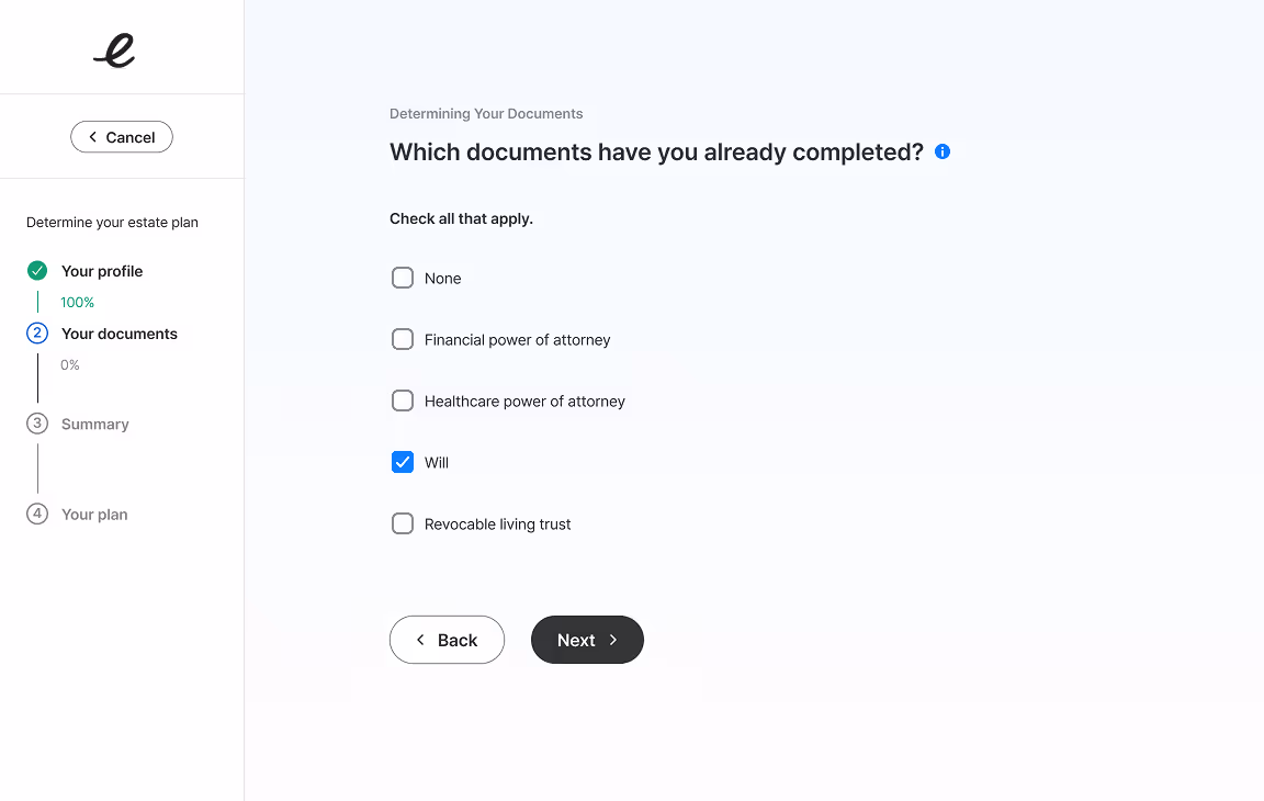
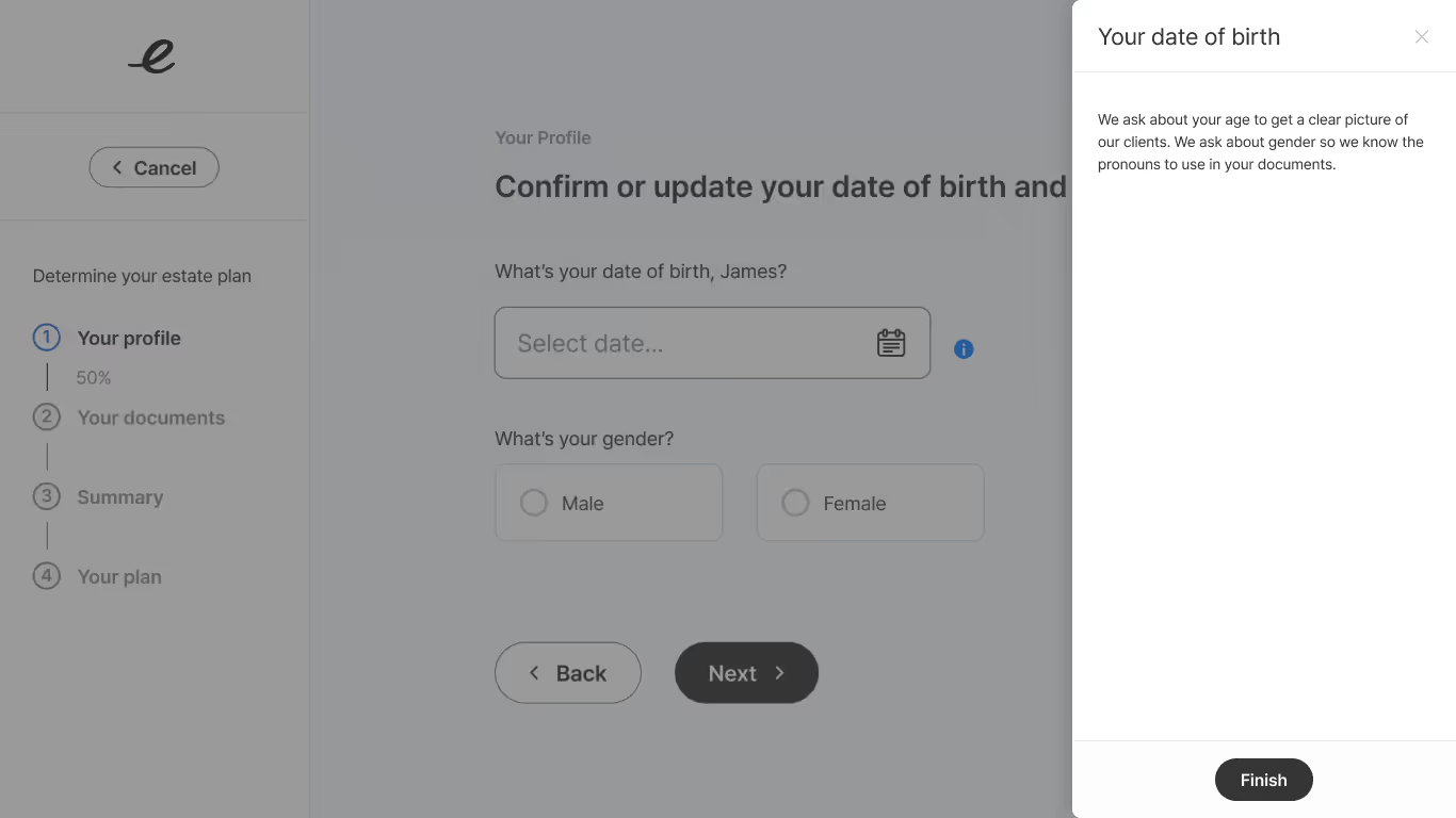
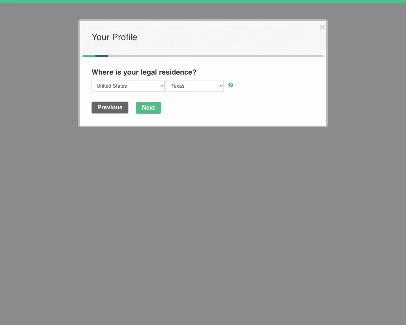
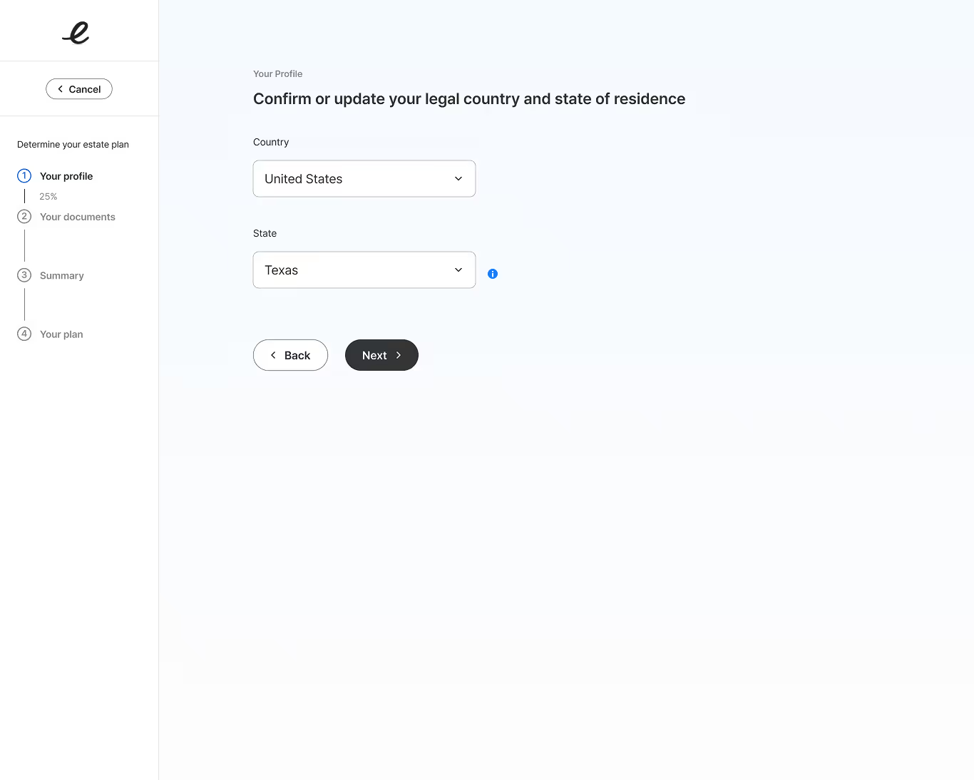
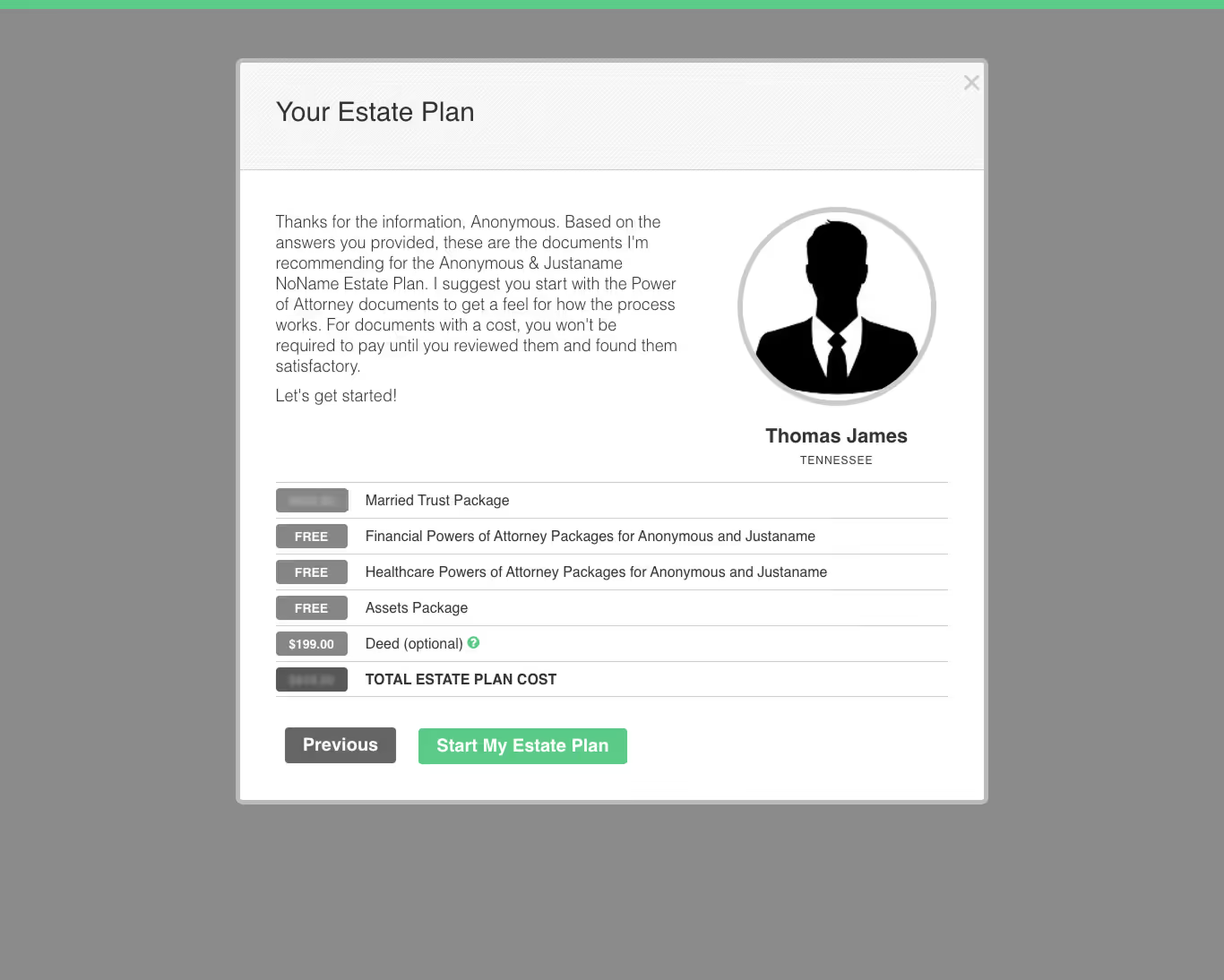
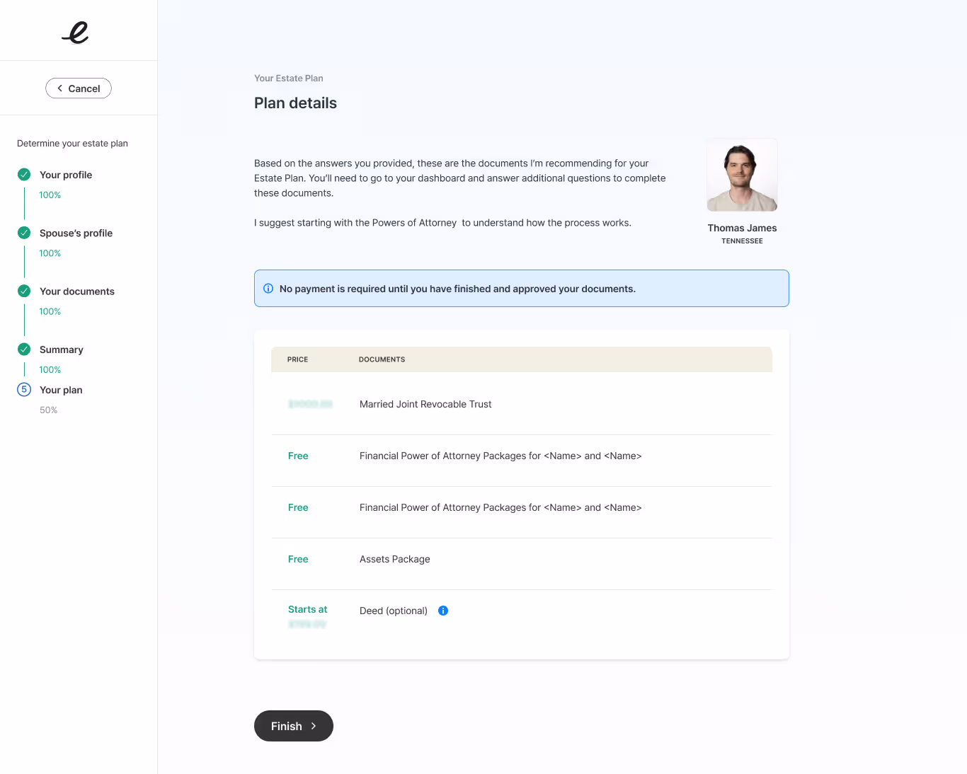
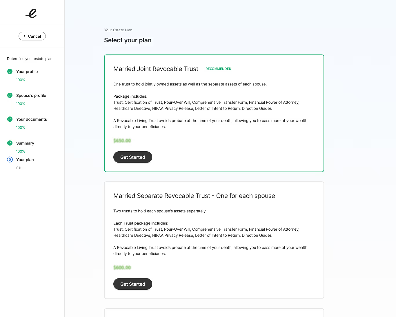
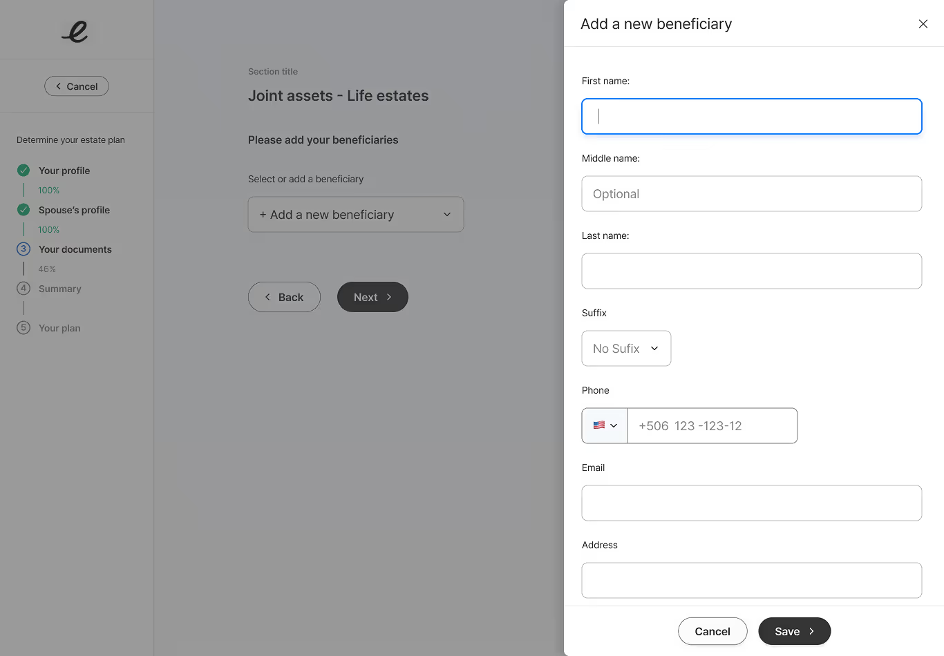
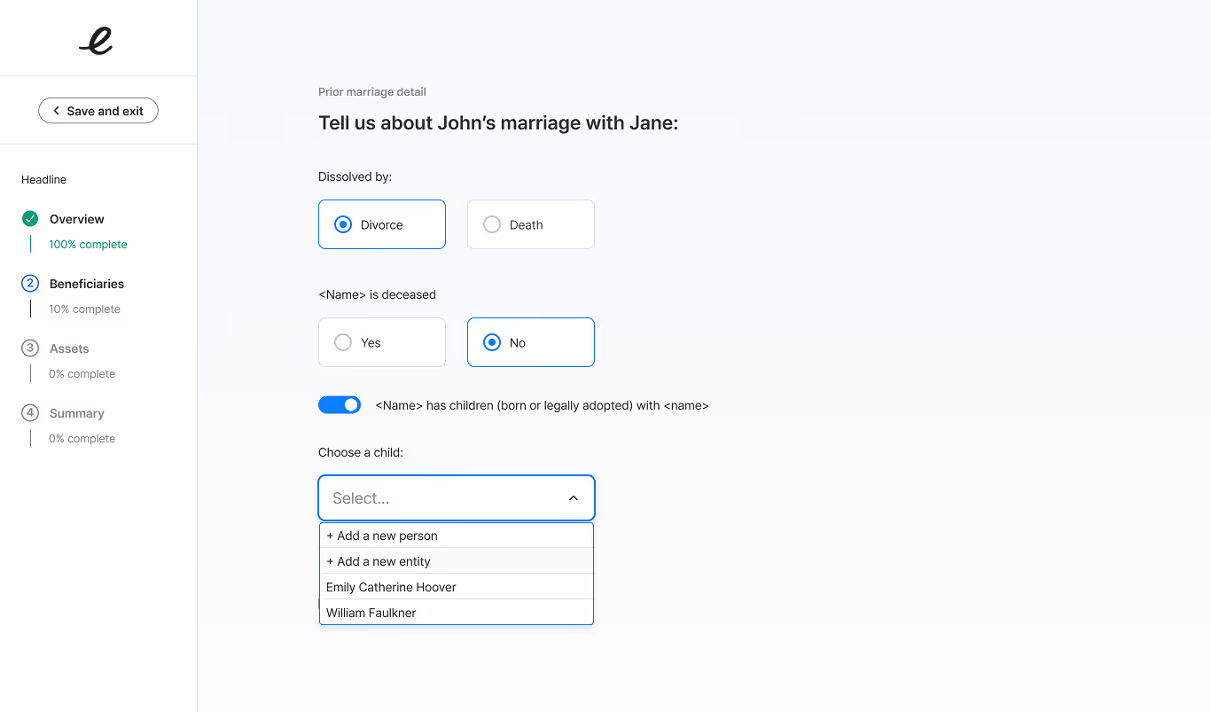
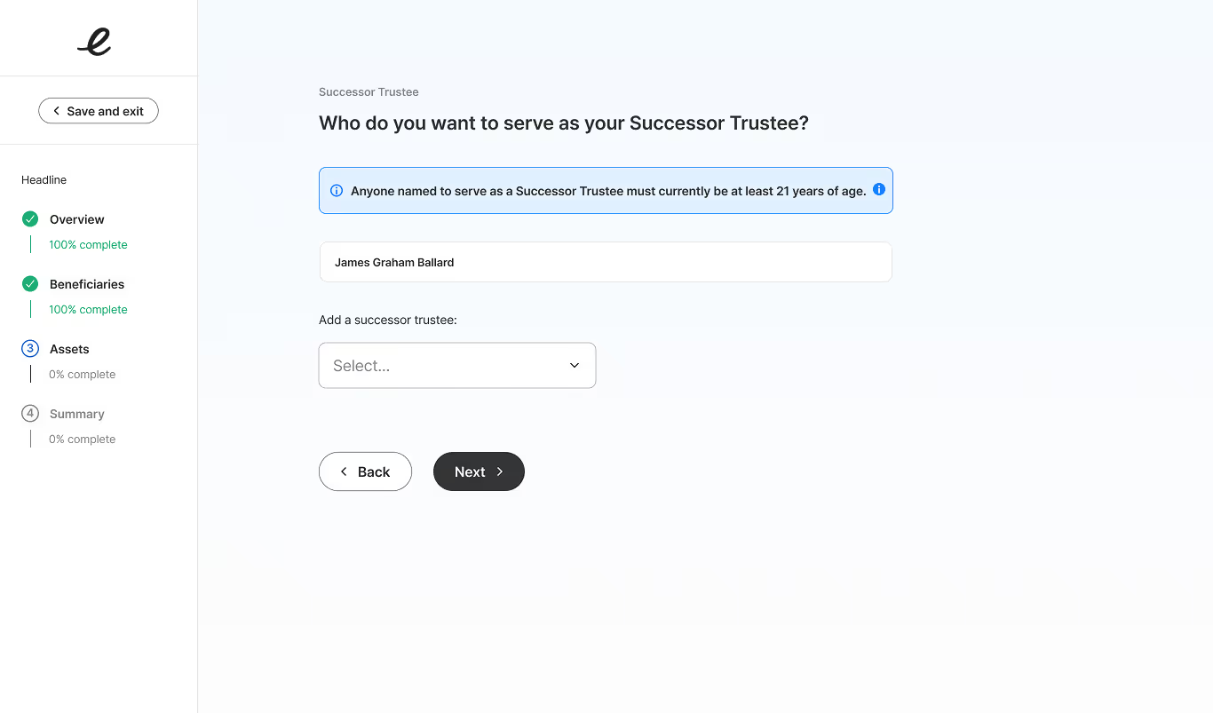
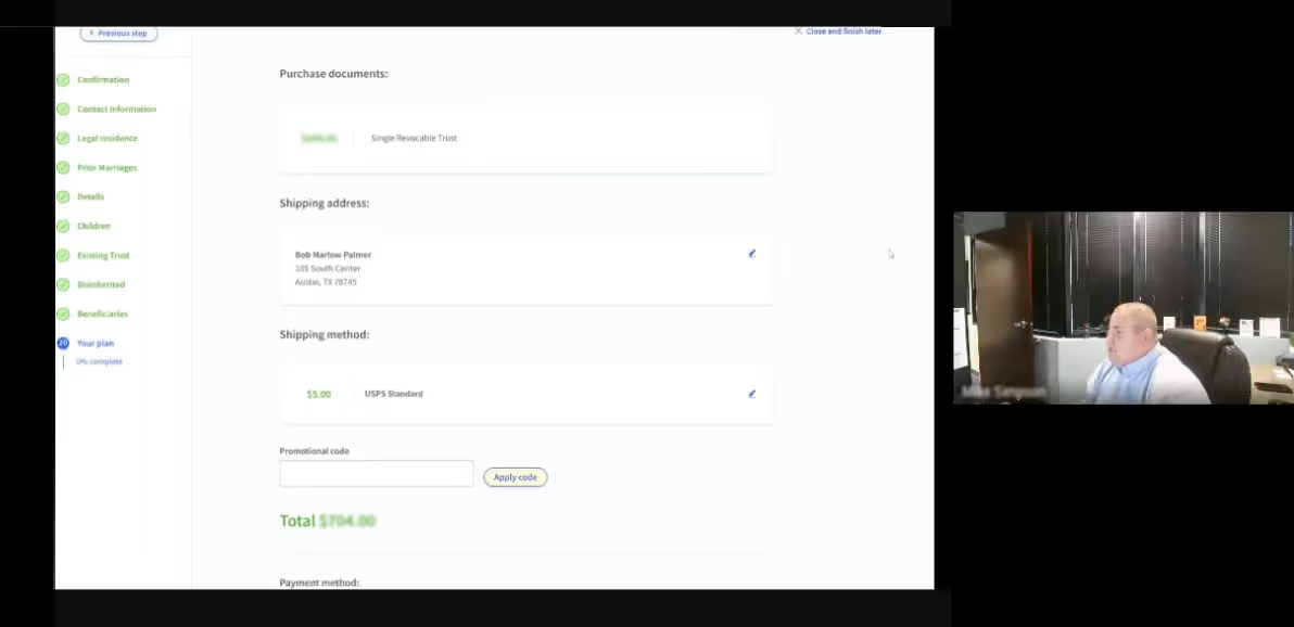
Feature 3: Questionnaire & Document Determination Process
Purpose
Guide users through the process of determining estate plan document types and clearly indicating what questionnaires need to be completed to finish estate plan.
User Benefit
For Advisors: Clear structure to guide clients through complex decisions.
For Clients: Understandable process that builds confidence and reduces anxiety.
Design Approach
- Progress indication - Always show current position and remaining steps
- Simplified pages - One clear task per screen
- Plain language - Accessible content with legal accuracy
- Contextual help - Clarifying information when needed
- Clear alerts - Clear indications of next steps to finish plan
Process Flows
- Profile information collection (triage)
- Existing document check
- Asset and family structure questions
- Document type determination
- Attorney assignment (automatic or review queue)
- Questionnaire progression
- Payment and fulfillment
Clear outcomes and friendlier language
Simplifying decision process
Clearer language and UI
Using drawers to maintain task focus
Simplified UI
Simplified UI
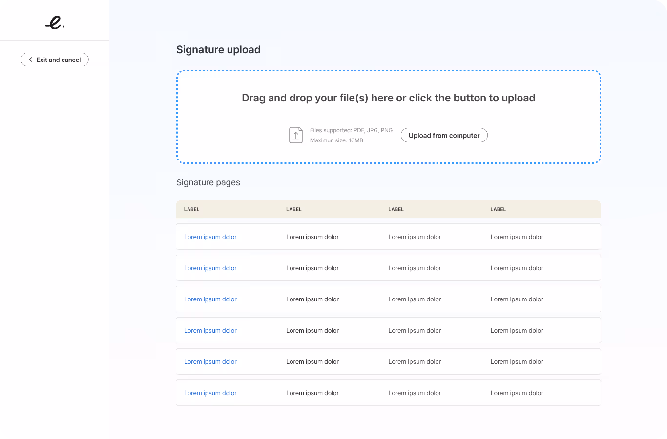
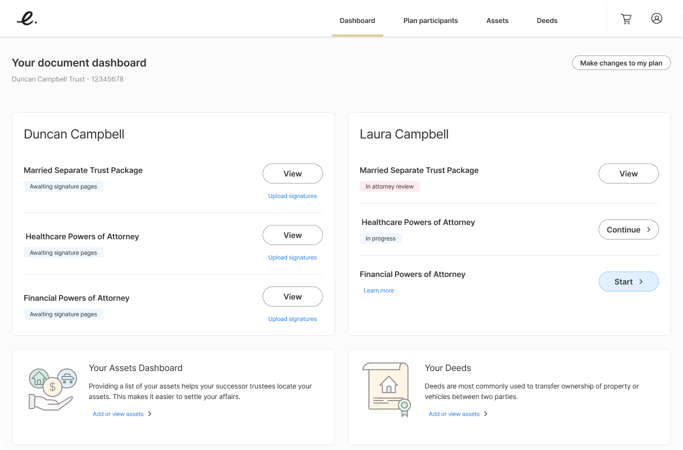
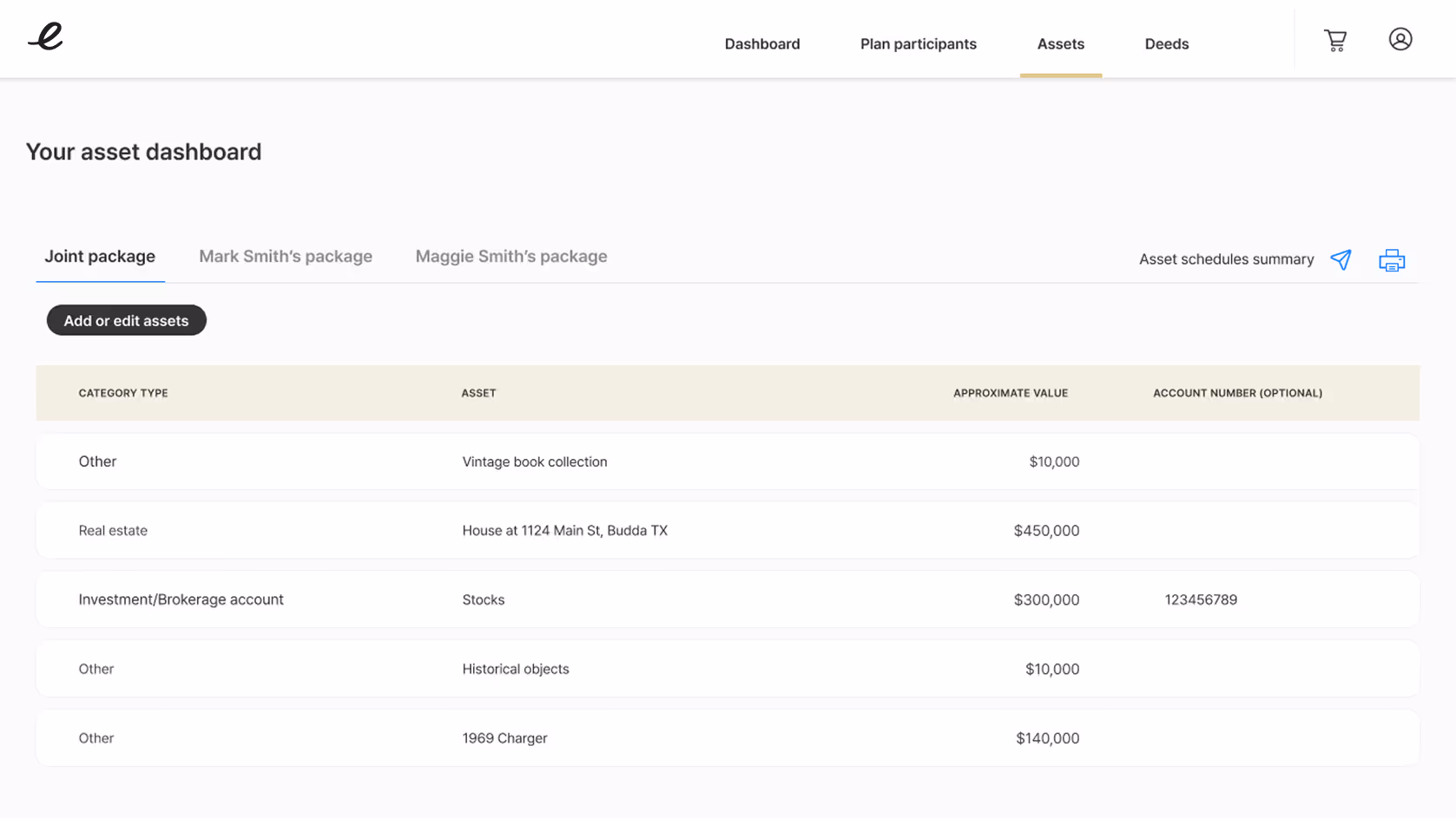
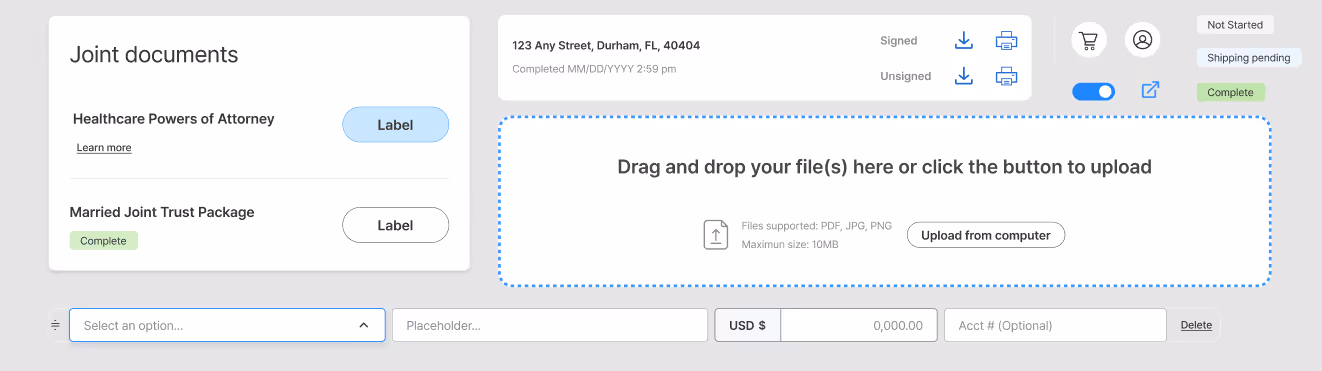
Feature 4: Client Portal
Purpose
Self-service dashboard for end clients to see progress, plan type, completed documents, upload signed documents, manage assets, and view plan participants.
User Benefit
Users needed clear visibility into their plan type and document status, along with a secure, reliable place to access and store legal documents. They also wanted the ability to manage estate details independently and understand the planning process with full transparency.
Design Approach
- Clear guidance - No ambiguity about next steps
- No distractions - Builds trust and confidence
- Simplified interactions - Minimal learning curve
- Professional appearance - Builds trust and confidence
Process Flows
- Document status dashboard
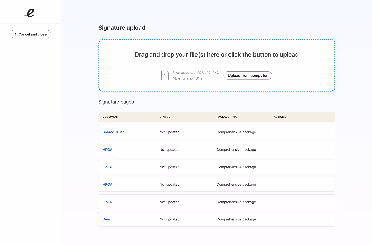
- Secure document downloads
- Signature page upload
- Asset inventory management
- Deed upload and storage
- Plan participant details
Document status dashboard
Plan participant details
Secure document downloads
Signature page upload
Asset inventory management
Deed upload and storage
Design System Contribution
As the sole designer, I built a comprehensive design system from scratch to support the entire Estate Guru platform.
Components Created

Foundation
- Typography scale (Pretendard font family)
- Color palette (primary, secondary, semantic, neutral)
- Spacing and layout grid
- Iconography library
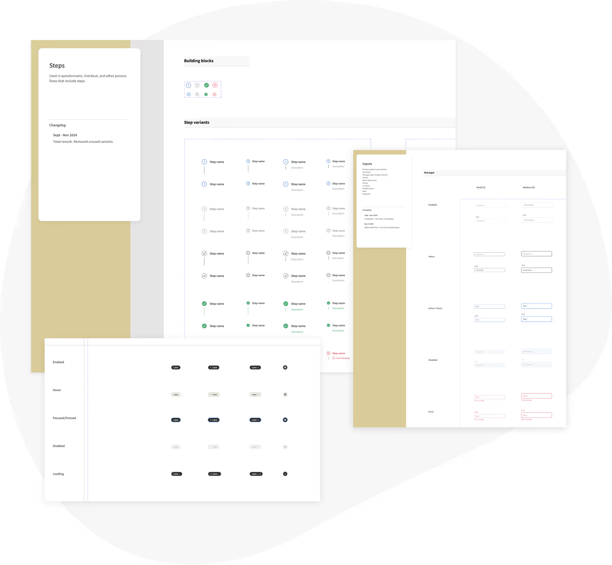
Interactive Elements
- Buttons (multiple variants, sizes, states)
- Form inputs (text, dropdown, checkbox, radio, date)
- Links and navigation elements
- Status indicators and badges
- Progress indicators and steppers
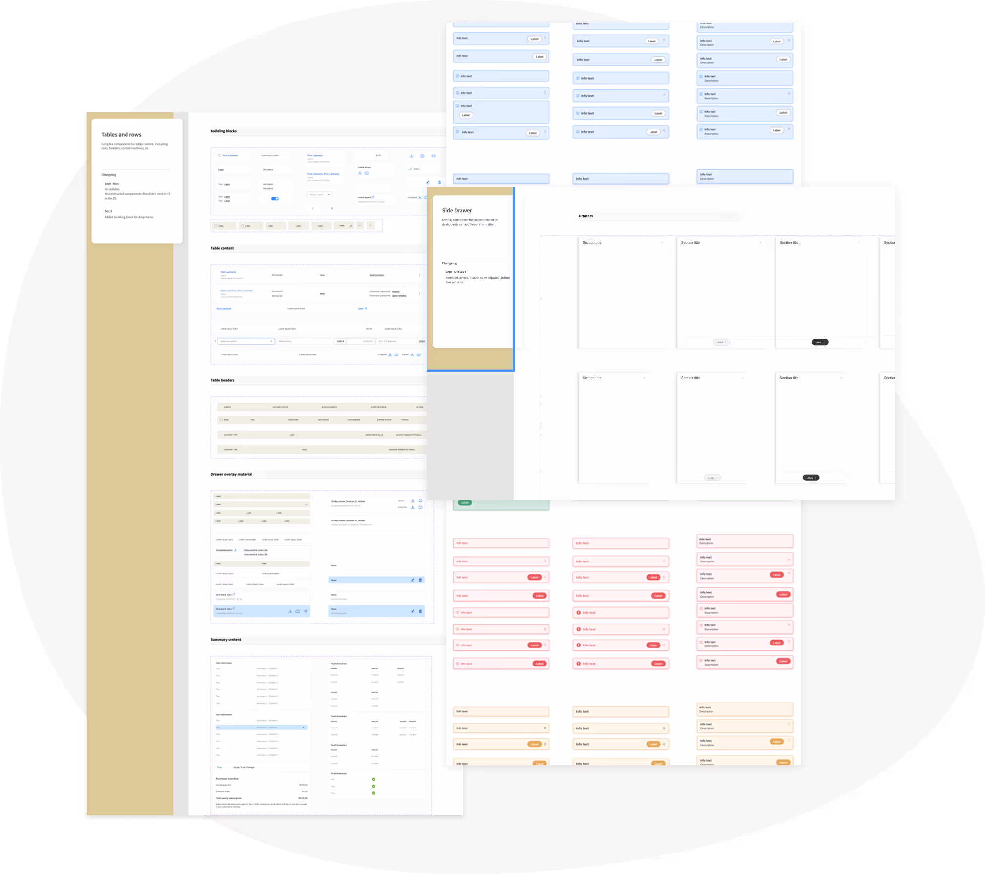
Layout Components
- Tables and data displays
- Cards and tiles
- Modal dialogs
- Slide-in drawers
- Alerts and notifications
Validation & Testing
Testing Methods
Moderated Usability Testing
Approach:
Conducted remote testing sessions with 10 participants using interactive Figma prototypes via Google Meet.
Participants
- 7 financial advisors (active Estate Guru users)
- 3 end clients (consumer portal testing)
Process
- 60-minute sessions per participant
- Task-based scenarios reflecting real workflows
- Think-aloud protocol to capture reasoning
- Screen recording and note-taking
- Post-task satisfaction surveys
Focus Areas
- Dashboard navigation and information findability
- Questionnaire flow comprehension
- Document status understanding
- Client portal usability
- Upload workflows (signatures, deeds)
Unmoderated Testing
Platform: UserTesting.com
Participants: 20 users matching target personas
Approach: Remote, asynchronous testing with predefined tasks
Task Analysis
- "Find information about a specific client's estate plan status"
- "Begin the process of creating a new client account"
- "Upload a signed document to a client's plan"
- "Determine how many questionnaires remain to complete a plan"
- "Access a client's asset list"
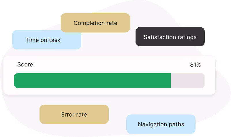
Metrics Captured
- Time on task
- Task completion rate
- Error rate
- Satisfaction ratings
- Navigation paths
Key Findings
What Worked Well
1. Time on Task Dramatically Reduced
- Average task completion 35% faster than baseline
- Most users could find client information in under 10 seconds (vs. 30+ seconds in old system)
- Questionnaire completion time reduced by an estimated 20-25%
2. Discoverability Improved
- 90%+ of users successfully found primary actions without guidance
- Quick actions menu was immediately understood and appreciated
- Status indicators were correctly interpreted in 95% of cases
3. Signature Upload Flow
- New upload workflow tested at 100% completion rate
- Users appreciated clear instructions and drag-and-drop capability
- File type validation prevented common errors
4. Overall Satisfaction
- Average satisfaction score: 4.6/5
- "Much easier to use" - common feedback
- "Finally looks professional" - advisor feedback
- "I actually understand what I'm supposed to do" - client feedback
What Needed Refinement
1. Document Status Color Scheme Finding: Initial color palette for document statuses caused confusion between "in progress" and "in attorney review"
Solution: Adjusted color values to increase contrast and added iconography to status chips for additional differentiation
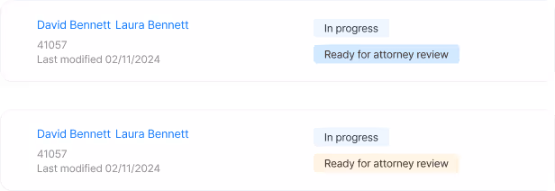
Before / After
- Before: Blue for both "in progress" and "in attorney review"
- After: Blue for "in progress," Gold/amber for "ready for attorney review"
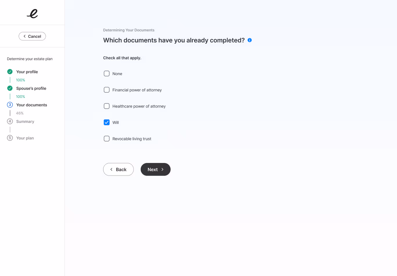
2. Content Clarity in Specific Questions Finding: 3 specific questionnaire questions still caused hesitation despite rewrites
Solution: Added contextual help tooltips with plain-language explanations and real-world examples
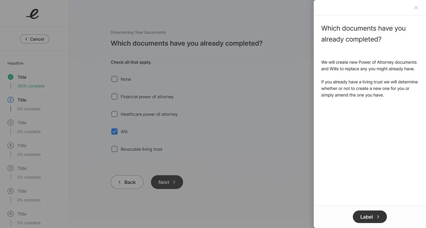
Example
- Question: "Which documents have you already completed?"
- Added help: "We will create new Power of Attorney documents and Wills to replace any you might already have. If you already have a living trust we will determine whether or not to create a new one for you or simply amend the one you have."
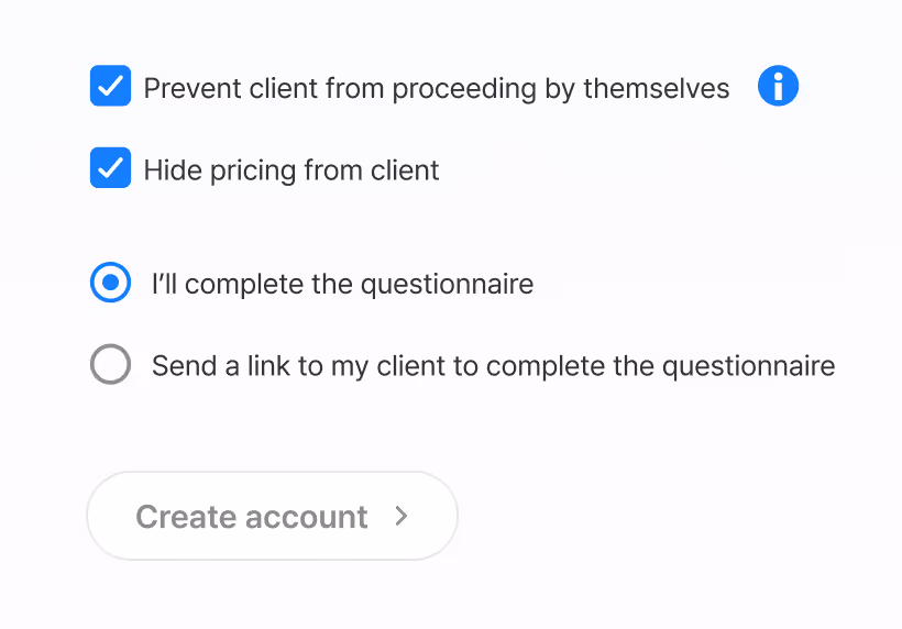
3. Price Visibility Controls Finding: Some advisors needed ability to hide pricing from clients so they could handle pricing discussions themselves
Solution: Added account-level setting allowing advisors to show/hide pricing in client portal
Discovery: This was a surprise finding - we hadn't anticipated this need in initial research, but it emerged clearly during testing
Impact: Became a key feature for institutional clients who wanted pricing flexibility
Implementation & Collaboration
Engineering Partnership
Location: Remote collaboration (team in Utah, I worked remotely)
Communication: Google Workspace, Slack, email, periodic in-person visits
Design Handoff: Figma Dev Mode for specifications and asset export
Process
- Bi-weekly design reviews to discuss upcoming features
- Figma files shared with developer access for measurements, styles, assets
- Design QA sessions after implementation to ensure quality
- Breakout sessions for complex interactions or edge cases
Collaboration Highlights
- Engineers provided valuable feedback on technical feasibility early
- Iterative approach allowed for adjustments based on implementation realities
- Strong partnership resulted in high-fidelity implementation matching designs
Product Management Partnership
Location: Remote collaboration
Communication: Google Workspace, Slack, email, Aha.io, periodic in-person visits
Cadence: Daily check-ins during active sprints, design reviews multiple times per week
Process
- Collaborative feature definition and user story creation
- Journey mapping sessions to understand user flows
- Prioritization discussions balancing user needs with business goals
- Scrum ceremonies (sprint planning, retrospectives, demos)
Collaboration Highlights
- Product managers championed user research findings with stakeholders
- Helped balance ambitious design vision with realistic delivery timelines
- Provided critical business context informing design decisions
Business Stakeholders Partnership
Stakeholders: CEO, COO, CTO
Cadence: Bi-weekly check-ins, monthly strategic reviews
Communication: Google Workspace, Slack, email, periodic in-person visits
Process
- Regular progress updates with visual demonstrations
- Strategic alignment on product vision and roadmap
- Design reviews ensuring business objectives met
- Feedback incorporation while maintaining user-centered principles
Collaboration Highlights
- Executive buy-in on user research findings strengthened design authority
- Stakeholder insights into competitive landscape informed strategy
- C-level support for design system investment paid dividends in consistency
Compliance/Legal Partnership
Cadence: As-needed for content and workflow reviews
Communication: Google Workspace, Slack, email, periodic in-person visits
Process
- Submit content drafts for legal review
- Incorporate feedback while maintaining usability
- Validate workflow changes don't compromise compliance
- Discuss state-specific requirements and edge cases
Collaboration Highlights
- Legal team became partners in finding compliant solutions that worked for users
- Developed mutual understanding: compliance essential, but UX matters too
- Created templates for common scenarios to speed future reviews
Quality Assurance Approach
Design QA Reviews
- Systematic comparison of implementation vs. designs
- Testing in multiple browsers and screen sizes
- Interaction and animation verification
- Content accuracy checks
- Accessibility spot-checks
QA Documentation
- Screenshots with annotations showing discrepancies
- Priority levels (critical, high, medium, low)
- Specific guidance on corrections needed
- Follow-up verification after fixes
Breakout Sessions
- Scheduled deep-dives on complex features
- Real-time problem-solving for implementation challenges
- Collaborative refinement when designs needed adjustment
- Knowledge sharing to build team capabilities
Outcomes, Impact, and Reflections

Quantitative Results
User Experience Improvements
Task Completion Rates:
- 35% improvement in task completion rates (measured against baseline usability testing)
- Users successfully completed critical workflows with minimal errors
- Baseline: 5 participants in initial audit phase
Error Reduction:
- 50% reduction in user errors (measured against baseline usability testing)
- Fewer incorrect questionnaire submissions requiring revision
- Reduced support tickets related to user confusion

Qualitiative Results
Increased Engagement
Task Completion Rates:
Higher Portal Usage: Users actively engaging with the client portal and creating new accounts at increased rates post-redesign
Metric: Increased client portal adoption and account creation (specific numbers not disclosed)
Elevated Product Value
Stronger Value Perception: The platform is now perceived as a high-value tool for professional users, not just functional software
Competitive Advantage:
- Design quality now matches or exceeds funded competitors
- Unique features (attorney network, physical documents) now properly showcased
- Professional appearance supports premium positioning
Scalable Design System
Foundation for Growth: A modular component library built for future adaptability, enabling:
- Faster feature development
- Consistent user experiences across all touchpoints
- Easier onboarding for future team members
- Reduced design and engineering debt
Component Coverage:
- 50+ reusable components
- Multiple layout templates
- Documented patterns and guidelines
- Accessibility specifications
Improved Workflow Efficiency
Reduced Time on Task: Simplified daily operations for advisors and attorneys through:
- Consolidated dashboard reducing navigation
- Quick-access patterns for common tasks
- Clear status visibility eliminating status-check calls
- Streamlined questionnaire flows
Anecdotal Feedback:
"I can get through my client list in half the time now" - Financial Advisor
"Finally, a system that doesn't fight me" - Attorney user
"I actually felt confident completing this myself" - End client
Enhanced Brand Cohesion
Professional, Trustworthy Interface: Modern design aligned with Estate Guru's refreshed branding, creating:
- Stronger perception as premium solution
- Increased advisor confidence in recommending platform
- Better first impressions in sales demonstrations
- Differentiation from legacy competitors
Market Positioning: The redesign positioned Estate Guru to compete effectively against newer, better-funded competitors by matching (and in some areas exceeding) their design quality while maintaining unique value proposition.
Greater User Satisfaction
Positive Feedback Themes:
- Simplicity: "So much clearer than the old system"
- Clarity: "I actually understand what I'm supposed to do"
- Professionalism: "This looks like a real product now"
- Ease of Use: "My clients can actually use this without me walking them through it"
Testing Results:
- Average satisfaction score: 4.6/5 (up from estimated 2.8/5 on legacy system)
- 90%+ would recommend to colleagues
- Reduced learning curve for new users
Business Impact
Positioned for $124T Opportunity
The redesign transformed Estate Guru from a legacy product held back by poor UX into a platform ready to capture meaningful market share in the generational wealth transfer.
Product Readiness:
- Scalable architecture supporting growth
- Professional appearance suitable for institutional clients
- User experience competitive with well-funded startups
- Foundation for rapid feature iteration
Supporting 1.2M+ Documents
The platform successfully manages over 1.2 million documents across the estate planning lifecycle, with the new UX making this scale manageable for users.
Scale Achievements:
- 400+ corporate clients
- Growing user base
- Expanding advisor network
- Institutional partnerships enabled
Reflections & What I Learned
What Worked Well
1. Over 1.2M+ Documents on the Platform
I'm proud of the impact this work has had on such an important and potentially stressful necessity. Estate planning affects families during critical life moments - having a role in making that process more accessible and less intimidating is meaningful.
Personal Impact: Creating peace of mind for hundreds of thousands of families while helping advisors build stronger practices and serve their clients better.
2. Positioned for $124 Trillion Wealth Transfer
Over the next two decades, an estimated $124 trillion in total assets will transfer in the U.S. I expect Estate Guru to play a strong role in this massive societal shift, and I'm proud to have built the foundation enabling that impact.
Legacy: This redesign positioned Estate Guru to serve millions of families through one of the largest wealth transfers in history.
3. Remote Collaboration Success
Working with a fully distributed team across time zones, I built strong async communication practices and trusted relationships despite limited face-time.Through clear documentation, effective use of async tools like Figma comments and Loom, and proactive stakeholder alignment, I maintained momentum, trust, and clarity across distance.
4. Transforming a Valuable Product
Transforming a clunky but fundamentally valuable product into the modern, professional platform it deserved was deeply satisfying. The before-and-after shift—from unusable legacy software to a polished, human-centered experience—demonstrated how strong UX/UI can unlock real business value.
5. Sole Contributor Achievement
As the only designer on this project, I owned the entire design process from research through implementation. This comprehensive ownership allowed me to:
- Maintain consistent vision across all touchpoints
- Make strategic decisions without committee delays
- Build deep relationships with all stakeholders
- Develop end-to-end product design capabilities
- Create complete design system from scratch
Key Learnings
The Value of Estate Planning
Working deeply in the estate planning domain gave me a strong appreciation for how critical these services are for families—and how historically inaccessible they’ve been. The project reinforced my belief that thoughtful, human-centered design can make essential, high-stakes services more accessible and understandable.
Through this work, I developed deep domain expertise spanning estate planning documents, multi-state regulatory requirements, attorney review workflows, generational wealth transfer dynamics, and financial advisor practice management.
Integrating Legal Oversight into Product Design
Designing for a regulated industry taught me how to balance legal compliance with strong user experience. I learned to partner effectively with legal teams, push back when caution undermined usability, and make required legal content more accessible by embedding compliance directly into the product structure.
These skills are highly transferable to other regulated domains—such as healthcare, finance, and insurance—where UX often suffers in the name of compliance but doesn’t have to.
Improving User Interview Techniques
Through 15+ user interviews and testing sessions, I significantly sharpened my ability to uncover real user needs—asking better open-ended questions, reading between the lines, creating space for honest feedback, and synthesizing patterns across diverse users.
Over time, my interviews evolved from surface-level conversations to deeper insight-driven sessions, allowing me to validate findings, distinguish critical needs from nice-to-haves, and surface genuine frustrations and aspirations.
Building for Multiple User Types
Designing for advisors, attorneys, institutions, and end clients simultaneously taught me how to balance shared needs with role-specific requirements—knowing when to use common patterns versus distinct interfaces while maintaining consistency across different mental models.
Through validation with each group, clear patterns emerged: fundamentals like status visibility, document access, and progress indicators mattered to everyone, while needs such as pricing control, review queues, and beneficiary marketing were role-specific.
Evolution & Status
Current Status
The product was successfully relaunched in 2025 after the comprehensive redesign. The new platform is now serving users in production, managing the 1.2M+ documents across the estate planning lifecycle.
My Departure
The product was successfully relaunched in 2025 after the comprehensive redesign. I left the project after the decision was made to require the team to work from the office following product launch. As a remote designer who had successfully delivered this entire transformation remotely, the shift to office-required didn't align with my work style or the proven success of our distributed collaboration.
Reflection: While I would have loved to continue iterating on the product post-launch, I'm proud of the foundation I built and confident it will serve Estate Guru well as they continue to grow, serving users in production, managing the 1.2M+ documents across the estate planning lifecycle.
Future Potential
The design system and patterns I established create a strong foundation for Estate Guru's continued evolution. The platform is now positioned to:
- Rapidly add new features leveraging existing components
- Expand into new user types or market segments
- Scale to serve millions of users in the wealth transfer opportunity
- Compete effectively against well-funded competitors
Closing Summary
Over nearly three years as Estate Guru's sole product designer, I transformed a 20-year-old legacy platform into a modern, competitive product positioned to serve millions of families in the largest wealth transfer in history.
Transformation Achieved:
- From cluttered, confusing interface → Clean, professional platform
- From buried functionality → Intuitive, task-focused design
- From intimidating legal jargon → Accessible, clear language
- From no design system → Comprehensive component library
- From user frustration → 4.6/5 satisfaction scores
Impact for Users
- 35% faster task completion
- 50% fewer errors
- Dramatically improved satisfaction
- Accessible estate planning for more families
Impact for Business
- Positioned to compete in $124T opportunity
- Supporting 1.2M+ documents
- Reduced support burden
- Scalable foundation for growth
Impact for the Industry: Demonstrated that regulated, complex products can be both compliant and delightful to use - legal requirements and great UX aren't mutually exclusive.
Skills Demonstrated
This project showcases my ability to:
- Lead end-to-end product design as a sole designer
- Navigate regulated industries balancing compliance with usability
- Conduct meaningful user research and translate findings into design
- Build comprehensive design systems from scratch
- Collaborate remotely across distributed teams
- Manage stakeholders while building strong team partnerships
- Work strategically outcomes while building strong team partnerships
- Execute independently while building strong team partnerships
FAQ
Eric Tomlinson served as Chief Product Designer at Estate Guru from 2022–2025, leading the end-to-end UX transformation of a legacy estate planning platform, owning strategy, research, design, and stakeholder alignment throughout the project.
Estate Guru’s decade-old estate planning platform was outdated, hurting sales and retention, with unclear workflows, clunky interface patterns, and inconsistent UX that prevented the product from competing in a $124 trillion wealth transfer opportunity.
The redesign delivered a 35% improvement in task completion rates, a 50% reduction in user errors, and positioned the product to support 1.2M+ documents with a modern, scalable UX that supports complex workflows and enterprise needs.
Eric’s human-centered design process included comprehensive UX audits, user research (interviews, surveys, usability testing), personas, journey mapping, iterative prototyping, and a scalable design system — all contributing to greater clarity, efficiency, and trust in the platform.
The work helped Estate Guru compete in a large market opportunity, support a high volume of documents, reduce errors, accelerate task completion, and enable sustainable growth — while improving advisor usability and client satisfaction.
Methods included discovery audits, stakeholder alignment with C-level leadership, deep user research, competitive analysis, scalable design system creation, and iterative validation/testing with both advisors and end clients.
You can reach out directly using the links in the footer below, or head back to the Projects page to see more of my work.
Selected work
Flowbird: UX Maturity
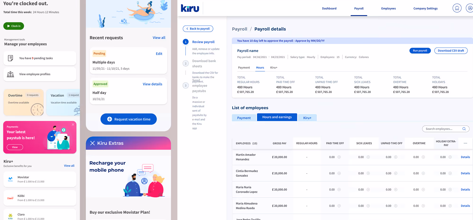
Estate Guru: Modernizing Estate Planning
Kiru: A Payroll Startup

PayPal: Unified Card System
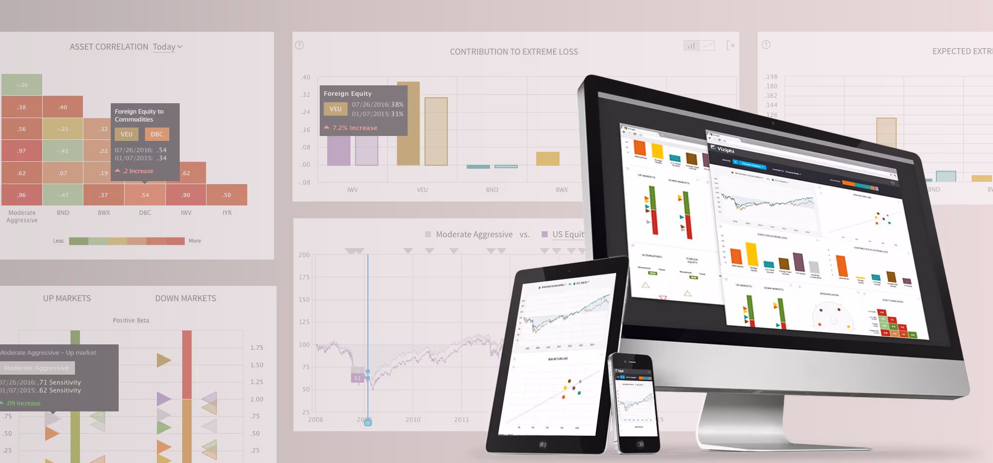
Viziphi: Visualizing Wealth
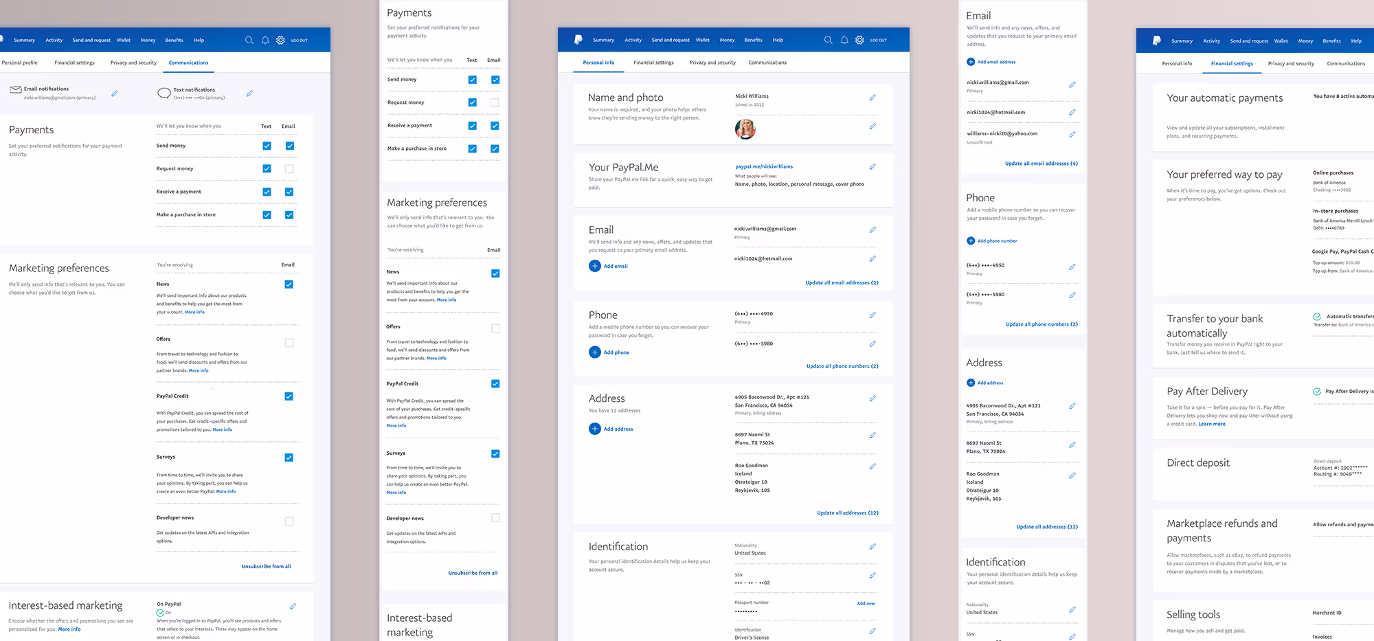
PayPal: Settings Redesign