A LATAM-focused payroll platform that streamlines payroll, taxes, and timecards while enabling employees to pay utilities at a discount.
0→9,000+
users in under 2 years
83%
CSAT
Overview
As Head of Design and one of the first ten hires at Kiru, I led the design vision for a innovative payroll platform for Latin America's underserved workforce. I built and directed a distributed design team across three countries, taking the product from concept to launch—reaching 9,000+ users and 400 corporate clients within two years.
Role:
Head of Design
Timeline:
2+ years (Pilot to market launch)
Team:
Led 4 designers (2 senior, 1 mid-level, 1 content) across USA, Colombia, and Poland
Collaborators:
CEO, CTO, COO, Head of Product, Chief Dev Architect
Scope:
B2C mobile app, B2B mobile app, B2B SaaS dashboard
Company Context:
Kiru was a startup focused on making utility costs affordable in LATAM via a payroll system that benefited each stakeholder in the value chain
The Challenge
Latin American workers faced a fragmented, opaque payroll experience that exacerbated financial insecurity, while employers struggled with compliance complexity and communication breakdowns with their teams.

1. Employees
Unreliable time tracking, invisible benefits, confusion about overtime and deductions, and limited control over fixed living costs created mistrust and financial stress.

2. Managers and Business Owners:
Scattered tools (often just Excel), complex tax codes varying by country, difficulty monitoring attendance, and poor communication channels led to compliance risks and operational inefficiency.

3. Service Providers:
Utility companies dealt with inconsistent, late payments from consumers.
The Opportunity:
Create value for everyone simultaneously—reducing costs for employees, simplifying compliance for employers, and ensuring reliable payments for service providers.
Setting the Stage
Impact At-a-Glance
User Growth
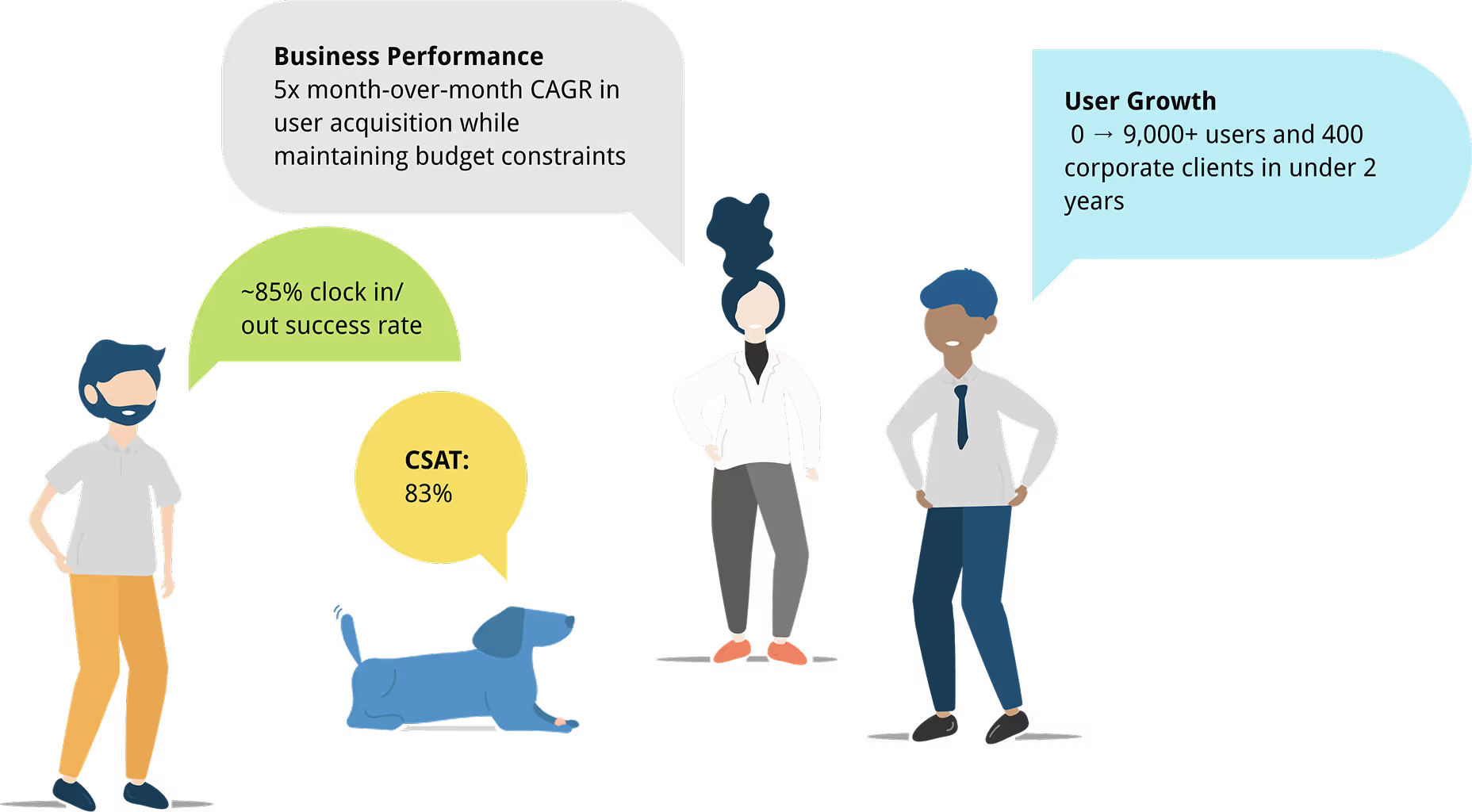
0 → 9,000+ users and 400 corporate clients in under 2 years
Employee (User) Satisfaction
NPS: 80
CSAT: 83%
80% onboarding completion
~85% clock in/out success rate
Business Performance
5x month-over-month CAGR in user acquisition while maintaining budget constraints
Skills Demonstrated
Design Leadership • User Research • Fintech UX • Design Systems • Cross-functional Collaboration • International Design Operations • Strategic Product Vision
Market Context
Kiru entered a LATAM payroll landscape dominated by Excel spreadsheets and legacy systems. With pilot operations in Costa Rica and expansion into Colombia, we faced a market where over 40% of employers used Excel without HR alignment, tax codes varied dramatically by country, and workers had virtually no fintech tools to reduce cost of living.
Business Model
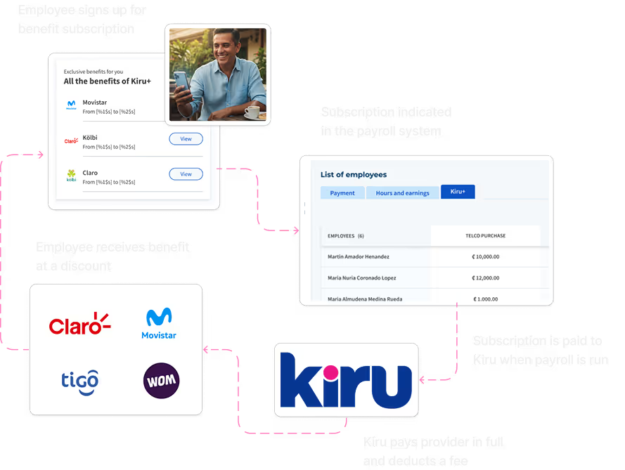
Kiru's approach was elegantly interconnected: employees gained discounted utilities (automatically deducted from paychecks), utility providers received guaranteed payments, employers accessed streamlined payroll tools, and Kiru captured value through service provider fees and dashboard subscriptions.

Discovery: Understanding a Complex Ecosystem
Research Approach
Over two years, I led comprehensive quarterly research cycles including dozens of one-on-one interviews in Spanish and English (remote and in-person across Costa Rica and Colombia), hundreds of surveys, and behavioral analytics through Pendo. Collaborating closely with the Head of Product, Head of Marketing, and front-end engineers, we continued to learn about our users and mapped their journeys and pain points to uncover valuable insights.
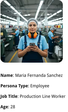
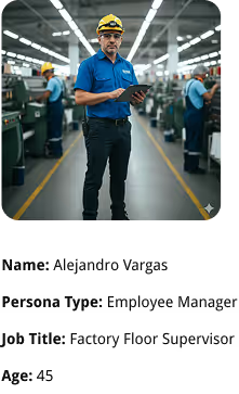


5 Critical Insights That Shaped Our Design
1. Trust Through Transparency Was Non-Negotiable
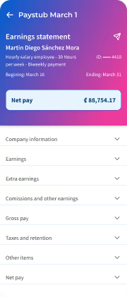
Hourly workers expressed frustration about unclear deductions and hidden overtime calculations. Many checked pay stubs multiple times due to past employer discrepancies.
Implication: Every design decision prioritized radical transparency—surfacing calculations, making benefits visible, showing exactly where money was going.
2. The Discount Model Was Validated
Over 80% of interviewed employees would subscribe to auto-deducted utility payments if they received a discount.
Implication: The marketplace feature was core to employee value proposition and needed prominent placement.
3. Compliance Complexity Was Crippling Employers
Nearly 70% of business owners struggled with tax codes, while 8/10 accountants cited automatic government submission and paystub generation as primary pain points. Over half used accountants to manage payroll.
Implication: We needed to design for employer confidence—surfacing compliance status, automating submissions, and handling regional variations seamlessly.
4. Localization Would Make or Break Market Expansion
Interviews revealed dramatic differences in labor laws, social security systems, tax thresholds, and cultural expectations across Costa Rica and Colombia.
Implication: System architecture had to be modular from day one, with localization built into the foundation.
5. The Employee-Employer Relationship Was Strained
Communication breakdowns and lack of transparency created unnecessary friction between workers and management.
Defining the Design Challenge
Design Principles
- Payroll and HR Transparency – No hidden calculations or buried information
- Improve Employee-Employer Relationships – Design as a trust-building tool
- Compliance Without Complexity – Handle regulatory nuances behind the scenes
- Localized for LATAM Context – Respect regional differences from day one
- Create Value for the Entire Ecosystem – All personas gain something meaningful
Problem Statement
"How might we alleviate the financial burden of workers in Latin America by improving payroll transparency while creating sustainable value for employers, service providers, and Kiru?"
The Solution: Three Products, One Ecosystem
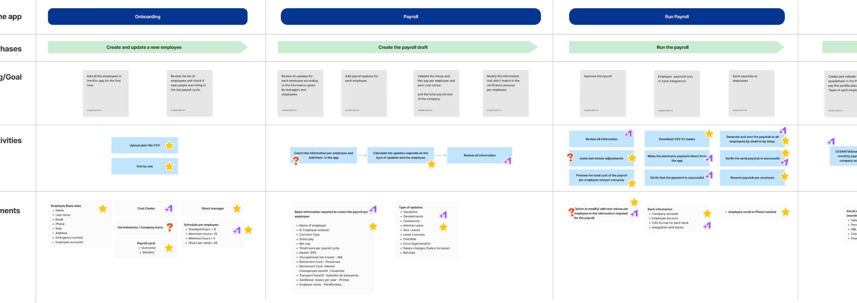
Critical User Flows
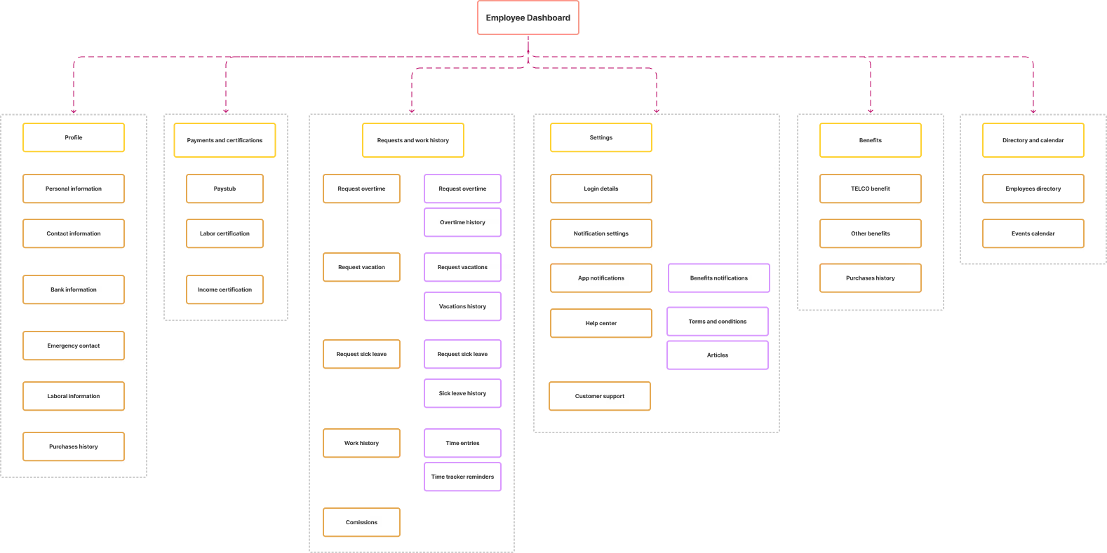
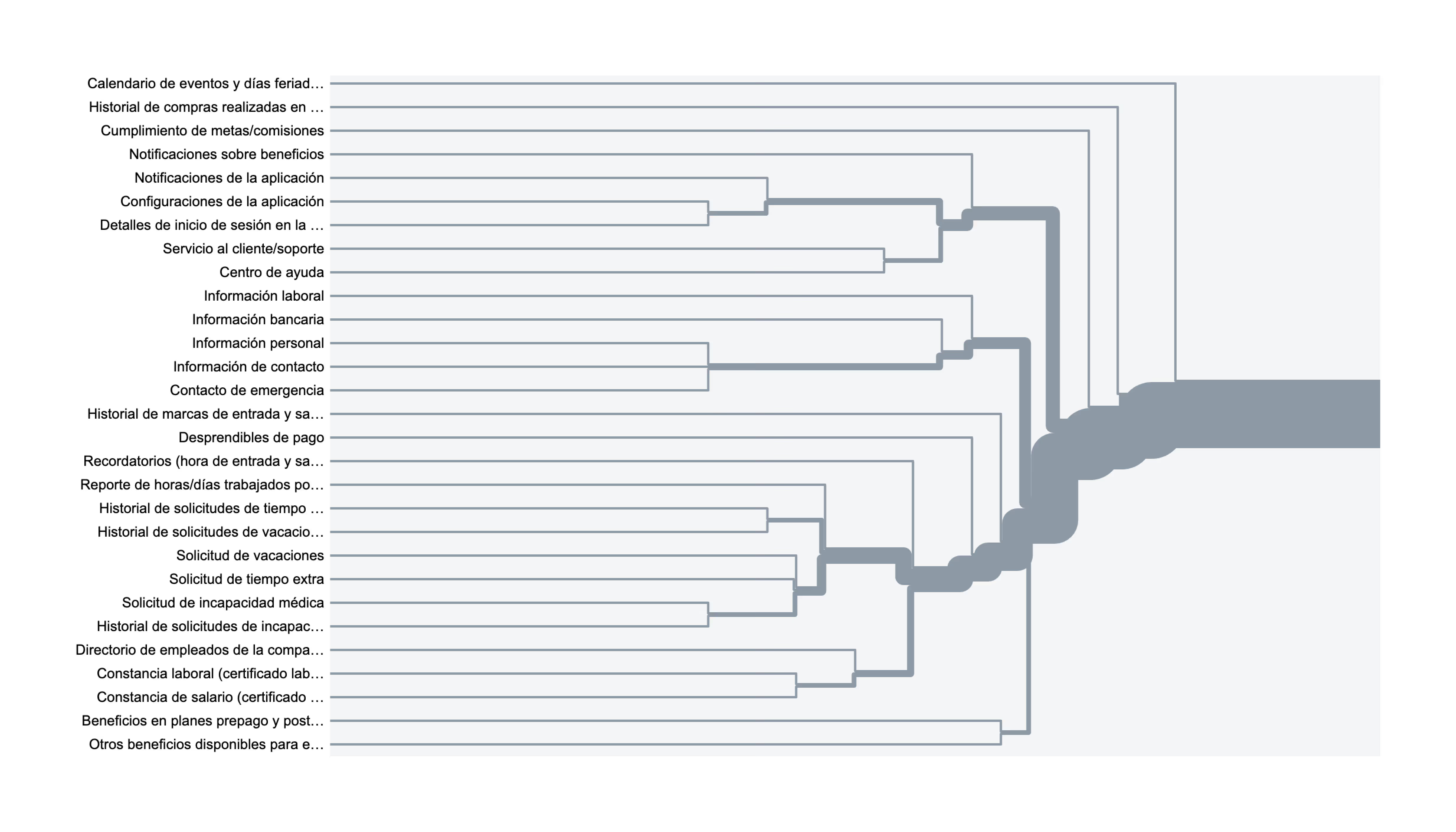
Information Architecture Strategy
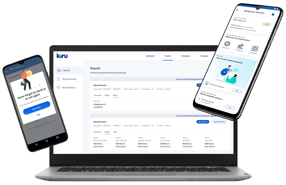
The Kiru ecosystem comprised three interconnected platforms: Employee Mobile App, Manager Mobile App (with elevated permissions), and Employer/Accountant SaaS Dashboard (web, desktop-optimized).
Employee Mobile:
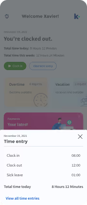
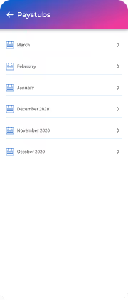
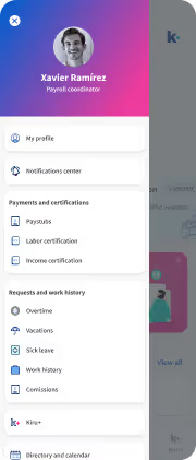
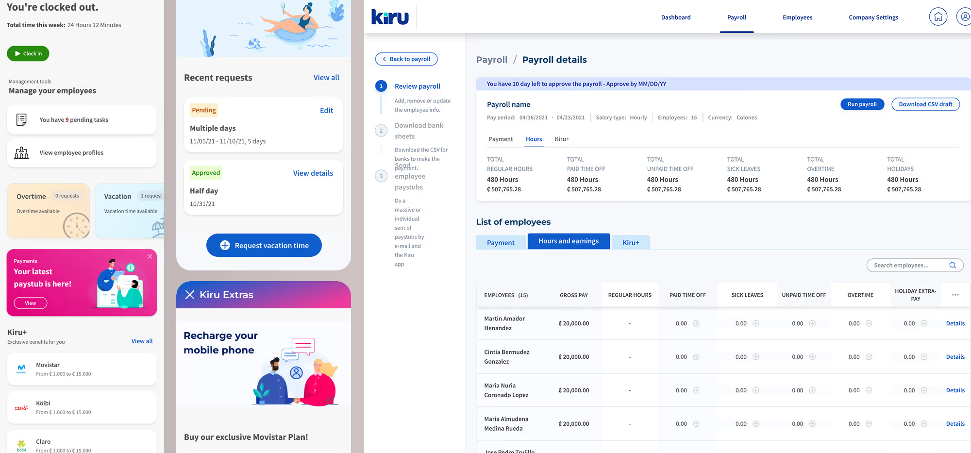
Clock in/out with GPS verification, view/request benefits, access discount marketplace, receive notifications, view pay history with full transparency
Manager Mobile:
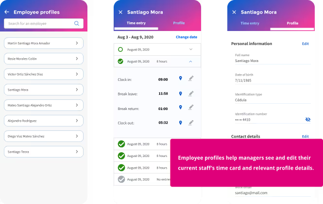
All employee capabilities plus approve/deny requests, view real-time team status, receive priority notifications, update employee profiles
Employer/Accountant SaaS:
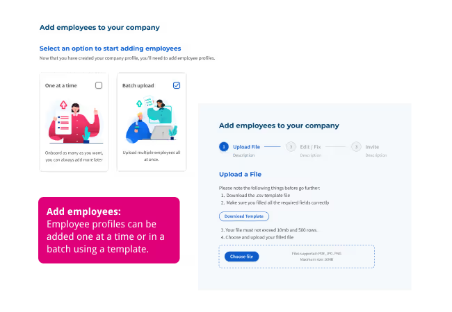
Payroll with drill-down, automated/manual runs, anomaly handling, tax compliance, policy setup, reporting, and batch employee creation
Analysis: 6 Core Features
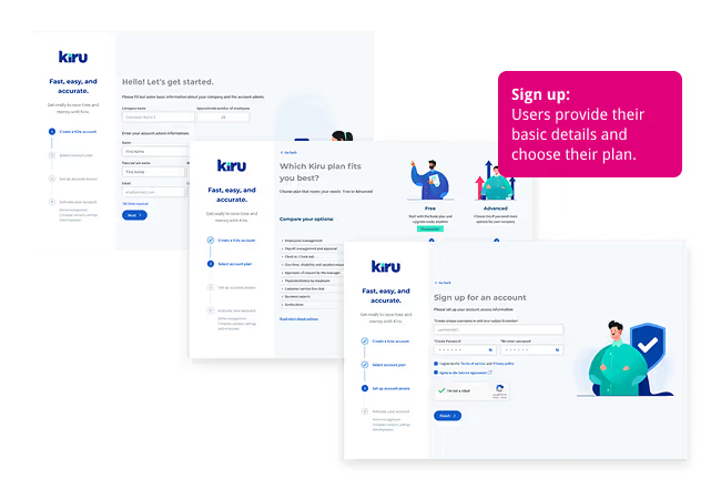
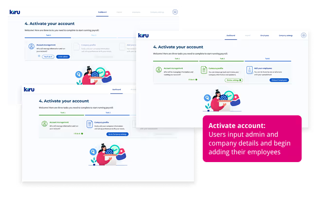
Feature 1: Company Onboarding (SaaS)
Purpose: Get employers from signup to first payroll run quickly while gathering necessary compliance information.
User Benefit: Business owners can set up entire payroll infrastructure in minutes. The system guides them through plan selection, company profile creation, and employee batch uploads. Employees receive pre-populated profiles and just verify details.
Design Approach: Step-by-step wizard with progress indicators, save-and-return capability, visual cues explaining why information matters, and clear next steps. When employees adjust information, employers receive reconciliation notifications.
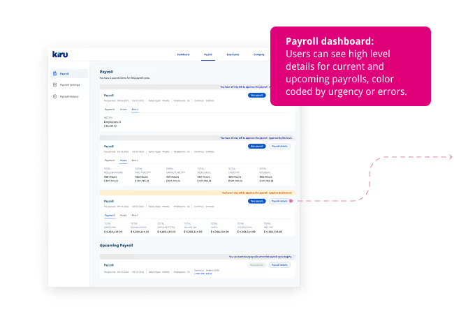
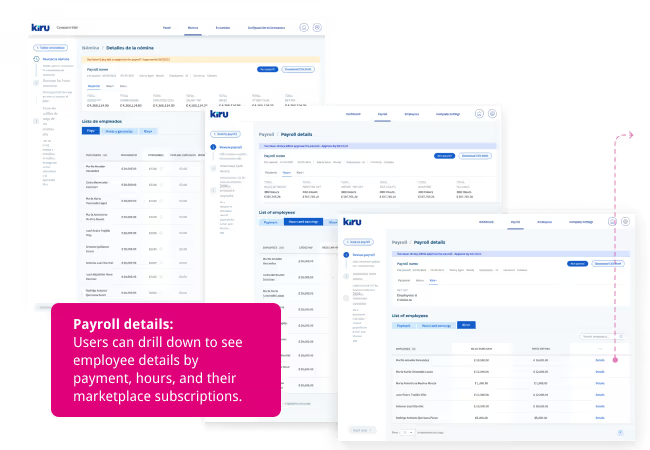
Feature 2: Payroll Processing Dashboard (SaaS)
Purpose: Give employers and accountants confidence that payroll is accurate, compliant, and ready to run while surfacing issues before they become problems.
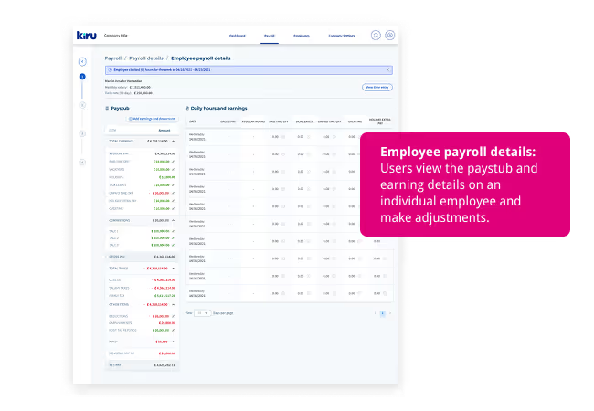
User Benefit: Instead of wrestling with Excel, users see comprehensive overview with intelligent flagging of anomalies. They can drill into individual employees, make adjustments, and run payroll with confidence—manually or on automated schedule.
Design Approach: Prioritized scanability and hierarchy with at-a-glance status indicators, clear typography, and progressive disclosure. Alert cards for issues requiring attention used specific language about what's wrong and how to fix it.
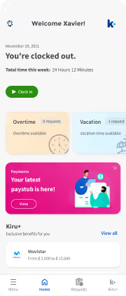
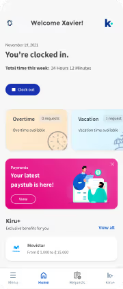
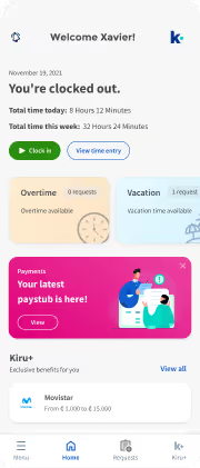
Feature 3: Employee Mobile Dashboard
Purpose: Create a home base where employees feel informed, in control, and connected to their employer while accessing Kiru's unique value.
User Benefit: Employees immediately see work status, upcoming benefits, recent employer notifications, and quick access to discount marketplace. This transformed payroll from opaque frustration into an empowering tool.
Design Approach: Warm, approachable, content-prioritized with custom illustrations. Dashboard organized into clear zones—status at top, quick actions in middle, notifications and marketplace below.
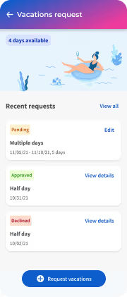
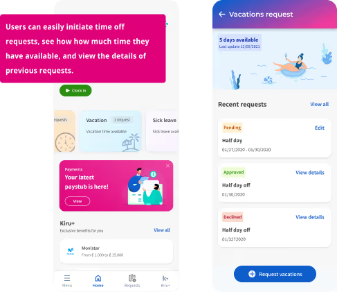
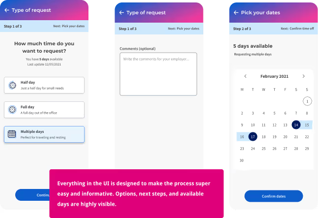
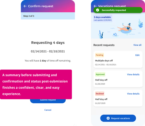
Feature 4: Vacation Request Flow (Mobile)
Purpose: Allow employees to request time off while understanding benefit status—removing uncertainty and awkwardness.
User Benefit: Employees see exactly how many vacation days they have, when they accrue more, and can submit requests directly. Managers receive notifications and approve/deny with single tap. The exchange is documented, removing miscommunication.
Design Approach: Benefit status highly visible before allowing requests. Calendar interface for easy date selection, optional notes, and conflict visibility. Clear confirmation screens and push notifications kept both parties informed.
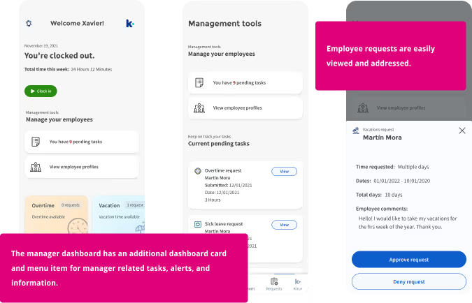
Feature 5: Manager Tools (Mobile)
Purpose: Give managers everything employees have plus oversight and approval tools without overwhelming complexity.
User Benefit: Managers stay informed about team status in real-time, respond quickly to requests, and address issues proactively. This reduces surprises and helps managers support teams effectively.
Design Approach: Extended employee app with additional "Team" section. Team dashboard showed who's working, who's approaching overtime, and pending approvals. Notification badges and priority indicators guided attention.
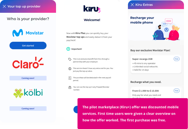
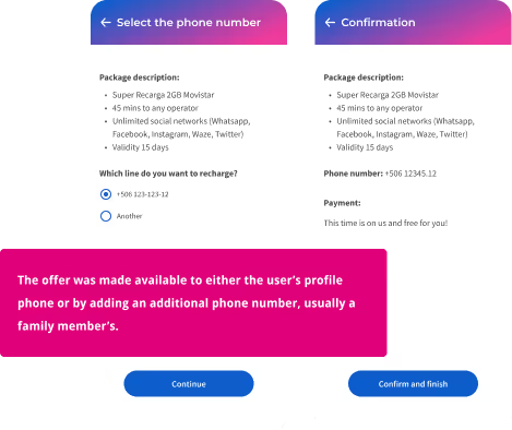
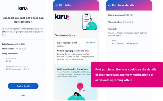
Feature 6: Discount Marketplace (Mobile)
Purpose: Deliver tangible financial value through discounted subscriptions automatically deducted from paychecks.
User Benefit: Employees save money on expenses they're already paying (electricity, water, mobile carriers, transportation) without extra effort—just one-time setup and automatic deduction. This was the hook making Kiru uniquely valuable.
Design Approach: Curated benefit feel rather than overwhelming shopping. Each service displayed discount percentage prominently and explained how deduction worked.
Design System & Accessibility
Documentation and Component Library
I oversaw creation of a comprehensive design system including UI components, custom culturally relevant illustrations, separate color palettes for mobile (warm) and SaaS (professional) meeting WCAG AA contrast requirements, hierarchy optimized for mobile screens and desktop dashboards, and custom iconography.
Documentation & Tools: Figma for design specs, Zeplin for developer handoff, Jira for task tracking, Monday for backlog management, Confluence for written documentation.
Accessibility & Localization
WCAG Compliance: All text met minimum contrast ratios, never used color alone to convey meaning, focus indicators clearly visible, descriptive page titles, consistent navigation, clear link purposes, plain language content, consistent component behavior, specific error messages, and input review/correction ability.
LATAM Considerations:
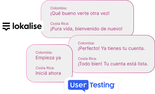
→ Language: Managed through Lokalise, supporting Spanish and English with seamless switching
→ Literacy: Clear, simple language supported by visual indicators, tested with users of varying education levels
→ Connectivity: Optimized mobile for lower bandwidth—compressed images, progressive loading, offline capability for core functions
Testing: Remote via UserTesting.com across target markets and in-person testing in Bogotá conducted by local team following research protocols I developed.
Platform Strategy: Mobile vs. Desktop
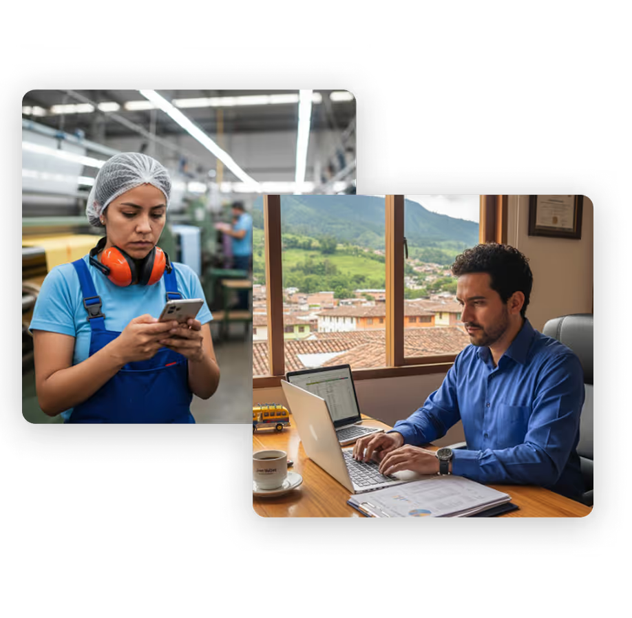
Mobile for Employees & Managers: Portability was essential—ability to clock in from job sites, check benefits during breaks, or approve requests on the move.
Desktop-Only for Payroll Initially: Research showed payroll processing was predominantly desktop activity. Employers and accountants needed screen real estate and were transitioning from Excel workflows. We launched SaaS on desktop only with 1440px minimum breakpoint.
Rationale: Target audience behavior, complexity better suited to larger screens, resource prioritization, and built-in validation mechanism—if we received mobile requests, we'd know to prioritize it.
Validation & Iteration
Testing Methodology
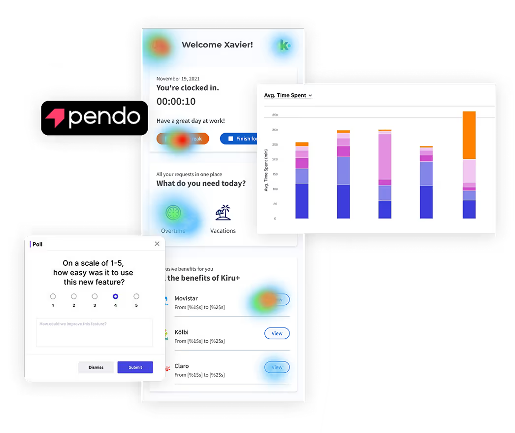
Quarterly Cycles: Moderated and unmoderated usability testing (8-10 participants per round), NPS/CSAT surveys integrated into product UX (hundreds of users), and Pendo analytics tracking click-through rates, time-on-task, and hotspot analysis.
What We Learned
Successes: Onboarding flow, mobile dashboard, and payroll processing tested exceptionally well.
Refinements:
Onboarding persistence: Added save-and-resume functionality
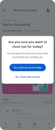
Clock in latency: Added confirmation screen with visual feedback before app closure
Manager onboarding: Redesigned flow to handle dual-role setup more elegantly
Compliance complexity: Iterative refinement with legal consultation for sick days, holiday bonuses, and government requirements
Surprises: The emotional response to transparency. In testing, employees became visibly more confident and relaxed when they could see benefit accruals and understand deductions. This validated our core principle—trust through transparency was emotionally meaningful indicators clearly visible, descriptive page titles, consistent navigation, clear link purposes, plain language content, consistent component behavior, specific error messages, and input review/correction ability.
Cross-Functional Collaboration & Leadership
Partnership Model
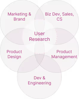
Engineering (Weekly): Design feasibility discussions, status reviews, upcoming backlog previews, joint problem-solving
Product Management (Daily/Weekly): Conducted research together, managed backlog prioritization, ran design reviews, analyzed testing results and metrics, made strategic decisions about feature scope
Business Stakeholders (Bi-weekly): Strategy alignment, go-to-market planning, ideation on business opportunities, financial feasibility discussions, decision-making on feature investments
Compliance/Legal (As-needed): Pre-launch reviews, validation of tax and compliance solutions, guidance on country-specific features

Design-to-Development Handoff
Designed in Figma with comprehensive specs, transferred to Zeplin for developer access, regular check-ins before releases to ensure quality, acceptance testing of implemented features.
Overcoming Remote Challenges: With development team in Poland (opposite time zone), I established scheduled video conferences, Slack channels with clear documentation, recorded Loom videos for complex interactions, and detailed written specs.
Leading the Design Team
Team Structure: I hired and led 2 senior designers, 1 mid-level designer, and 1 content designer across USA, Colombia, and Poland.
Leadership Philosophy: Daily one-on-ones, multiple online group sessions weekly, involved team members in high-level conversations (research, strategy, stakeholder meetings) so they understood the "why" and grew strategically, delegated significant features with autonomy, and conducted regular 360 feedback sessions.
Influence Without Authority: Built trust through consistent, research-backed recommendations; spoke the language of business impact alongside user needs; demonstrated design value through rapid prototyping that de-risked decisions; partnered rather than dictated; and delivered excellent work that made stakeholders design advocates.

"I've been looking for a product like Kiru for years. It's so easy and does everything I need it to!"
— María Francisca, Business Owner
Outcomes & Business Impact
Qualitative Impact
User Feedback:
Employees frequently mentioned feeling "more in control" and "finally understanding" their pay and benefits—language validating our transparency-first approach.
Stakeholder Feedback: C-level team expressed strong satisfaction with product performance, user reception, and market traction. The CEO noted design quality became a sales differentiator.
Team Impact: Established design as strategic function, created scalable processes, built design culture influencing other departments, mentored designers who led initiatives elsewhere.
Quantitative Results
User Growth (Under 2 Years):
0 → 9,000+ users and 400 corporate clients with 5x month-over-month CAGR in user acquisition within budget constraints
Product Performance:
80% onboarding completion, ~85% clock in/out success, NPS of 80, CSAT of 83%
Operational Success:
Costa Rica pilot within 6 months, Colombia expansion within 1 year, deployed mobile in Spanish and English, scaled to support ~100 employees across organization
Market Positioning
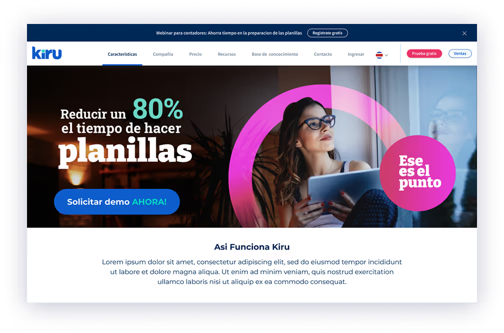
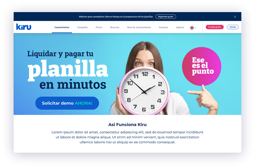
Kiru differentiated itself by being designed specifically for LATAM contexts, offering unique employee value (discount marketplace), integrating payroll/time/HR seamlessly, and providing excellent UX in a category known for poor design.
Reflections & What I Learned
What Worked Well
1. The Team I Built
Despite time zones and physical distance, we maintained cohesion, quality, and morale. Designers I hired were talented, collaborative, and deeply committed to serving underserved users. Watching them grow and take ownership was incredibly rewarding.
2. Research-Driven Design in an Underserved Market
We invested heavily in understanding real user needs. This wasn't designed from Silicon Valley assumptions—it was built on deep empathy for LATAM workers and employers. That authenticity drove adoption.
3. Strategic Complexity of Multi-Sided Platform Design
Designing three interconnected products on two platforms for remote, international markets in under two years required strategic thinking, ruthless prioritization, and constant balancing. I'm proud we maintained design quality while shipping rapidly.
What I'd Do Differently
1. Diversify Funding Sources
Although fully funded from the start, we had a single funding source. When that source chose to exit due to political and economic barriers, the entire company shut down despite strong performance. I'd push harder for diversified funding to reduce single-point-of-failure risk.
2. Start Smaller, Then Scale
We tackled the entire ecosystem simultaneously. While this created compelling integrated experience, it stretched resources and increased risk. I'd advocate for solving a core problem exceptionally well first, proving the model, then expanding. This would provide more room to pivot if we'd discovered business model issues.
3. Localization Strategy from Day One
Localization became urgent faster than anticipated. While we built modularity, I should have prioritized a comprehensive localization strategy—including translation workflows, regional design variations, and compliance frameworks—from the very beginning. We implemented Lokalise mid-flight, which worked, but earlier planning would have reduced technical debt.
The End of Kiru & Lessons Carried Forward
What Happened
Kiru closed when the owner/funder discovered political and economic barriers complicating monetization in expansion markets. Rather than pivot or sell, the decision was made to close entirely.
What This Taught Me
Design Excellence Doesn't Guarantee Business Success
We created a useful product users loved with strong metrics, but product success exists within larger business context shaped by market dynamics, regulatory environments, and stakeholder decisions beyond design's control. This deepened my understanding that design leadership requires fluency in business strategy, market realities, and risk assessment—not just user empathy and craft.
Transparency in Leadership Matters
I maintained open communication with my team about challenges and uncertainties. When Kiru closed, this foundation of trust meant team members understood the context. I've carried this commitment forward—being honest about business realities while maintaining morale.
Connection to the Bottom Line
My work has become more explicitly connected to revenue, market positioning, and business sustainability. I now ask harder questions earlier: What's the path to profitability? What are regulatory risks? How do we validate business model assumptions, not just product assumptions?
Key Takeaways for Design Leaders
If you're designing a multi-sided platform in underserved or emerging markets:
1. Research Across All Ecosystem Sides – Understand every stakeholder to reveal constraints and opportunities
2. Design for Trust in Low-Trust Environments – In markets where workers have been burned, transparency is the foundation
3. Localization Is Product Strategy – Regional differences in regulation, culture, and infrastructure fundamentally affect product design
4. Balance Complexity With Clarity – Don't hide complexity; manage it by showing users what they need when they need it
5. Design Systems Enable Scale – Early investment in comprehensive design systems pays dividends repeatedly
6. Lead With Empathy, Decide With Data – Emotional commitment paired with rigorous testing and validation
7. Business Acumen Is a Design Skill – Understanding unit economics, regulatory risk, and business model viability makes you more effective
Closing Thoughts
Designing Kiru was one of the most challenging and rewarding experiences of my career. I'm proud of what we built—a product that genuinely improved people's financial lives and demonstrated that fintech could serve underserved markets with dignity and excellence.
The closure was painful, but it doesn't diminish the value. We proved transparent, user-centered design could drive adoption in a traditionally dry category, showed multi-sided platforms could create value for all stakeholders, and built a design culture that elevated the organization.
Most importantly, we listened to people often overlooked by technology and created something that truly helped them. That's the work I'm most proud of, and the approach I carry forward: deep empathy paired with strategic rigor, craft excellence paired with business understanding, and commitment to designing systems that create meaningful value for real people.
FAQ
Eric Tomlinson was Head of Design and one of Kiru’s first ten hires. He led the design vision from concept to launch, built and managed a distributed team across three countries, and guided UX across mobile and SaaS products.
Kiru addressed a fragmented and opaque payroll experience that increased financial stress for workers and created compliance complexity for employers—while also reducing reliability for service providers receiving payments.
Kiru designed a connected payroll ecosystem with three products: an employee mobile app, a manager mobile app, and an employer/accountant SaaS dashboard—serving employees, employers, and service providers as one integrated value chain.
Kiru grew from 0 to 9,000+ users and 400 corporate clients in under two years, reached 83% CSAT and NPS 80, and achieved strong onboarding and key task success rates while scaling acquisition rapidly.
Eric led ongoing quarterly research cycles including one-on-one interviews (in Spanish and English), surveys, and behavioral analytics, then translated insights into information architecture, design principles, and validated flows across the ecosystem.
This was a multi-sided platform spanning mobile and SaaS, designed for underserved users and varying regulatory environments across LATAM—requiring trust-building transparency, modular localization, and careful handling of compliance complexity.
Research showed hourly workers distrusted payroll due to unclear deductions and overtime. The product prioritized radical transparency—making calculations visible, clarifying where money goes, and reducing friction between employees and employers.
You can reach out directly using the links in the footer below, or head back to the Projects page to see more of my work.
