
Unifying PayPal’s Card Experiences for Scale and Consistency
10M+
active users
40%+
increase in feature adoption
Unified Card Management
Overview
As the Lead Product Designer on PayPal's Consumer Financial Services (CFS) team—spanning both web and mobile—I was responsible for driving the end-to-end design of two new product initiatives and leading a comprehensive redesign of an existing financial experience. CFS focused on democratizing financial access for underbanked populations through products like the PayPal Cash Card and Early Wage Access (Paychex/PayActiv partnerships)—alternatives to predatory payday lending. For the Unified Card System, I oversaw the full UX strategy and execution, from defining user journeys and interaction patterns to collaborating closely with product and engineering partners to ensure feasibility and alignment.
In collaboration with the Content Designer and Product Manager, I also planned and conducted user interviews, usability studies, and validation research to ground the work in real customer behavior and needs. These insights informed key design decisions, helped shape the product roadmap, and ensured the solution delivered a consistent, trustworthy, and intuitive card-management experience across PayPal's ecosystem.
Role:
Lead Product Designer, User research
Timeline:
3 months
Team:
Lead Product Designer, Lead Content Designer, Lead Product Manager, UX Research
Collaborators:
Head of Product
Scope:
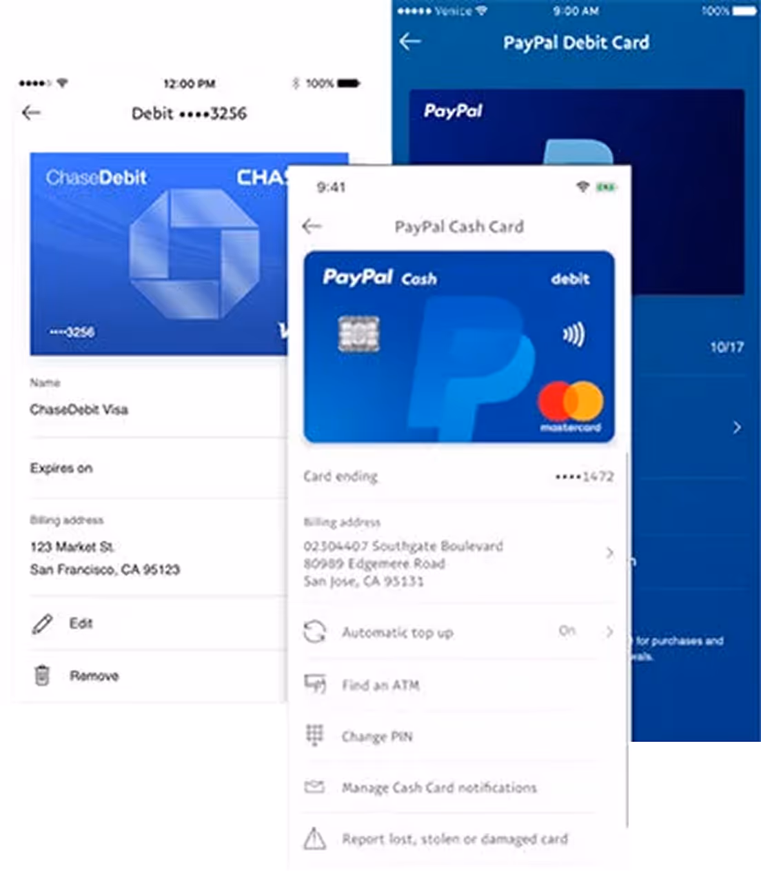
5 different UI for cards (business, personal, debit, etc), both mobile and web
Company Context:
PayPal is a multinational financial technology company operating an online payments system in the majority of countries that support online money transfers. Within PayPal, Consumer Financial Services (CFS) focused on democratizing financial access for underbanked populations through products like the PayPal Cash Card and Early Wage Access.
The Challenge
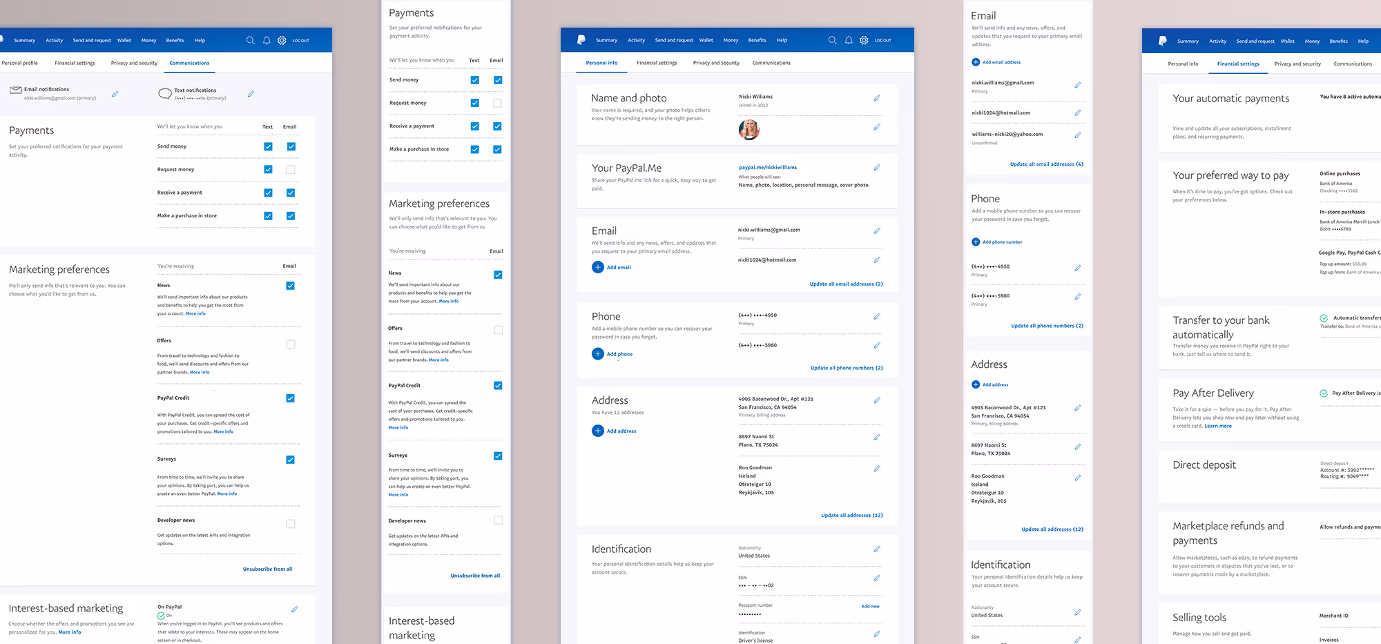
During the time that PayPal was a part of eBay, the legacy card products had developed in isolation, resulting in fragmented design, inconsistent interfaces, duplicate work, and higher maintenance costs. This lack of unification spanned card types, platforms (web and mobile), and account types (consumer and merchant), covering the full lifecycle from awareness to ongoing management.
This case study focuses on unifying the servicing and management experiences across all card offerings. This work was particularly critical for the PayPal Cash Card, a debit product designed for underbanked users without access to traditional banking. For these users, clear and trustworthy card management was essential to building financial confidence.
Our Goals
- Design consistent, flexible, and scalable experiences across all card products, supporting the needs of multiple products, stakeholders, and markets—both current and future.
- Update the UI to align with PayPal’s modern design standards and quality guidelines.
- Introduce new servicing features based on market research and the voice of the customer, including: lock card, copy card number, and automatic top-up for debit cards.
How We Determined Success
- Customers experience consistent and seamless interactions across all cards, resulting in decreased time on task and overall customer satisfaction.
- New features and improvements can be launched simultaneously across all cards and markets.
- Speed to market is improved overall, enabling PayPal to offer card products globally, efficiently.
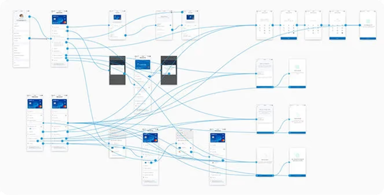
Step 1: Understanding the Project Scope by Mapping the End-to-End Cycle of Different UX
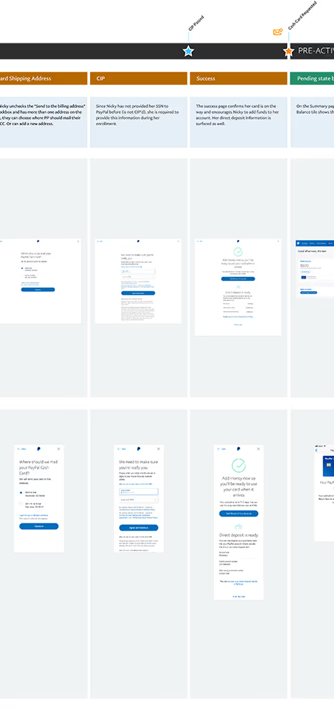
Given the complexity of this initiative, we approached the project from a full end-to-end user experience perspective. The effort spanned multiple card products across consumer and merchant accounts, on both web and mobile platforms, requiring us to identify commonalities and differences in user flows. Below are excepts of the PP Cash Card user story, covering the entire lifecycle—from awareness and enrollment to activation and ongoing servicing, all the way through account closure.
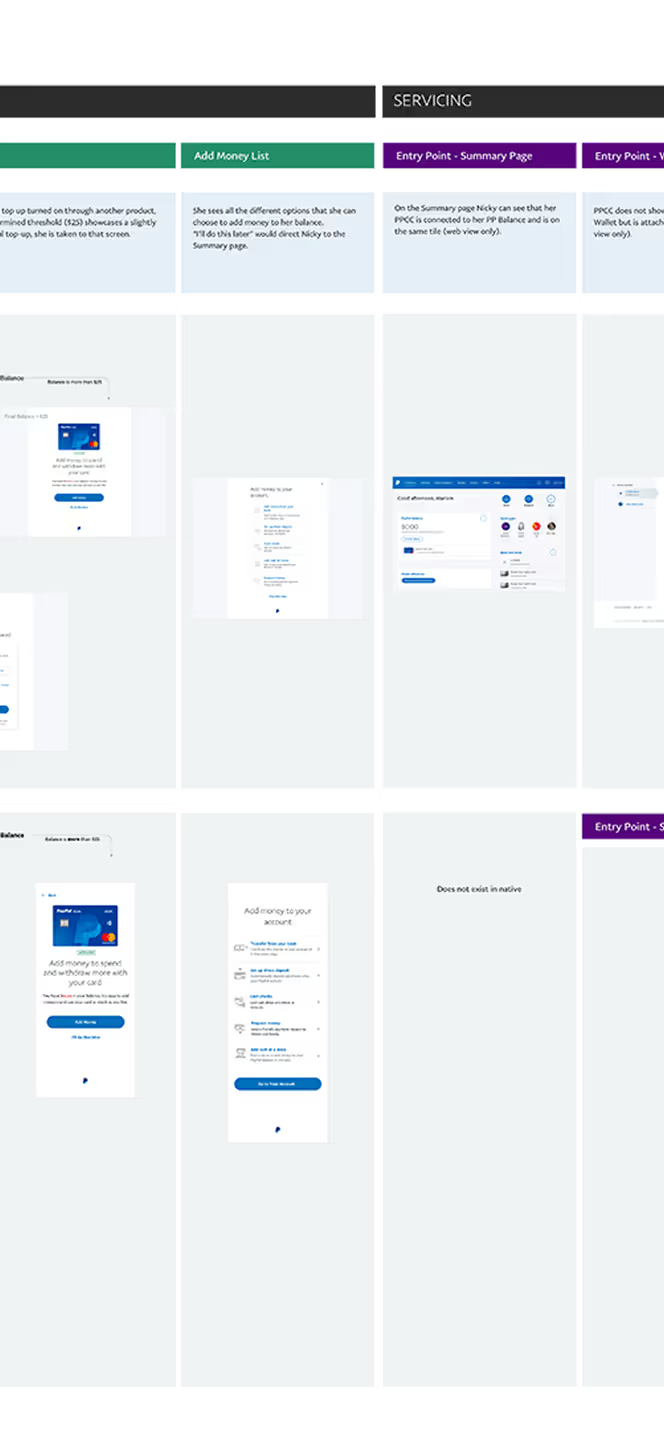
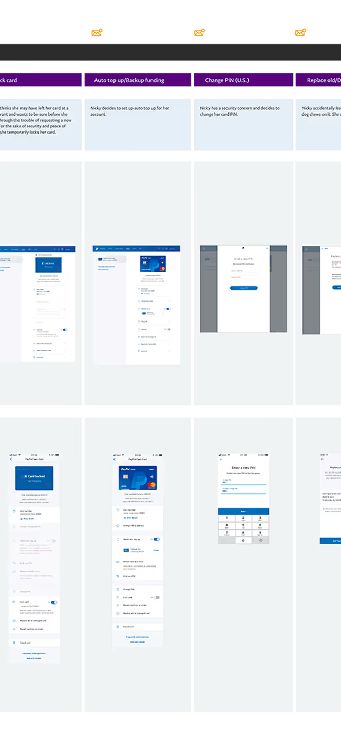
Focus Area for This Case Study
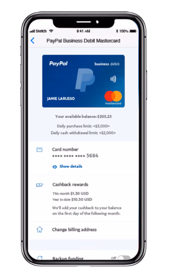
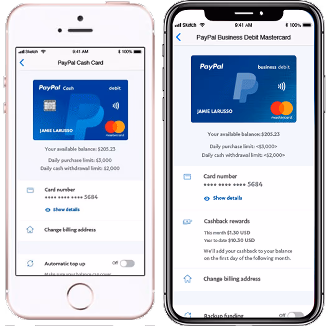
This case study focuses on the mobile experience for the PP Cash Card, highlighting card management organization and UI, the copy card number feature, and the lock card feature. Both web and mobile frames are shown here to illustrate that there was design consistency and functional alignment across platforms.

Research Strategy and Problem Analysis
Our goal was to understand what worked across the board in card management and uncover opportunities for clarity and efficiency. We used a mixed-methods research approach that included:
- Content audit and organization through in-lab card sorting
- Unmoderated task testing to establish baselines
- In-lab qualitative research sessions for deeper behavioral insight
- Validation testing with iterative prototypes
- Four in-lab sessions across North America
- One final unmoderated round to test new features at scale
The project kicked off with a cross-functional alignment on scope, process, timelines, and sprints. We gathered insights and requirements from consumer, merchant, and customer service teams, analyzed a year of card product metrics with our data analyst, and conducted a competitive feature review. These efforts informed user journey consolidation and hypotheses for a unified, scalable card servicing experience.
Step 2: Ideation and Validation
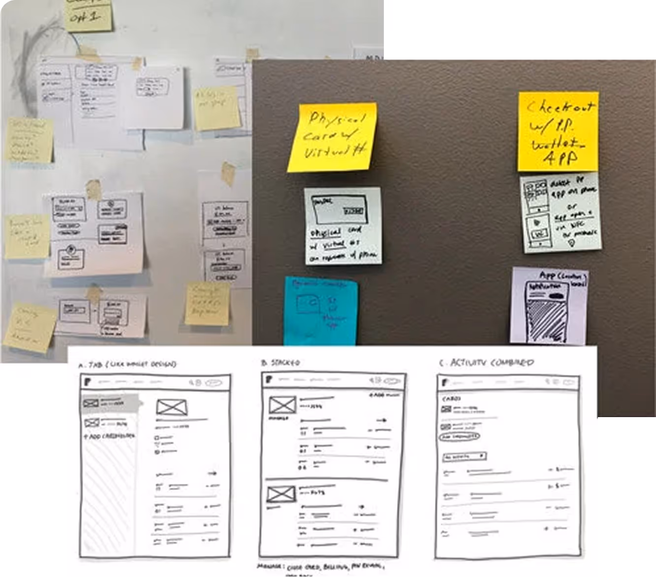
Closed Card Sorting and Brainstorming
To establish a scalable information architecture, I led a collaborative brainstorm with stakeholders from multiple teams to audit existing and future features, define flexible groupings, and align on labeling strategies.
We then conducted closed card sorting with customers in the PayPal lab to validate our hypotheses around organization and mental models.
User Testing: Iterating Toward the Solution
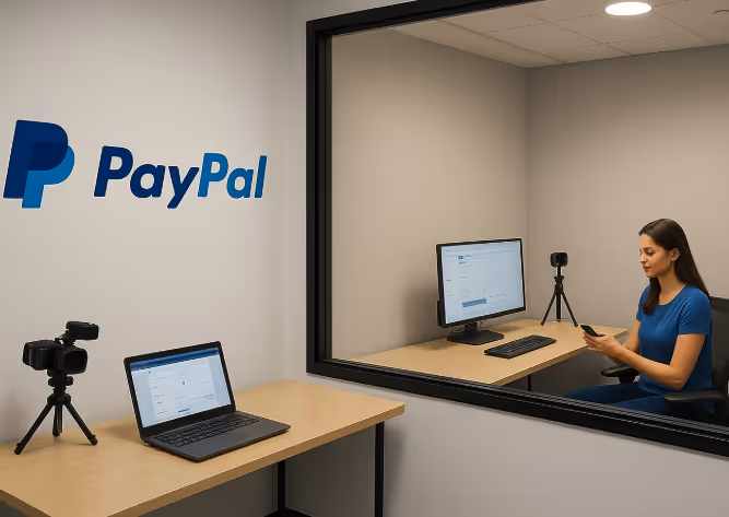
User testing was conducted in the user testing lab on the PayPal campus in San Jose, CA. Tests were conducted both in person and remotely.
First Approach
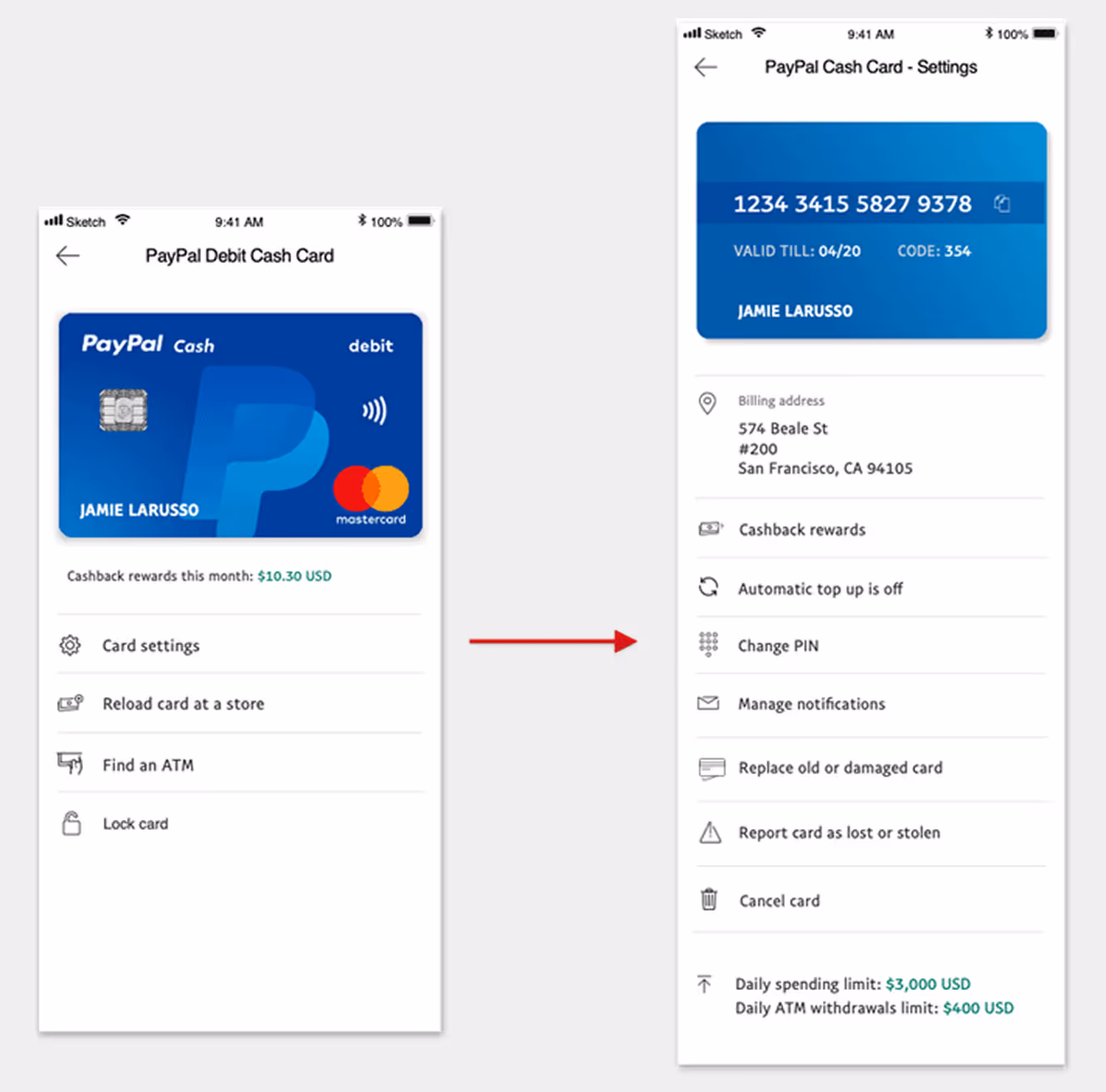
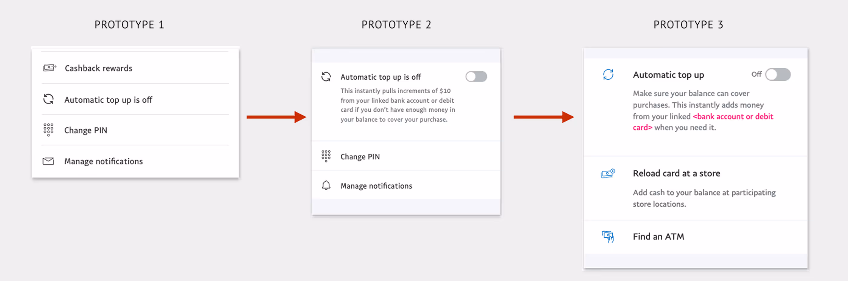
Early prototypes prioritized simplicity—surfacing minimal information to reduce cognitive load and support scalability.
Settings were grouped into a single “Card Details” section, while Lock Card and Copy Card Number were tested for discoverability.
Feedback revealed key issues:
- Too many taps and disjointed flow
- Poor discoverability for Lock Card and Copy Card Number
- Confusion around Automatic Top Up (balance vs. card)
- Accessibility and security concerns in card detail exposure
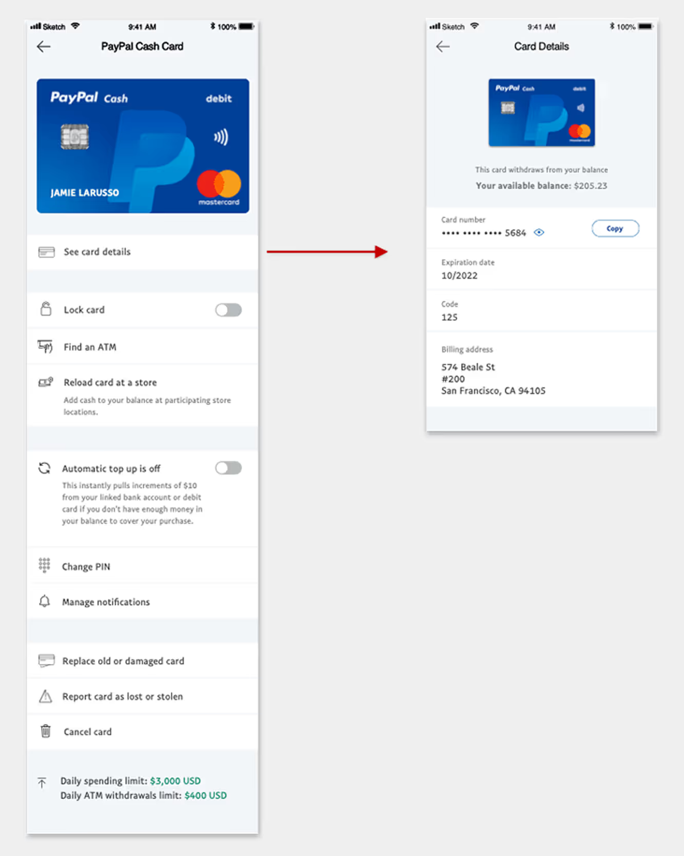
Next Iteration
Informed by user feedback, I refined the layout to surface key settings directly on the landing page while nesting detailed views.
Adjustments including:
- Improved typography and grouping for scanability
- Clearer content for Automatic Top Up comprehension
- A complete redesign of the Copy Card Number interaction
- Continued emphasis on Lock Card based on strong user interest
Testing showed major improvements in navigation efficiency and comprehension, though grouping and prioritization still needed refinement.
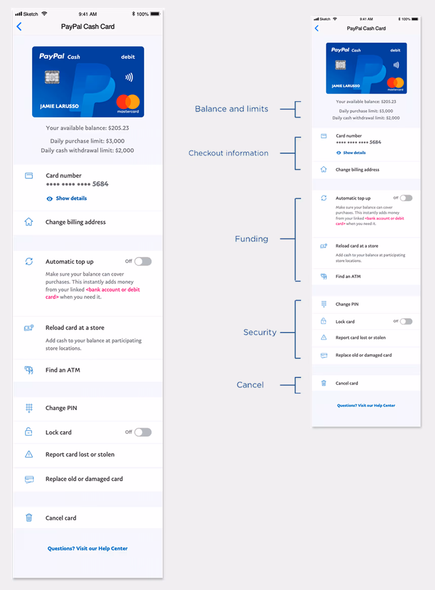
Arriving at the Solution
The final design surfaced essential information upfront with clear, logical grouping. Enhanced typography and iconography made the layout more scannable and accessible.For card details, an accordion pattern provided both security and ease of access without navigating away.
Balance and spending limits were aligned with the card for visibility but visually downplayed to avoid overemphasis.
Results:
- Users completed tasks faster with minimal effort
- Clear feature hierarchy improved comprehension
- Grouping validation confirmed scalability across markets
One crucial insight: users seeking top-up features benefited from higher placement, while Lock Card and PIN management performed well even when lower on the page—confirming grouping success and user prioritization.
Feature Evolution Through Testing
Evolution of entry points
In addition to the order and architecture of the features, improvements were made to the UI that greatly enhanced the experience. As mentioned before, one of the changes that improved comprehension was grouping the features. Improvements were made in typography and content for hierarchy and comprehension. Changing the color of the icons to blue also improved compression and modernized the designs.
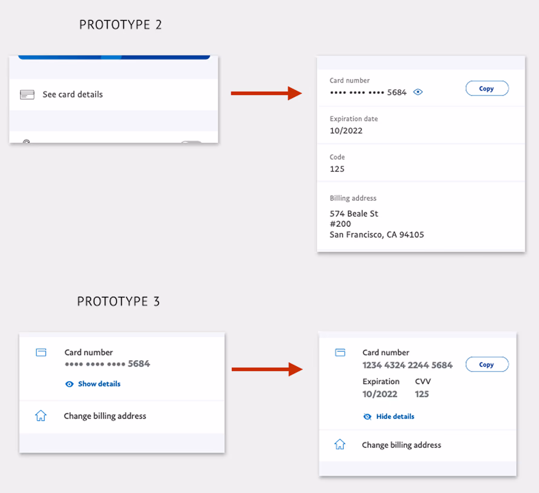
Evolution of Copy Card Number
This feature emerged from early brainstorms, market analysis, and user data showing customers manually entering card details for merchants lacking PayPal checkout.
Our goal: empower users to pay anywhere while keeping security and accessibility intact.
Using the accordion pattern, sensitive details remained hidden until intentionally revealed. Testing showed strong enthusiasm—users appreciated the control and flexibility this offered.
The concept’s success has since influenced broader product development, supporting PayPal’s vision of enabling payments anywhere, seamlessly.
Lock Card
The Lock Card feature was born from a combination of market analysis and voice-of-customer insights gathered through PayPal’s customer service teams. Competitor offerings were already introducing similar capabilities, and we discovered that many users would temporarily misplace their card, cancel it, then call back once it was found—creating frustration for customers and unnecessary replacement costs for PayPal.
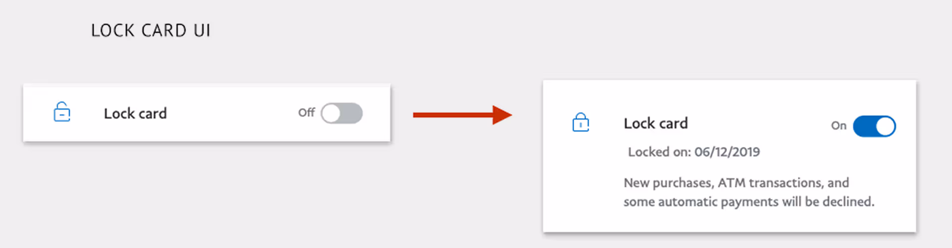
This was a clear on/off interaction, so a simple switch control was the most intuitive pattern. The challenge lay not in the UI component, but in how we communicated the locked state—what users could or couldn’t do, and when that information appeared.
Messaging was surfaced only when contextually relevant—keeping the overall experience streamlined and informative rather than interruptive.I also designed a new lock icon within PayPal’s UI library standards, ensuring visual clarity and immediate recognition of card states.

Outcome and Impact
The redesigned Settings experience and introduction of Lock Card tested extremely well, improving both usability and user satisfaction.
- Unified Card System (UCS) launched in February 2020
- Enabled scalable expansion of card products into new markets
- Reduced customer service calls related to card loss and replacement by 20%
- Accelerated delivery of new features and card products by +40%
The success of Lock Card demonstrated how user-centered design, clear communication, and scalable patterns can create measurable impact across both customer experience and business outcomes.
FAQ
Eric Tomlinson was the Lead Product Designer on PayPal’s Consumer Financial Services team, responsible for end-to-end UX strategy and execution across web and mobile—including user journeys, interaction patterns, and close collaboration with product and engineering for feasibility and alignment.
The Unified Card System was critical to PayPal's Consumer Financial Services division, which served underbanked populations globally. Products like the PayPal Cash Card provided debit access to users without traditional bank accounts, and Early Wage Access partnerships (Paychex, PayActiv) offered alternatives to predatory payday lending. By unifying card management across these products, we enabled faster delivery of financial inclusion features to millions of users who depended on PayPal as their primary financial service.
PayPal’s card products had evolved in isolation, creating fragmented experiences across card types, platforms, and account types. The Unified Card System unified card servicing and management into consistent, scalable patterns—reducing duplicate work and long-term maintenance costs.
The goals were to design a consistent and flexible card management experience across all card products, align the UI to PayPal’s modern design standards, and introduce new servicing features informed by customer insights—such as Lock Card, Copy Card Number, and Automatic Top Up.
The team used a mixed-methods approach including content audits, in-lab card sorting, unmoderated task testing, in-lab qualitative sessions, validation testing with iterative prototypes, metric analysis, and competitive feature reviews.
Key improvements included a unified information architecture, better feature grouping and hierarchy, an improved Copy Card Number interaction using an accordion pattern for sensitive details, and a Lock Card toggle designed for clarity and secure communication of state.
The Unified Card System launched in February 2020, enabled scalable expansion into new markets, reduced customer service calls related to card loss and replacement by 20%, and accelerated delivery of new features and card products by +40%.
Unification created reusable patterns across multiple card types and platforms, allowing improvements and new features to roll out more consistently across markets—improving speed to market while maintaining a trustworthy, coherent user experience.
Thank you!
I appreciate you taking the time to explore this project and the process behind it. If you’d like to connect, I’d love to hear from you—whether it’s to discuss a potential collaboration, compare notes on design challenges, or just say hello.
You can reach out directly using the links in the footer below, or head back to the Projects page to see more of my work.
Selected work
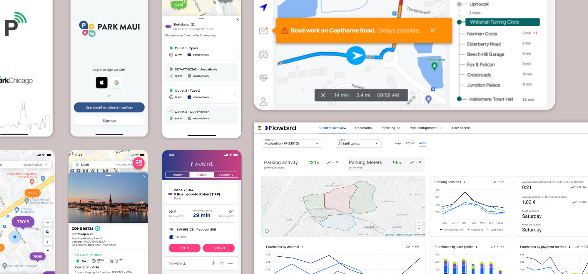
Flowbird: UX Maturity
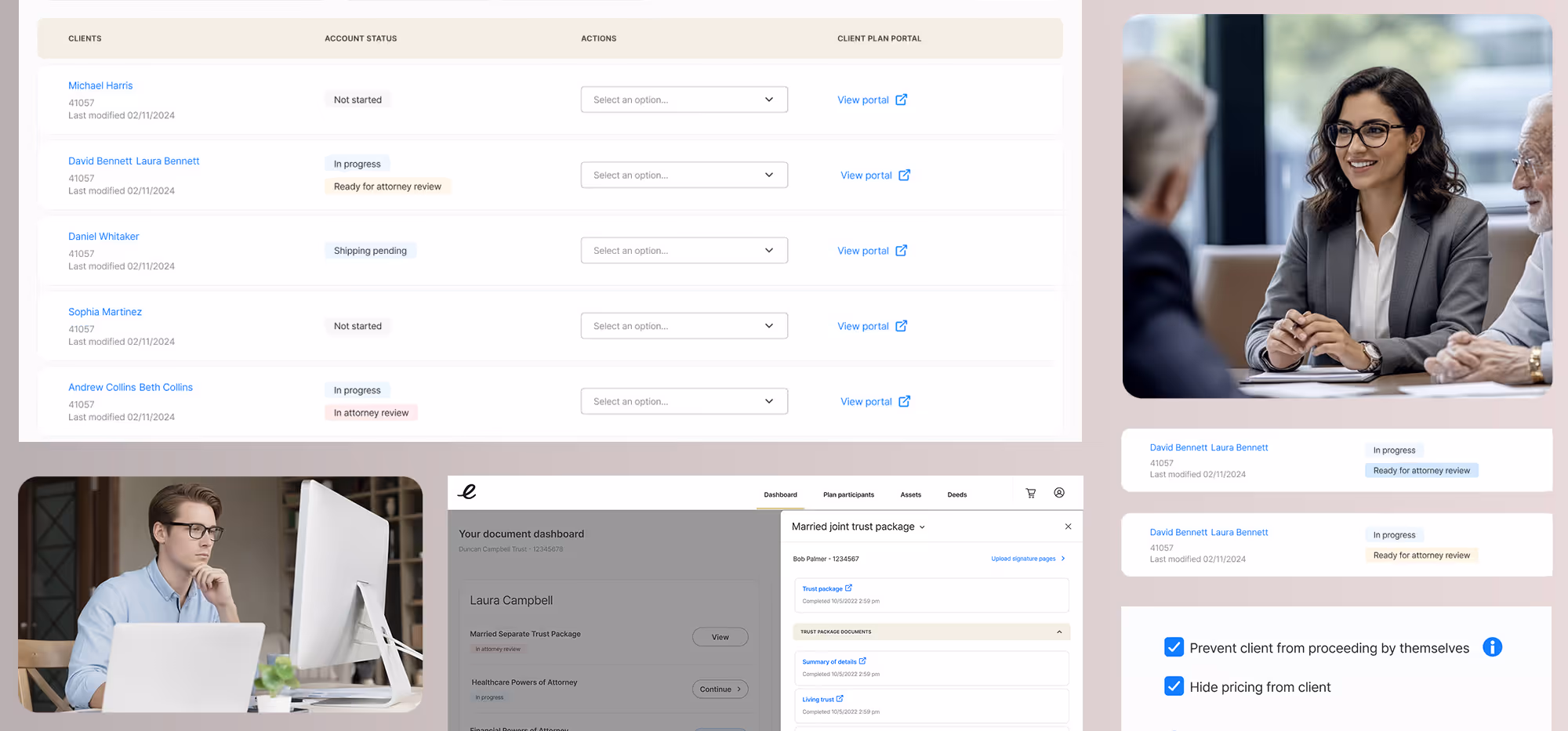
Estate Guru: Modernizing Estate Planning
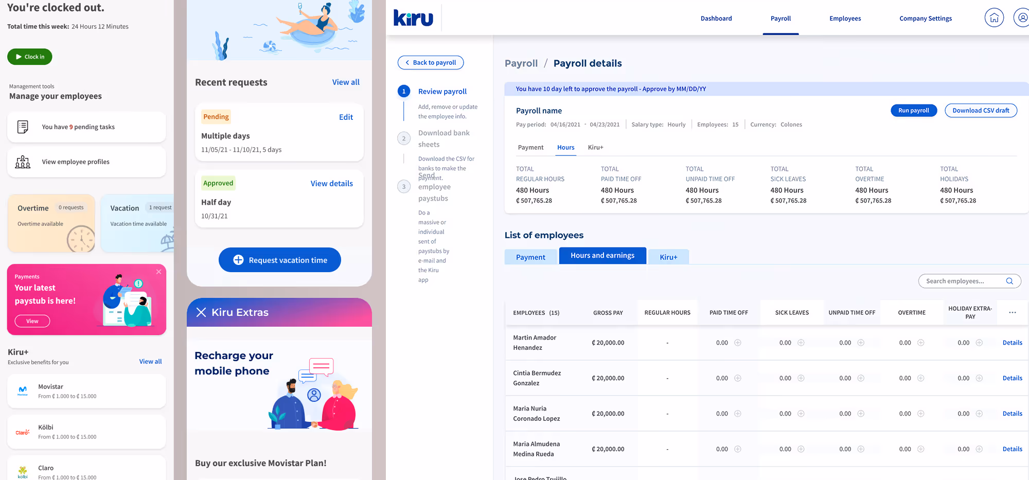
Kiru: A Payroll Startup

PayPal: Unified Card System
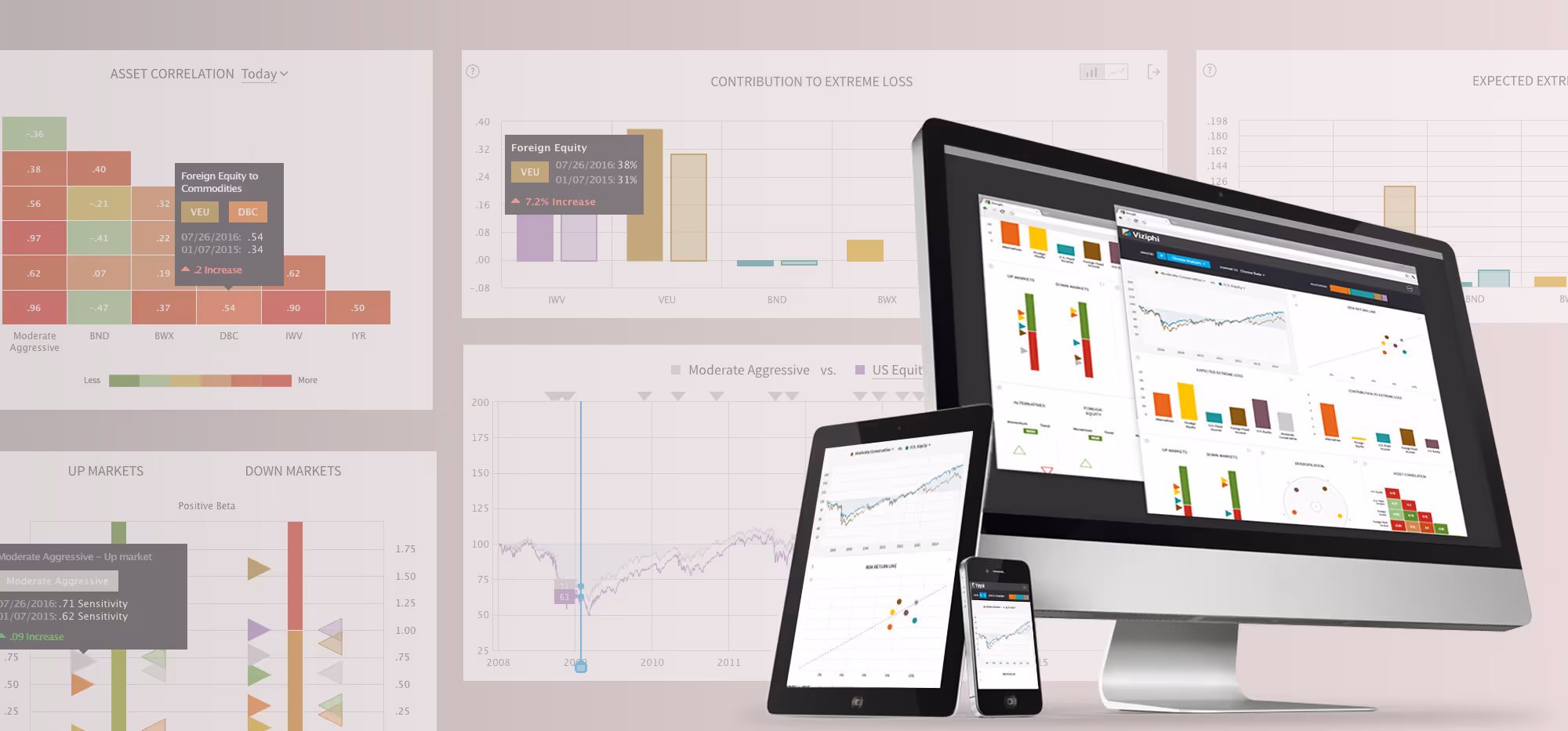
Viziphi: Visualizing Wealth
PayPal: Settings Redesign
RoleCall: A Platform for K-12 Staffing