Euvic / Alter Domus
The product didn't need less complexity. It needed a better way to handle it.
The product didn't need less complexity. It needed a better way to handle it.
Overview
I joined Euvic as a fractional Head of Design, working with one mid-level designer and limited time on the CapAssure project. My role covered design direction, product UX strategy, design quality, and review with client leadership. I also stayed hands-on where the complexity of the product made direct involvement worthwhile. That distinction shaped the work. I couldn't design every screen. I had to decide where my attention would materially change the product, where the designer could carry the work forward, and where a design decision could have consequences beyond the screen in front of us.

Role:
Fractional Head of Design

Timeline:
2 years (total engagement with Euvic)

Team:
1 Mid-level Designer, Lead Product Manager

Client:
Euvic / Alter Domus

Outcomes:
45% improvement in user satisfaction · 25% reduction in time on task
The Challenge
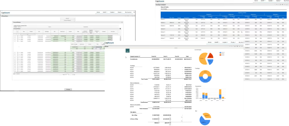
CapAssure is an enterprise platform for fund administration. Its users work with complex financial structures, calculations, allocations, reporting, and relationships between entities. The difficulty wasn't that the product contained too much information. The difficulty was making those relationships understandable and workable without stripping away distinctions that mattered to expert users. That became particularly apparent in the way the product handled rollups.
Goals
- Make the underlying financial model legible without removing the distinctions expert users depend on.
- Give each part of the roll-up task a clearer place: establishing context, working with the structure, and editing it.
- Establish patterns that hold together across the product rather than on individual screens.
What success looked like
- Users could tell where they were in a structure without reconstructing the context each time.
- Distinctions that mattered to the domain stayed visible and stayed usable.
- Improvement showed up in satisfaction and time on task, not only in how the screens looked.
Mapping the product before changing it
Before designing, I worked with the team to map how the product's major areas related to one another: Dashboard, LP Waterfall, GP Carry and Forecasting, and the roll-up structures feeding them. Understanding where information originated and where it surfaced is what determined which problems were worth direct involvement.
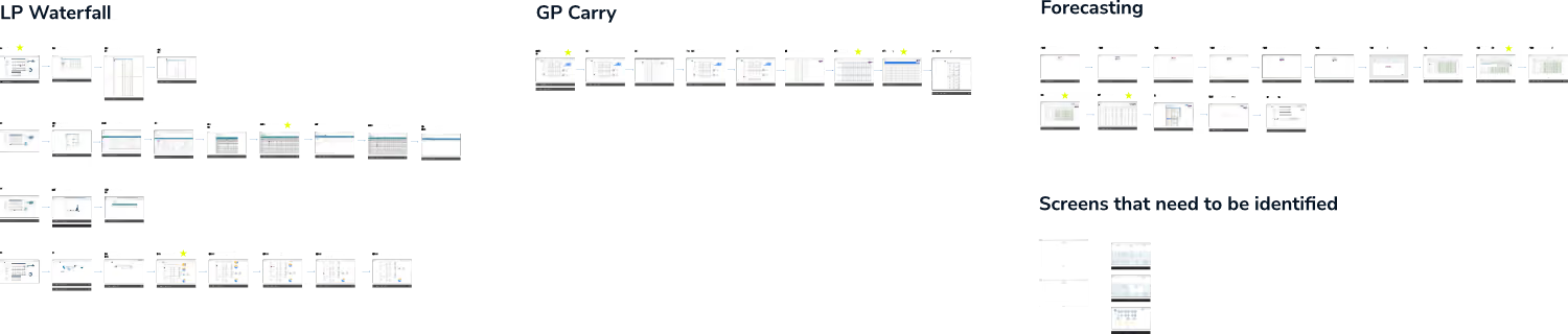
Focus area for this case study
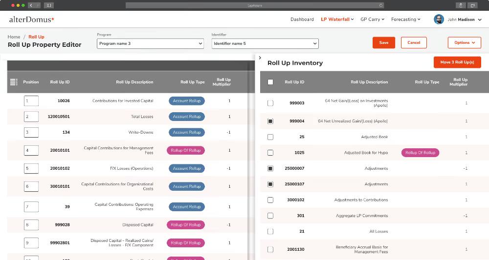
This case study focuses on the Roll Up Property Editor and the patterns that came out of it. It was the workflow where domain complexity, interaction detail and downstream consequences converged, and the place where my own hands mattered most.
My fractional constraint
Because I was working fractionally, I couldn't give every part of the product the same level of direct attention. I worked with the Euvic designer across the product, reviewing work, providing direction, and helping establish the patterns that needed to hold together across screens. I became directly involved when a problem met a particular bar:
- Domain complexity that couldn't be resolved at the screen level
- Interaction detail with consequences further downstream
- Structures that shaped how information appeared elsewhere in the product
- Problems where several rounds of proposed solutions hadn't worked
- Everything else stayed with the designer, reviewed rather than redrawn
The Roll Up Property Editor was one of those places. Rollups connect accounts and calculations into structures that determine how information is aggregated and presented elsewhere in the system. A problem there could propagate well beyond a single screen. That made it worth working directly in the file rather than reviewing the designer's work from a distance.
Making a complicated structure workable
Establishing context before the table
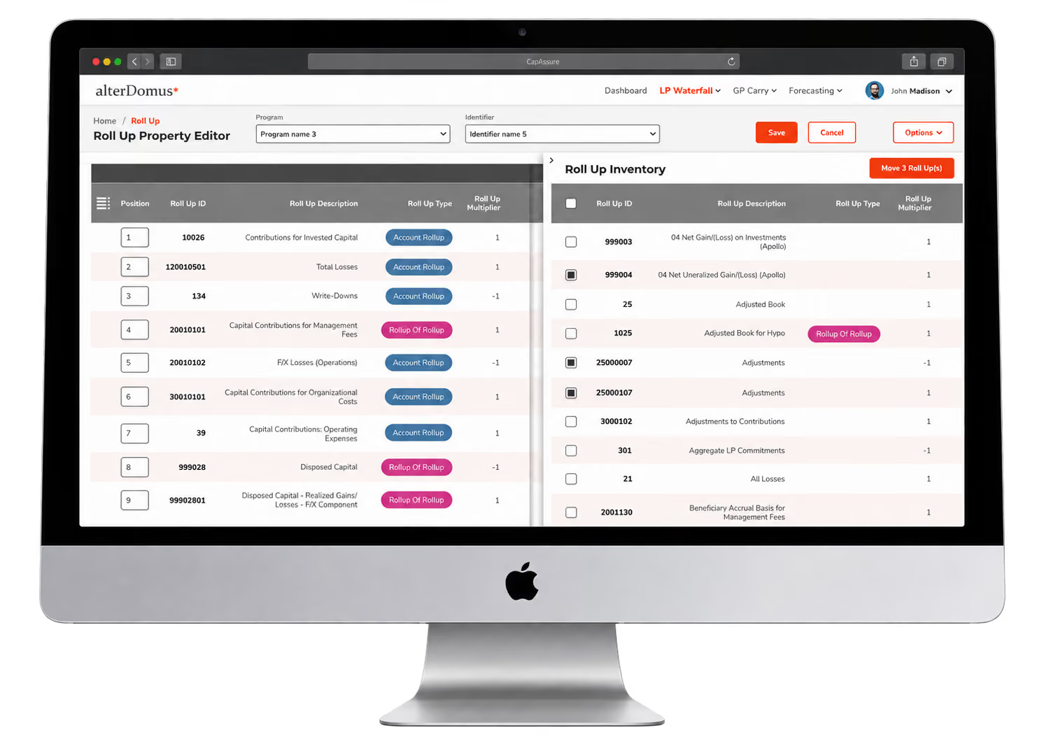
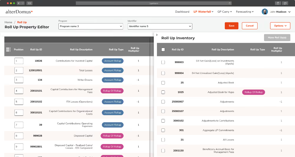
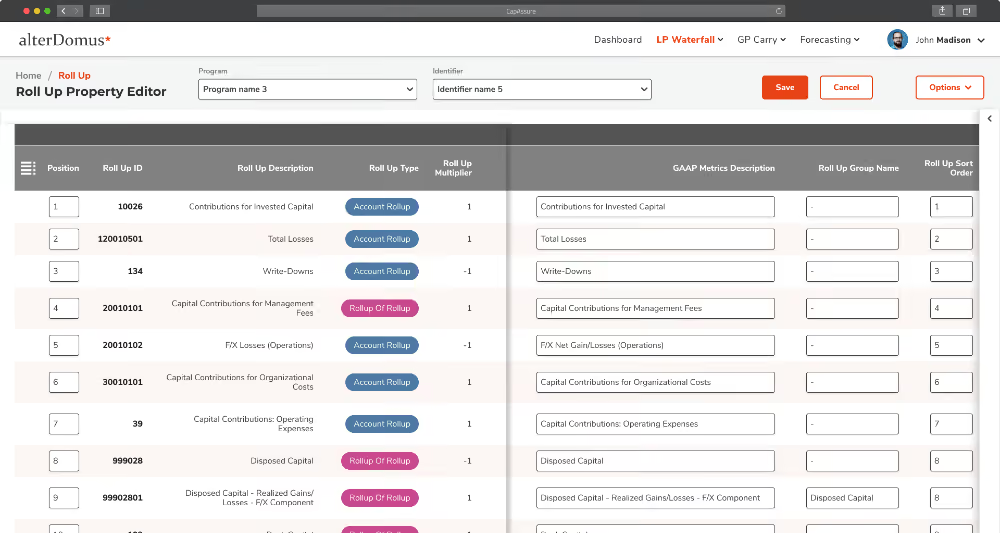
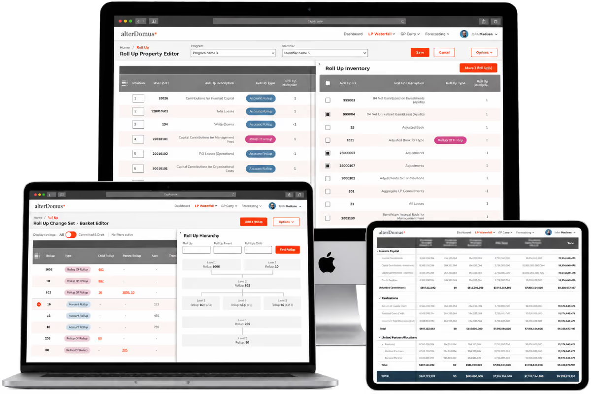
The redesigned editor establishes context before asking the user to act. Program and Identifier provide orientation. The table gives the structure a consistent visual language. Save and Cancel make the editing state explicit, rather than presenting every field as permanently active.
Bringing related information into the workflow
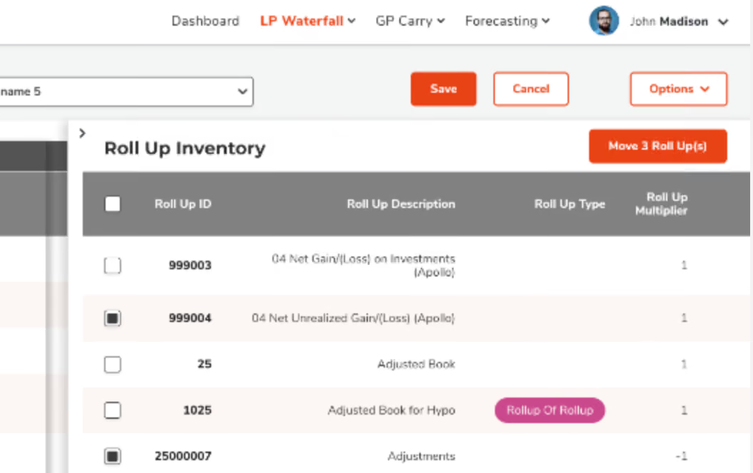
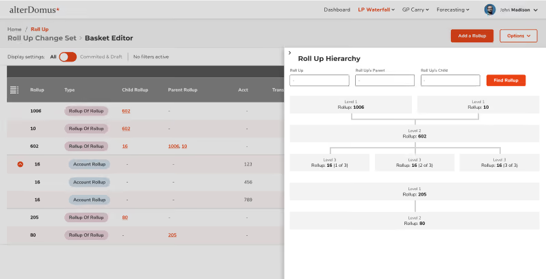
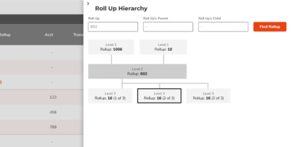
The Roll Up Inventory opens alongside the primary table. Users can find and select the rollups they need and move them into the structure they are building without leaving the task. The interaction becomes visible: select, move, review, save.
Where the first approaches failed
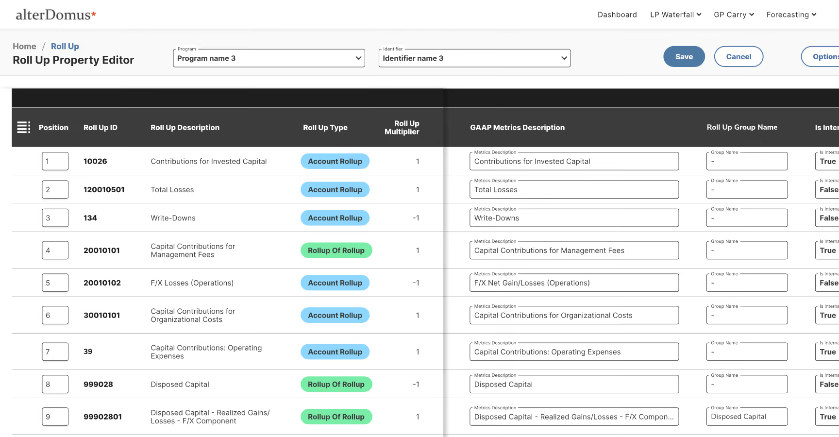
The early directions tried to resolve the hierarchy by showing less. Several rounds didn't work, because the structure users needed to reason about was the thing being hidden.
- Users couldn't tell what belonged beneath what
- The difference between an Account Rollup and a Rollup of Rollup disappeared
- Editing state was ambiguous, so every field read as live
- Finding an existing rollup meant leaving the structure being built
Working directly on the hierarchy
I worked directly with senior members of the Alter Domus team to establish a more user-centered approach to the hierarchy, then carried those decisions into the design.
- Context established before editing: Program and Identifier first
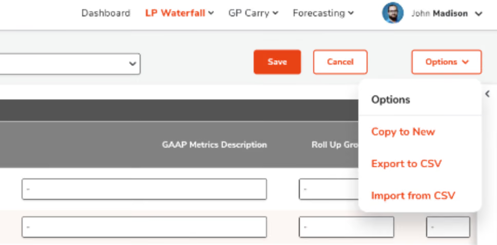
- An explicit editing state, with Save and Cancel
- The Roll Up Inventory as a contextual panel rather than a separate screen
- A consistent visual language for the structure inside the table
The depth stayed. What changed was the user's relationship with it.
Preserving the domain model
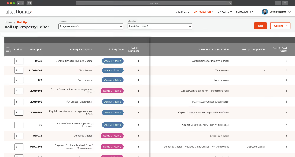
One of the easiest ways to make an enterprise product look simpler is to hide the distinctions that make it useful. That would have been the wrong trade. Account Rollups and Rollups of Rollups remain visibly different. Multipliers remain explicit. Relationships between rollups stay visible. Ordering and grouping stay part of the working model.
- Distinctions that mattered to the domain stayed visible
- Hierarchy and interaction carried the meaning instead of density
- Patterns established here extended to the wider product
Navigation became more coherent across Dashboard, LP Waterfall, GP Carry and Forecasting. Tables became more structured, actions more explicit, and panels gave context without taking users away from the task.

Details that carried the work
Typography, spacing and table structure
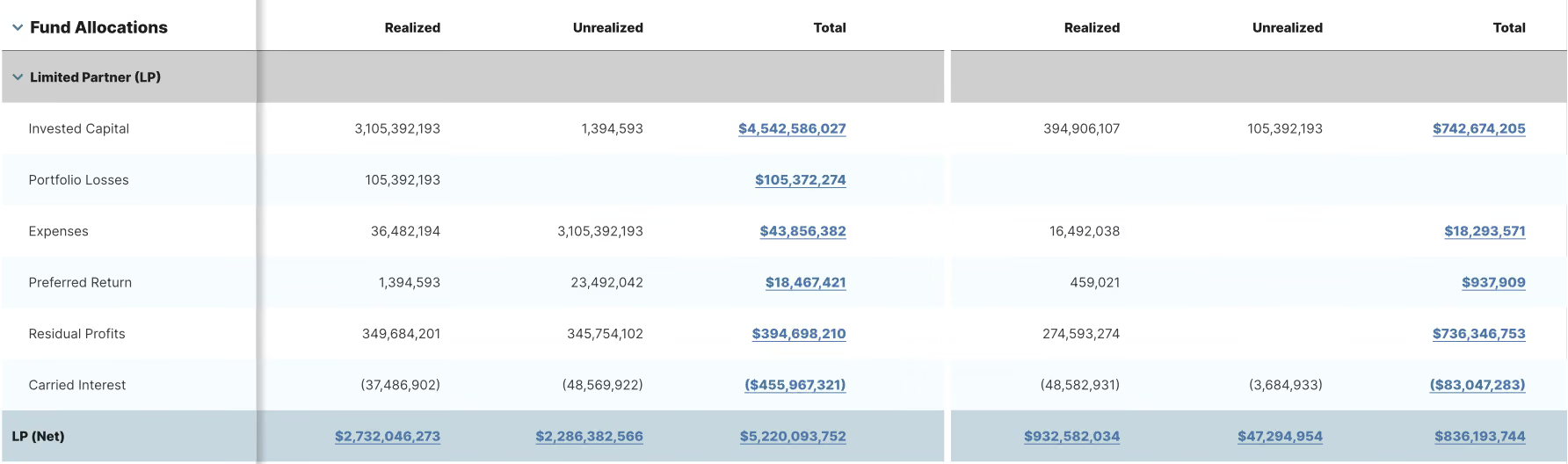
Beyond architecture, the details carried much of the improvement. Spacing, typography, table structure, panel behavior, hierarchy, and the relationship between information and action. In a data-dense product these aren't cosmetic. They're what makes a structure readable at a glance.
What changed
The work produced measurable improvement for expert users working inside a complex financial model.
- 45% improvement in user satisfaction
- 25% reduction in time on task
- Roll-up structures became navigable without leaving the task
- Patterns established in this work carried into the wider product
The outcome wasn't a simpler product. It was a product that better accommodated the complexity its users actually needed to work with. Working fractionally reinforced something I've learned repeatedly in design leadership: I don't need to design every screen to be accountable for the experience. I need to know where the decisions matter most, and be willing to get close to the work when they do.
[ FAQ ]

Fractional Head of Design, engaged through Euvic from January 2023 to February 2025. He set design direction and product UX strategy, directed a mid-level product designer, reviewed work with client leadership, and designed the highest-complexity workflows himself.
Between one and ten hours a week. That constraint meant not every part of the product could receive the same direct attention. Most of the work was deciding where direct involvement would materially change the product, and where the designer could carry the work forward with direction and review.
CapAssure users work with complex financial structures, calculations, allocations and relationships between entities. The product didn't contain too much information. The difficulty was making those relationships understandable and workable without removing the distinctions expert users depend on.
By owning the direction, the patterns and the review, and by getting close to the work where the decisions carried the most consequence. Accountability came from knowing which problems needed my hands, not from having touched every screen.
Fund administrators and advisors, including capital administrators, controllers and CFOs. They are expert users working daily inside a complex domain, which is why removing detail would have made the product worse rather than better.
One mid-level product designer carried the work across the product, with direction and review rather than redrawing. Work that met a particular bar, domain complexity combined with interaction detail and downstream consequences, came to me directly.
The constraint was time, not scope. I owned design direction, product UX strategy, quality, and the relationship with client leadership, and I directed the designer doing the day-to-day work. Full time removes the ceiling on how much of that I can do; it doesn't change the nature of it. The habit fractional work builds, deciding where senior attention actually changes the outcome, is the same habit that keeps a larger team from routing everything through one person.
Thank you!
I appreciate you taking the time to explore this project and the process behind it. If you’d like to connect, I’d love to hear from you—whether it’s to discuss a potential collaboration, compare notes on design challenges, or just say hello.
You can reach out directly using the links in the footer below, or head back to the Projects page to see more of my work.
[ Selected work ]
Flowbird: UX Maturity
Estate Guru: Modernizing Estate Planning
Kiru: A Payroll Startup

PayPal: Unified Card System
Viziphi: Visualizing Wealth
PayPal: Settings Redesign
RoleCall: A Platform for K-12 Staffing
